Competition Clash of The Jumpers- RELOADED | Geelong

Remove this Banner Ad

Jul 3, 2014
4,767
4,385
Perth
AFL Club
West Coast
Other Teams
West Perth, Pittsburgh Penguins
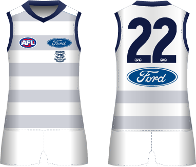
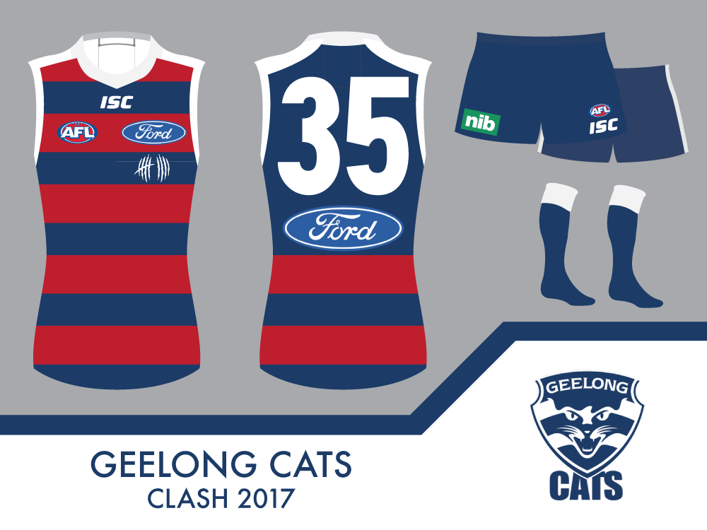
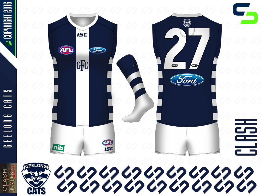
Our challenge is to design a working alternative design for Geelong, that will resolve potential jumper clashes against other AFL clubs of similar colours.

Basic Rules
- Maximum two entries per person
- Lets keep things original- try not to do something that's already been done. No former or existing designs, though inspiration from these ideas is allowed.
- Shorts and Socks are NOT mandatory
- Non club colours are permitted. (EG- Mero's Green Essendon Jumper)
- Other questions involving competition logistics will be answered below.

Each competition and poll will run for 1 week, subjective to interest.
 
I did a search and expected to find faded hoops, and it has probably been done, but the closest I found was the 150 year jumper. Anyway, I've kept it simple and as 'Geelong' as possible.


C00wQjh.png
 

Log in to remove this ad.

Wanted to use an external colour but needed to be dark rather than light to work with the home guernsey. Blood red Hoops with a pair of claw marks replacing the alternate club logo (Also, not sure about that white line showing up exclusively on my Geelong designs).
uadYhzZ.png
 
Wanted to use an external colour but needed to be dark rather than light to work with the home guernsey. Blood red Hoops with a pair of claw marks replacing the alternate club logo (Also, not sure about that white line showing up exclusively on my Geelong designs).
uadYhzZ.png
Speaking of white lines, I could go for nine lines off a left breast right about now...
 

(Log in to remove this ad.)

Invert that and I could see that being a genuine clash.

The basic design (minus the side panels) is already an inverse of the 1863-64 Geelong guernsey.

A Geelong clash needs to be dark though to contrast the light home.

I get that. Craegus' jumper is fantastic and would make an awesome clash. There just seems to be a trend of teams moving towards darker home and lighter away jumpers.

Exactly, the current home is light so as such the clash has to be dark. If it was the other way around then I would have certainly made the design white with navy elements, but this isn't a "what if" competition.
 
View attachment 268851
Corio Bay wave theme (as is their main jumper) - cartoon style on front, rollers in the bay on the back. If the player is upside down for some reason, there's gulls flying over;).
Thanks for the advice St Mark & akkaps:thumbsu:
Wow man, I must say congratulations on how you have improved. Great to see others helping as well to improve our designs as a standard and for people like me to keep pushing harder to try to beat an attempt like that. Well done. :thumbsu:
 
No mate - too advanced for me at this stage I'd reckon. However, if I come up with some ideas before the entry deadline that I think might fly I'll put in a bid.
I reckon you should give it a go. There are three other newbies this season, and in running a preseason competition; so you'll fit right in.
 

Remove this Banner Ad

Back
Top