http://www.collingwoodfc.com.au/news/2016-09-23/celebrating-125-years
A lot can happen in 125 years.
So it makes sense that the Collingwood Football Club will be celebrating its 125th birthday in style in season 2017.
As the club marks its special anniversary, there’s much to celebrate and reflect on, while looking forward to what the next 125 years hold.
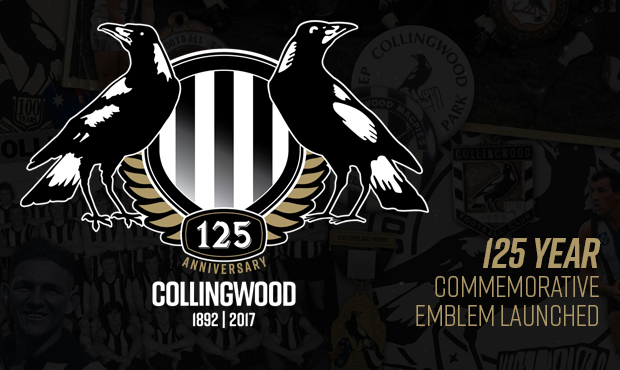
The 125 year commemorative emblem
For the next 12 months, you will notice a new emblem on Collingwood apparel and other club items.
The commemorative emblem represents:
- The two magpies represent our male and female teams standing side by side as we embark on this new era
- The two magpies represent the old and the new, including our heritage bird looking back on the past 125 years, and our more modern bird facing forwards and representing our exciting future
- black and white features heavily – these colours are obviously very important to the club as they represent our attitude, and us
- Integration of the gold laurel which is represented in Collingwood’s main logo and was drawn from the engraving on our 15 premiership cups. The 125 element also uses the same font and lettering as that of the premiership cups

For the next 12 months, you will notice a new emblem on Collingwood apparel and other club items.
How are we celebrating?
Collingwood’s 125th year will be marked by a series of events and celebrations to commemorate the occasion, including:
- A festival of celebrations on the weekend of the anniversary of our first game on 7 May 1892, featuring a rematch against our first opponent Carlton, at the MCG
- A fixture request has been submitted for a VFL match against the Northern Blues (Carlton’s VFL affiliate) at Victoria Park that weekend
- Celebrating our members and their years of consecutive service with a special member scarf
- The club has also included special 125th collectible elements in its membership packs for the 2017 season
Our membership website, membership.collingwoodfc.com.au, will feature a calendar of events for fans to reference throughout the year.
The club’s website, collingwoodfc.com.au, and historical database, forever.collingwoodfc.com.au, will play key roles in telling the story of the club’s first 125 years during the season.
Key dates
25 September 2016 (1891)
125 years since the Victorian Football League (VFA) finally agreed to admit the Collingwood Football Club into the competition after two years of lobbying.
12 February 1892
A meeting at Collingwood Town Hall to gauge community interest in the new venture. The Town Hall was overflowing, with riotous scenes and famous speeches.
26 February 1892
The first meeting of the Collingwood Football Club (to elect office bearers) was held at the Collingwood Town Hall.
16 April 1892
The club played its first practice match and elected its first captain at the Yarra Hotel before the match. The team played against ? Clifton (John Wren’s team) at Darling Gardens.
7 May 1892
The first official senior game for the Collingwood Football Club (against the Carlton Football Club) was played at Victoria Park. A huge crowd watched as the Magpies lost, kicking 2.11 (23) to the Blues 3.13 (31).
28 May 1892
Collingwood registered its first win, defeating Williamstown.
The dawn of a new era
Season 2017 is an exciting time for the club with the introduction of its women’s football and netball teams, so the club now has four teams that offer every child the opportunity to dream of playing in the famous Black and White stripes.
The emblem helps mark a point in the club’s development where it has officially become more inclusive and diverse with the launch of the two women’s teams.
A lot can happen in 125 years.
So it makes sense that the Collingwood Football Club will be celebrating its 125th birthday in style in season 2017.
As the club marks its special anniversary, there’s much to celebrate and reflect on, while looking forward to what the next 125 years hold.
The 125 year commemorative emblem
For the next 12 months, you will notice a new emblem on Collingwood apparel and other club items.
The commemorative emblem represents:
- The two magpies represent our male and female teams standing side by side as we embark on this new era
- The two magpies represent the old and the new, including our heritage bird looking back on the past 125 years, and our more modern bird facing forwards and representing our exciting future
- black and white features heavily – these colours are obviously very important to the club as they represent our attitude, and us
- Integration of the gold laurel which is represented in Collingwood’s main logo and was drawn from the engraving on our 15 premiership cups. The 125 element also uses the same font and lettering as that of the premiership cups
For the next 12 months, you will notice a new emblem on Collingwood apparel and other club items.
How are we celebrating?
Collingwood’s 125th year will be marked by a series of events and celebrations to commemorate the occasion, including:
- A festival of celebrations on the weekend of the anniversary of our first game on 7 May 1892, featuring a rematch against our first opponent Carlton, at the MCG
- A fixture request has been submitted for a VFL match against the Northern Blues (Carlton’s VFL affiliate) at Victoria Park that weekend
- Celebrating our members and their years of consecutive service with a special member scarf
- The club has also included special 125th collectible elements in its membership packs for the 2017 season
Our membership website, membership.collingwoodfc.com.au, will feature a calendar of events for fans to reference throughout the year.
The club’s website, collingwoodfc.com.au, and historical database, forever.collingwoodfc.com.au, will play key roles in telling the story of the club’s first 125 years during the season.
Key dates
25 September 2016 (1891)
125 years since the Victorian Football League (VFA) finally agreed to admit the Collingwood Football Club into the competition after two years of lobbying.
12 February 1892
A meeting at Collingwood Town Hall to gauge community interest in the new venture. The Town Hall was overflowing, with riotous scenes and famous speeches.
26 February 1892
The first meeting of the Collingwood Football Club (to elect office bearers) was held at the Collingwood Town Hall.
16 April 1892
The club played its first practice match and elected its first captain at the Yarra Hotel before the match. The team played against ? Clifton (John Wren’s team) at Darling Gardens.
7 May 1892
The first official senior game for the Collingwood Football Club (against the Carlton Football Club) was played at Victoria Park. A huge crowd watched as the Magpies lost, kicking 2.11 (23) to the Blues 3.13 (31).
28 May 1892
Collingwood registered its first win, defeating Williamstown.
The dawn of a new era
Season 2017 is an exciting time for the club with the introduction of its women’s football and netball teams, so the club now has four teams that offer every child the opportunity to dream of playing in the famous Black and White stripes.
The emblem helps mark a point in the club’s development where it has officially become more inclusive and diverse with the launch of the two women’s teams.