Discussion Copied logos in the wild

Remove this Banner Ad

Log in to remove this ad.

I posted this in another thread but it belongs here:

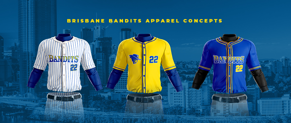
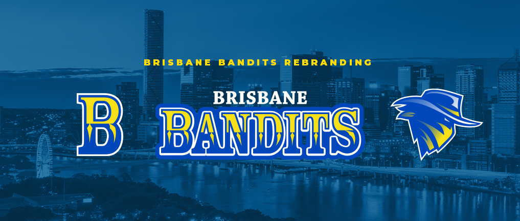
New logo and colours for the Brisbane Bandits.
Bandits-apparel-for-web.jpg

Huh, a stock uniform template. A bit amateurish but not out of the ordinary..
Bandits-rebrand-for-web.jpg

Oh, so they've included a new logo into their brand without updating the wordmark. Weird.. Wait, that Bandit logo is waaaay too generic.
screen-shot-2020-07-05-at-9-42-12-pm-png.906851

385479eec77202bf8d9827c8514f508f-jpg.906845

Oh. The original logo is made by the agency creative grenade. Hopefully it's just some laziness on their and the Bandit's part, but I doubt it.
 
Last edited:
I never understand local sides simply flat out copying an NFL logo like that. Even a s**t original logo is better than a thoughtless copy. That Eagles logo must be the most copied logo in sport over the last couple of decades.

The problem I guess is that most local sporting club committees couldn't give a s**t about design or having something special to the club. It's such a waste.
 
The Raiders logo has ‘Rebels’ in place of the orignal wording. Also see Barrett’s shirt, the Auckland Patriots.
I saw that.
First thought the logo looked like they’ve placed the NE Pats logo on top of the Atlanta Thrashers logo
On closer inspection it was the Blues logo.
 
I never understand local sides simply flat out copying an NFL logo like that. Even a sh*t original logo is better than a thoughtless copy. That Eagles logo must be the most copied logo in sport over the last couple of decades.

The problem I guess is that most local sporting club committees couldn't give a sh*t about design or having something special to the club. It's such a waste.

No access to anybody with design skills and no money to pay for them. Google does the job.

Having said that, a few of the clubs here definitely have the money to do it properly... I guess they just don’t think to or are too lazy.
 

Remove this Banner Ad

Back
Top