Workshop Cricket Kit Designs/Discussion

Remove this Banner Ad

Wouldn't mind seeing something simple like this. Drop the ridiculous bib/collar thing, change to a warmer yellow, darker green to match the Australia text/numbers. Simple inverse for Away ODI's and a black alternate for T20 and bang, you got a clean kit that someone like myself would actually consider dropping money on.

View attachment 1019792

I'll give Freight Train a well deserved plug with this ripper he designed for his Cricket portfolio last year, pretty much perfect ODI kit for Australia (and paired with a big campaign to bring ODI's back to the glory days of the 80's-00's, it would be even better). Only thing I'd change would be making the collar and buttons green just so there's not an overload of gold

pres-odi-jpg.768036
 
I'll give Freight Train a well deserved plug with this ripper he designed for his Cricket portfolio last year, pretty much perfect ODI kit for Australia (and paired with a big campaign to bring ODI's back to the glory days of the 80's-00's, it would be even better). Only thing I'd change would be making the collar and buttons green just so there's not an overload of gold

pres-odi-jpg.768036
That's it. Clean and simple. Would love to see a black version of this with that green > lime gradient on the sides, would look grouse.
 
That's it. Clean and simple. Would love to see a black version of this with that green > lime gradient on the sides, would look grouse.

you mean like this?

pres-t20i-jpg.768037
 

Log in to remove this ad.

Don't be daft. That looks like orange to me.

How about I ask our resident expert in all things orange, akkaps?
I mean, it's just what they call it though right? Like we say Australia's colours are green and gold, but its not actually gold.
 
While I do love a good retro kit, the idea is starting to become a bit jarring. Just make something new and fresh instead of piggybacking off classic old designs for a quick nostalgia buck.
Yeah I totally agree. It's starting to wear on a bit, & it seems like every cricket playing country in the world is starting to roll these out on a regular basis. Much like the film industry, I wish the designers would steer clear of the retro/remake craze for a little while & just focus on originality.
 

(Log in to remove this ad.)

Possibly, it's hard to tell because the stars are a new addition of about 10 years, when we last won the WC.
found this which seems to confirm it, locations of the grounds where the finals of the 2 WC's and t20WC were played
 
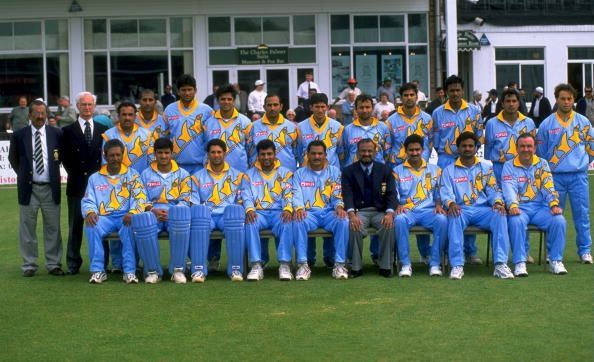
India's shirt really is a dogs breakfast, they have got Navy blue, royal blue, red, green, white and saffron all on the one shirt paired with very loud sponsor logos as well as the country name. Very unpopular opinion I imagine, but that '92 WC design should have stayed there.

If you want to go with a retro shirt for the indians, then I would have gone for the mid 2000's with this flag based number:
Master.jpg
Couldn't agree more! I actually recreated that shirt, with current sponsors, on Cricket 19. bd540707-ff69-433e-875e-1a2918477833.PNG
 
academy name to find this?
"SlitheringSam58" some of the team lists are dodgy. I'd recommend downloading, unlinking and then downloading the 2020 teams and kits "wasteyoryouth" has. I've also done some retro BBL kits. Mercantile Mutual Cup style.

On Pixel 2 XL using BigFooty.com mobile app
 
I agree that India look best when playing in sky blue. These days they seem to chop & change their colour scheme far too often, which in my eyes is problematic as now there are a total of four Test nations wearing some form of blue in ODIs (India, England, SL & Afghanistan).

1zyFMJt.jpg


1999 CWC kit for the win.
 
I'll give Freight Train a well deserved plug with this ripper he designed for his Cricket portfolio last year, pretty much perfect ODI kit for Australia (and paired with a big campaign to bring ODI's back to the glory days of the 80's-00's, it would be even better). Only thing I'd change would be making the collar and buttons green just so there's not an overload of gold

pres-odi-jpg.768036
This is light years ahead of the current hi-vis version.

Still can't get over the fact we played in a World Cup with the pads being a different colour to the rest of the uniform.
 
Pads are ridiculous in cricket now, must be something to do with the material because I struggle to find a cricket kit where the colour of the pads isn't at least a shade off.
And each brand is different as well.
 

Remove this Banner Ad

Back
Top