Navigation
Install the app
How to install the app on iOS
Follow along with the video below to see how to install our site as a web app on your home screen.
Note: This feature may not be available in some browsers.
More options


You are using an out of date browser. It may not display this or other websites correctly.
You should upgrade or use an alternative browser.
You should upgrade or use an alternative browser.
Workshop Cricket Kit Designs/Discussion
- Thread starter jethro11
- Start date
- Tagged users None
KrakouerPhat
Debutant
- Oct 5, 2017
- 96
- 105
- AFL Club
- Collingwood

Can’t get much worse...

Spanna_
The secret ingredient is crime
Harry Conway playing with a shirt with no name or number today was very niche
Freight Train
Once hit the sign at the Mercantile Mutual Cup
- Moderator
- #3,380
The current Asics kits are a bit dull and lack the general superiority of Nike, Adidas etc. To solve the Comm Bank problem it has a black border around the main part of the logo. Also the kit returns to the traditional gold home kit for the Aussies which has been missing for a few years. Probably could be executed better, but oh well. pornjk porn800 redtube
what
Late-night multitasking gone wrong.
caloschwaby
Whisper
- Jan 3, 2017
- 4,845
- 6,458
- AFL Club
- Collingwood
- Other Teams
- Celtics, Renegades, Packers
what
It's a bot. Been on this board a few times saying somewhat related things and then just splurting out random links at the end.Late-night multitasking gone wrong.
Has anyone seen what Ireland are wearing in the current ODI series v the Windies? They have mainly green shirts and pants but then wear Navy blue pads... and not even the same shade as what’s on their shirts...as Mum used to say ‘blue and green should never be seen without a colour in between...’
hitthepost
Norm Smith Medallist
Classic Ireland look. Nothing wrong with it at all.Has anyone seen what Ireland are wearing in the current ODI series v the Windies? They have mainly green shirts and pants but then wear Navy blue pads... and not even the same shade as what’s on their shirts...as Mum used to say ‘blue and green should never be seen without a colour in between...’

Gough
Moderator
- Sep 29, 2006
- 71,904
- 133,496
- AFL Club
- Hawthorn
- Moderator
- #3,385
Unless it's on a Dublin queen.Has anyone seen what Ireland are wearing in the current ODI series v the Windies? They have mainly green shirts and pants but then wear Navy blue pads... and not even the same shade as what’s on their shirts...as Mum used to say ‘blue and green should never be seen without a colour in between...’

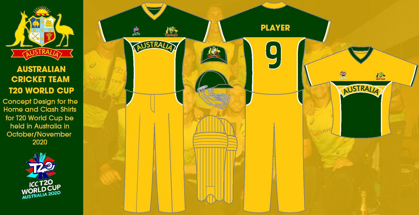
An idea for Australia's T20 World Cup kit.
It is using the current colour scheme with the design of the 2007 Cricket World Cup.
- Jun 9, 2015
- 12,051
- 9,274
- AFL Club
- St Kilda
A genuine winner due to the traditional button collar and not a sheewee oneView attachment 805734
An idea for Australia's T20 World Cup kit.
It is using the current colour scheme with the design of the 2007 Cricket World Cup.
Teen Wolf
Norm Smith Medallist
- Jul 5, 2011
- 8,104
- 8,911
- AFL Club
- North Melbourne
- Other Teams
- Afghanistan women's cricket team
More angles on the CA shop, but here is the best shot of the back with hayuuuge names and numbers that I saw today:

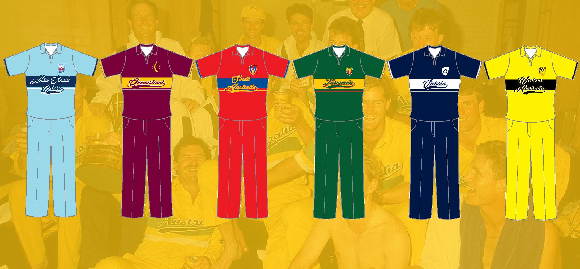
Here are my designs for the men's T20 Cricket World Cup and for State One Day Uniforms done in late 1980's World Series Cup Style

Adelaide Bushfire T20 Kit and Baggy


- Nov 15, 2010
- 2,409
- 2,157
- AFL Club
- Fremantle
- Other Teams
- WACA, Western Force, Arsenal, Glory
Would have been a nice twist if they used the monogram on the baggy cap. (everyone's a critic, I know.)
hitthepost
Norm Smith Medallist
I hope the Power's cap is black and white panels with teal piping.
fancyscum
Radical Crommunist
My exact thoughts, we've got a club shield, why not use it?Would have been a nice twist if they used the monogram on the baggy cap. (everyone's a critic, I know.)
- Apr 19, 2008
- 18,086
- 27,505
- AFL Club
- Essendon
- Other Teams
- Melb Stars, Man U, USC, NY Mets
Port wearing a baggy black with the 2020 PAFC shield on the front for the Bushfire Appeal game
On iPhone using BigFooty.com mobile app
- Apr 19, 2008
- 18,086
- 27,505
- AFL Club
- Essendon
- Other Teams
- Melb Stars, Man U, USC, NY Mets

Wouldn't mind seeing the Blackcaps wearing something similar TBH
hitthepost
Norm Smith Medallist
Like this?Wouldn't mind seeing the Blackcaps wearing something similar TBH

Bingo!Like this?View attachment 816533
For real, the white and teal stripes give me early 2000s NZ vibes. But also makes me want a Carlton Mid or a Benson and Hedges and I can't work out why...hitthepost
Norm Smith Medallist
So really Port's T20 baggy black looks like a regulation New Zealand Test capBingo!

Similar threads
- Replies
- 42
- Views
- 2K
