

- Jun 9, 2015
- 12,051
- 9,274
- AFL Club
- St Kilda
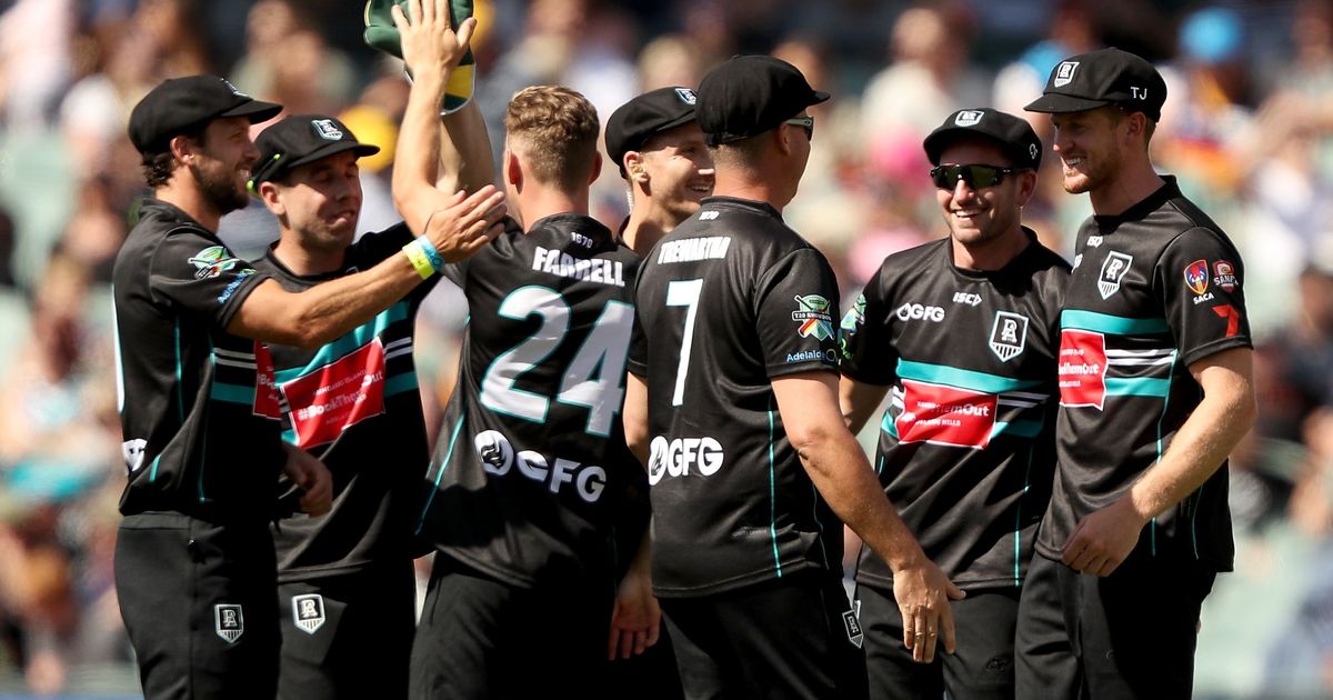
Yeah the strikers choked againI understand that this might be a weird request, but is there a scorecard of that Adelaide Bushfire game?
Follow along with the video below to see how to install our site as a web app on your home screen.
Note: This feature may not be available in some browsers.
Yeah the strikers choked againI understand that this might be a weird request, but is there a scorecard of that Adelaide Bushfire game?
I understand that this might be a weird request, but is there a scorecard of that Adelaide Bushfire game?


Courtney Walsh's shirt has a CA arms with kangaroo and emu instead of the Big Appeal logo.View of the front for the Bushfire Bash todayView attachment 819758


Nothing screams T20 excitement quite like arial condensed
Oh for *’s sakeSouth Africa T20 World Cup by New BalanceView attachment 823427
Not sure which person this is roasting more but I love the reference.curio from the shak getting a run for south africa in the cricket now?


For ICC events all teams must have their name on the front of their shirts. If it's not a standard design element of their kit (eg India) then it's done in the basic font.Ok seriously, what is with cricket kits and arial condensed? Do designers just give up halfway through? Is there a guideline that teams must follow? As a huge fan of creative typefaces, these choices are honestly mind boggling.
This took 2 seconds, but this is practically what cricket kit designers would do if they had control of (what pains me to say) is the best looking jersey in the majors.
View attachment 823913
So designers are incompetent nincompoops, gotchyaFor ICC events all teams must have their name on the front of their shirts. If it's not a standard design element of their kit (eg India) then it's done in the basic font.
I'm not quoting any regulations on this but that's how I see the current situation. India have their name on the front of their kits in all short-form cricket and continue the same font into tournaments and everyone else has to add it on and use boring font.
I got no issue with it. It does mean less sponsor bs on shirts.whoever made the rule on having the arial condensed nation name on the front of the kits is a *******.
as if i'm not going to know the cricketer with a long ass last name on the back wearing dark blue & yellow isn't from sri lanka.
same goes for any other bloody country. the kits themselves are usually kinda cool (last couple posted above are nice, and especially when nations like aus & nz do the flashback uniforms as well).
I think this is why it's done. Takes up a spot where otherwise teams would want a sponsor that may or may not be a competitor of one of the ICC's.I got no issue with it. It does mean less sponsor bs on shirts.
Just wish other teams would pick a better font.
