Navigation
Install the app
How to install the app on iOS
Follow along with the video below to see how to install our site as a web app on your home screen.
Note: This feature may not be available in some browsers.
More options

You are using an out of date browser. It may not display this or other websites correctly.
You should upgrade or use an alternative browser.
You should upgrade or use an alternative browser.
Workshop Cricket Kit Designs/Discussion
- Thread starter jethro11
- Start date
- Tagged users None
My thoughts on the new jerseys
Adelaide - Decent
Brisbane - Amazing
Hobart - Great
Renegades - Terrible
Stars - Great
Perth - Amazing
Sixers - Meh
Thunder - The worst
Adelaide - Decent
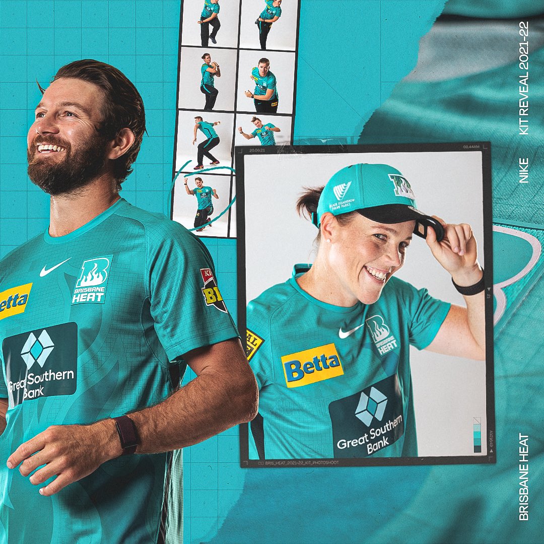
Brisbane - Amazing
Hobart - Great
Renegades - Terrible
Stars - Great
Perth - Amazing
Sixers - Meh
Thunder - The worst
WE HAVE PERSONALITY! Not a fan of the black pants though nor the heat pressed logos


caloschwaby
Whisper
- Jan 3, 2017
- 4,842
- 6,455
- AFL Club
- Collingwood

- Other Teams
- Celtics, Renegades, Packers
FFS Actual designs are back! Thank you!
Love the Strikers the most
Love the Strikers the most
Saint Mick
Senior List
- Sep 26, 2012
- 196
- 264
- AFL Club
- St Kilda
Be interesting to see what they do with the headwear - are 47 Brand still involved or will they move to Nike caps?
magpiemaniac44
Club Legend
- Aug 19, 2020
- 2,372
- 2,380
- AFL Club
- Collingwood
- Other Teams
- San Antonio, Melbourne Stars
Stars and Scorchers are the best, like the Thunder one but the writing is stupid. Renegades one is the worst of the lot.
I have to agree with you there, the writing is also on the hurricanes but not as muchStars and Scorchers are the best, like the Thunder one but the writing is stupid. Renegades one is the worst of the lot.
I'd agree with the Stars if they didn't have the black box around Aussie Broadband!Stars and Scorchers are the best, like the Thunder one but the writing is stupid. Renegades one is the worst of the lot.
Be interesting to see what they do with the headwear - are 47 Brand still involved or will they move to Nike caps?
Best view of a hat
Saint Mick
Senior List
- Sep 26, 2012
- 196
- 264
- AFL Club
- St Kilda
There's 2021/22 47 Brand caps on the CA shop so that answers that question I guess!
Best view of a hat

Bwillow11
All Australian
- Sep 16, 2016
- 680
- 470
- AFL Club
- Collingwood
- Other Teams
- Melbourne Stars
Strikers - 3 - Outer tone of blue is too contrasting with rest of shirtMy thoughts on the new jerseys
Adelaide - Decent
Brisbane - Amazing
Hobart - Great
Renegades - Terrible
Stars - Great
Perth - Amazing
Sixers - Meh
Thunder - The worst
Heat - 5 - Brilliant, Always had a great flame element, with very subtle yet bold enough colouring
Hurricanes - 3 - Large H shape draws attention to an oversized, bland element with a lack of a dynamic shape.
Renegades - 2 - Feels unbalanced, lack of continuity, design element is a bit muddled and confusing.
Stars - 2 - Green looks a bit dull, too significant a contrast between dark design element and shirt, the white glow is a bit garish
Scorchers - 4 - Gradient creates a symbolic reference, creates a bright focal point, contrast between logo element is slightly too high but blends nicely with rest of shirt.
Sixers - 4 - Clever use of a traditional design element to create an even greater contrast with the glowing illustration below, really strong colour
Thunder - 2 - What is that text? Trying to fill in a glaring gap in the design. The thunder drew the short straw with that colour 10 years ago
Last edited:
- Oct 27, 2016
- 5,938
- 10,623
- AFL Club
- Collingwood
- Other Teams
- Packers, Raptors, Renegades
Can anyone explain why they think the Renegades ones are bad? The best kit we've had since BBL07 imo. Would be cooler if they worked the logo into it somewhere but otherwise kinda nice.
They just look a bit bland with the two squares. Personally if they wanted that 'Renegade' style they should have added it more, like fading in from the bottom with a light version of the logo in it. I think people don't like it because they could've done more but didn't.Can anyone explain why they think the Renegades ones are bad? The best kit we've had since BBL07 imo. Would be cooler if they worked the logo into it somewhere but otherwise kinda nice.
Teen Wolf
Norm Smith Medallist
- Jul 5, 2011
- 8,096
- 8,902
- AFL Club
- North Melbourne
- Other Teams
- Afghanistan women's cricket team
Strikers' is good if you think suspenders are cool. But in general it was the right idea to not base the main design around their crappy logo, no such luck for the Stars (but that's what happens when you pick a bad nickname).
Renegades' is obviously the best. I can however understand why those with mere incipient taste prefer the offerings of, say, the Heat and Scorchers.
Back to pants matching pads for all teams it seems, thankfully, as the alternate always comes off looking like peak park cricket sloppiness.
And I was hoping things would change with the numbers and names on the back... but such a change would probably have been showcased today if it was to be.
In the video the Canes put up, the design seems to disappear in daylight. Hopefully we will be appreciate the designs during the game and not just in studio shoots.
Adelaide: A lot going on, but nothing that screams fantastic. - 3/5
Brisbane: Flame is back = good, may look more like shadowing when out on the field though = bad - 4/5
Hobart: Giant logo on front, check. Does it work? No - 2/5
Renegades: Different? Yes. Different good? Not really. - 3/5
Stars: Feels like a throwback to their first design. Star stands out which is better than Brisbane, but overall not as good. 3/5
Perth: As expected. Could do with more black on the shirt to create contrast in the design. - 4/5
Sixers: Very much the Sixers, but nothing to stand out from the crowd. - 3/5
Thunder: About what you would expect from the Thunder. Text stands out too much. Make the text less visible and add some more black on the sleeves and the rating would likely be higher. - 3/5
Overall: Better than the last set by a massive margin (but just about anything would have been). All could be improved with simple tweaks. Unfortunately most are middle of the road, not amazing, but not terrible, certainly not designs that have me wanting to race out and buy any. Total score = 3.125/5
- Moderator
- #3,896
Everyone having black pants is lame imo. The little bit of individuality some clubs had is now gone
As opposed to having everyone in a single colour with no design?
The individuality has returned, if anything.
- Oct 27, 2016
- 5,938
- 10,623
- AFL Club
- Collingwood
- Other Teams
- Packers, Raptors, Renegades
okay fair enough. I do agree they could do more, but it's better than a plain red shirt that's for sure.They just look a bit bland with the two squares. Personally if they wanted that 'Renegade' style they should have added it more, like fading in from the bottom with a light version of the logo in it. I think people don't like it because they could've done more but didn't.
fancyscum
Radical Crommunist
They are all pretty good apart from the Thunder (who thought sticking a great big "thunder nation" on the shirt was a good idea) and the Stars (the gradient treatment on the star just doesn't do it for me). Strikers is the best one here, love how it is mimics the helmet design. Will be picking one up for sure, hopefully there is a run of shirts before they sign a big ugly sponsor on the front.
These would be the tweaks I would make to the stars kit.
- Return the green pants
- Add black to the sleeves like 05-08
- A more transparent star
- Remove the black box around the Aussie Broadband logo

- Return the green pants
- Add black to the sleeves like 05-08
- A more transparent star
- Remove the black box around the Aussie Broadband logo

I'm also trying to work out why Tones and I is an ambassador. She had a photoshoot with most teams jersey hat and hair colour. Apparently she is "A self confessed cricket lover". We'll probably not hear from her after this anyways so it wont really matter.


Similar threads
- Replies
- 42
- Views
- 2K
