Navigation
Install the app
How to install the app on iOS
Follow along with the video below to see how to install our site as a web app on your home screen.
Note: This feature may not be available in some browsers.
More options


You are using an out of date browser. It may not display this or other websites correctly.
You should upgrade or use an alternative browser.
You should upgrade or use an alternative browser.
News Crows guernseys/apparel discussion and news
- Thread starter SC26
- Start date
- Tagged users None

SugarShane
C12 H22 O11
The Sharks is very cool, but how could you be upset about being the Crows over the Rams?
You can do so much cooler s**t brand wise with a crow than a sheep. Imagine our goal celebration video at AO being "BAAAAAAAAAAAAAAAAA".
Good thing now they didn't go with the Lakers either.The Sharks is very cool, but how could you be upset about being the Crows over the Rams?
You can do so much cooler s**t brand wise with a crow than a sheep. Imagine our goal celebration video at AO being "BAAAAAAAAAAAAAAAAA".
MatthewB
If the drinking lamp is lit, you should be too
- Sep 17, 2015
- 9,999
- 12,173
- AFL Club
- Adelaide
- Other Teams
- NY Yankees, Glenelg Adelaide Giants
We could have played a couple games in NZ aswell, get a whole lot of new fansThe Sharks is very cool, but how could you be upset about being the Crows over the Rams?
You can do so much cooler s**t brand wise with a crow than a sheep. Imagine our goal celebration video at AO being "BAAAAAAAAAAAAAAAAA".
- Oct 28, 2014
- 9,816
- 23,815
- AFL Club
- Adelaide
It should be the Graham Kennedy faaaaaaark faaaaaaark!The Sharks is very cool, but how could you be upset about being the Crows over the Rams?
You can do so much cooler s**t brand wise with a crow than a sheep. Imagine our goal celebration video at AO being "BAAAAAAAAAAAAAAAAA".
Not the worst logo. But can't imagine anything else but the Crows now. Thought it made sense the Powa should have been the Sharks. Their silver/grey colour would have been useful for it too.
On CPH2333 using BigFooty.com mobile app
EightyFour
Senior List
MatthewB
If the drinking lamp is lit, you should be too
- Sep 17, 2015
- 9,999
- 12,173
- AFL Club
- Adelaide
- Other Teams
- NY Yankees, Glenelg Adelaide Giants
I noticed there was a small change in the logo or was just for this announcement
I suppose this is good news if you bought a 2022 guernsey, you can expect it to still look current in 2025
- Thread starter
- #2,010
That different collar has shown up again


Fingers crossed.That different collar has shown up again
View attachment 1568552
SugarShane
C12 H22 O11
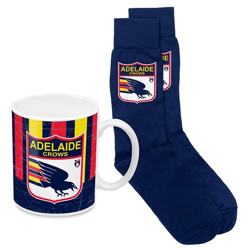
So my wife went shopping yesterday, saw a retro Crows mug and socks set and bought it for me because she knows that logo is the goat. This is the set.

Any logo nerds spot the issue?
Further research shows there's a large range of this retro stuff available at the moment, all officially licensed and on official AFL and AFC stores. Hats, shirts, hoodies, keyrings, all the with the stripes wrong.
How does this even happen on an official product? Does it go through any approvals process at the club? Further, how do you even get that wrong? A simple google search brings up our logo, and surely they have vector images of these all in the vault ready to use. Clearly they've recreated the logo from scratch and botched a pretty important part. Jeez the AFL licenses some dodgy stuff.
SugarShane
C12 H22 O11
The stripes, yes. The wording is accurate for 97/98, when we swapped to the ADELAIDE Crows instead of Adelaide CROWS.The red strips behind the Crow tail getting inversed?
The OG logo had Adelaide small font and Crows bigger, but it was swapped to how that logo looks after Port joined
The order of our stripes/hoops is kind of a big deal. Even if they got them in the wrong order repeatedly it'd be less jarring than them swapping halfway through.
How does this even happen on an official product? Does it go through any approvals process at the club?
I actually don't think it does. It seems we just get what we are told to sell.
How else do you explain those horrible custard yellow and faded blue BLK guernseys we had for a while.
Like surely no one at the club sent back some vibrant jumpers and said, too good, lets tone them down a lot.
The answer might have been that's all they were capable of doing with their current processes or whatever, but I can't imagine an Eddie McGuire (the new guy maybe...) telling Collingwood's supplier, yep no problem, we can use the brown stripes this year, try again next year.
And that's something as important as a guernsey, the AFL supplied stuff would be even more hands off.
Burtonsgottago
Premiership Player
- May 5, 2019
- 4,415
- 4,454
- AFL Club
- Adelaide
Cannot believe Port didn’t use Sharks. Power is the worst name in the league. Yes, even worse than Suns.Not the worst logo. But can't imagine anything else but the Crows now. Thought it made sense the Powa should have been the Sharks. Their silver/grey colour would have been useful for it too.
On CPH2333 using BigFooty.com mobile app
SugarShane
C12 H22 O11
Cannot believe Port didn’t use Sharks. Power is the worst name in the league. Yes, even worse than Suns.
It's a shocker (no pun intended). I hate any name like that that you can't apply to a single player. "Ball lands between a Crow and a Power... player." Same with Utah Jazz and Miami Heat, etc.
That said, I do love how everything about their club screams 90z kewl. The teal and silver, lightning bolts, outside the box name. In a way they're lucky they went power because if they went Sharks or Pirates with their marketing team you can almost bet they'd have come in as Port Piratez! Their club is like a "Jazz Cup" brought to life.
Scorpus
Moderator
- Apr 16, 2014
- 58,232
- 150,859
- AFL Club
- Adelaide
- Moderator
- #2,018
It's a shocker (no pun intended). I hate any name like that that you can't apply to a single player. "Ball lands between a Crow and a Power... player." Same with Utah Jazz and Miami Heat, etc.
That said, I do love how everything about their club screams 90z kewl. The teal and silver, lightning bolts, outside the box name. In a way they're lucky they went power because if they went Sharks or Pirates with their marketing team you can almost bet they'd have come in as Port Piratez! Their club is like a "Jazz Cup" brought to life.
The only thing they managed to avoid was having a gradient on the jumper
Dirty Bird
Pokémon Master
The worst I saw was actually sold at Crowmania.So my wife went shopping yesterday, saw a retro Crows mug and socks set and bought it for me because she knows that logo is the goat. This is the set.
Any logo nerds spot the issue?
Further research shows there's a large range of this retro stuff available at the moment, all officially licensed and on official AFL and AFC stores. Hats, shirts, hoodies, keyrings, all the with the stripes wrong.
How does this even happen on an official product? Does it go through any approvals process at the club? Further, how do you even get that wrong? A simple google search brings up our logo, and surely they have vector images of these all in the vault ready to use. Clearly they've recreated the logo from scratch and botched a pretty important part. Jeez the AFL licenses some dodgy stuff.
The first retro stuff to come out, it was our old logo. But it had the VFL logo on the side.....
Punchy Bassett
Brownlow Medallist

Dirty Bird
Pokémon Master
Hmmmmm, idk.
On one hand, it looks slick, on the other, it also looks a training top.
SugarShane
C12 H22 O11
Oh dear. That looks suspiciously like $120 flying out of my wallet.
That jumper looks pretty great.
Carlton have a white jumper this season?
Carlton have a white jumper this season?
dogs105
Sweet Kennels Proprietor
Ooh, a navy blue guernsey for Gather Round. Nice! Who are we playing against?
Similar threads
- Replies
- 2K
- Views
- 29K
- Replies
- 430
- Views
- 22K
- Sticky
- Replies
- 73
- Views
- 6K
- Replies
- 2K
- Views
- 28K
