

Dirty Bird
Pokémon Master
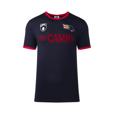
So we've replaced our yellow away strip with a red one?
Follow along with the video below to see how to install our site as a web app on your home screen.
Note: This feature may not be available in some browsers.
So we've replaced our yellow away strip with a red one?
Looks that way but you'd hope not. The Yellow was suitable for a lot more clashes. Having the 3 to rotate through was perfect. Red still has the "dark" appearance so doesn't truly work against the Essendon, Brisbane, St Kilda types.So we've replaced our yellow away strip with a red one?
It sounds like they have. Never cease to be amazed.Would be mad to get rid of the yellow strip. Last season's looked amazing.
Getting rid of the yellow is a joke
What do we do away against Essendon and Melbourne?
Yuck.

 shop.afc.com.au
Yeah, in 1999. Though I'd say it's trying to evoke more of an early 90's vibe.Did that logo exist with that AFL logo?
I'd say they just went with what sold better.I really liked the yellow jumper so hopefully it's still around in some form.
Did we lose a few games in it so now it's not popular or something?
That said, If there is some benefit to releasing "new" jumpers, I'd rather us alternate the yellow and red jumpers every couple of years than feel the need to bring back the non-traditional "artistic" designs from a few years ago.
We've identified the lack of hoops was a problem, it was fixed, don't let the problem happen again.
Same with the away jumper, they put it to a poll, the three hoop design won by quite a bit right? I was really annoyed that a few years later they thought it was necassary to turn the hoops into a weak chevron with the We Fly As One logo on top of them, like we voted against similar designs in previous years.
Now the full hoops in yellow/red is even better, this is it now.
But the red we didn't get mass produced for you to just walk in off the street and buyI'd say they just went with what sold better.
Which might have been a clue on how popular it was if they ran it once and it sold like gangbusters.But the red we didn't get mass produced for you to just walk in off the street and buy
Was a pre-order only.
