- Mar 1, 2014
- 9,099
- 17,304
- AFL Club
- Port Adelaide
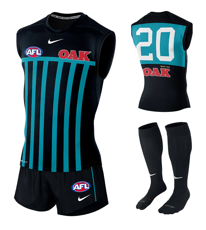
I was once totally against any changes to the prison bar jumper but some of those designs with silver or blue look sensational, which just goes to show the original was so good that it can be tastefully modernised and still retain its history. ")