


Realizm_Au
Draftee
- Apr 1, 2020
- 19
- 90
- AFL Club
- Collingwood

Apologies if it’s the wrong forum but figured you guys may dig this.
Sent from my iPad using BigFooty.com
Sent from my iPad using BigFooty.com
Last edited:
Follow along with the video below to see how to install our site as a web app on your home screen.
Note: This feature may not be available in some browsers.
damn, that’s dope!View attachment 1149418
Apologies if it’s the wrong forum but figured you guys may dig this.
Sent from my iPad using BigFooty.com
This is sick. Definitely the right forum.View attachment 1149418
Apologies if it’s the wrong forum but figured you guys may dig this.
Sent from my iPad using BigFooty.com
damn, that’s dope!
Is that using procreate?
Ripper! Looks dope. Love the textures and the colours used.Yeah mate all on ProCreate
Sent from my iPad using BigFooty.com
I love itView attachment 1149418
Apologies if it’s the wrong forum but figured you guys may dig this.
Sent from my iPad using BigFooty.com
Agree, personally I’ve always liked the drawing of our mascot Checker and thought they could use him as the centre piece to a logo.Annoys me massively that we still don't use a demon in the logo.

The flame over the top on its own turned into my favourite away jumperAnnoys me massively that we still don't use a demon in the logo, wish wed bring back Theseventhhamster avatar one with a modern twist. Was easily my favourite.
What’s the modern twist? COVID mask I guessAnnoys me massively that we still don't use a demon in the logo, wish wed bring back Theseventhhamster avatar one with a modern twist. Was easily my favourite.
What’s the modern twist? COVID mask I guess
9 stars in an incomplete circle to represent our streakWhat’s the modern twist? COVID mask I guess
Challenge accepted!You can bring it to life a bit more, the shape is great but it's a bit bland, I'd like to see some blue incorporated in it as well, . Ill have a crack at some stage on the weekend and see what I can come up with.
Annoys me massively that we still don't use a demon in the logo, wish wed bring back Theseventhhamster avatar one with a modern twist. Was easily my favourite.
Wasn't the current logo designed with Bartlett's dream of making Melbourne the NY Yankees of Australia in mind? In that it was a very simple logo with just a monogram and the name of the city that tourists might purchase as a souvenir when visiting.
I loved the old Daniher era demon logo but I like the new one too. It's very clean and looks good on apparel. We've changed our logo way too many times in the past 15 years to go again.


.png")
.png")
hmmm...
hmmm...

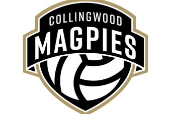
A soccer ball?
I believe that's the logo for their netball side.
.png")


Worst logo I've seen is the one we had during the Neeld years.Its sh*t, got magpies in the name plate and not a magpie in sight. Even we aren't that dumb.

