Design a Jumper Competition: 17th Team - Gold Coast **See Now Version 2**

Remove this Banner Ad

Status
Not open for further replies.
Re: Design a Jumper Competition: 17th Team - Gold Coast

GCFCLayoutgoldenlogodcopy.gif

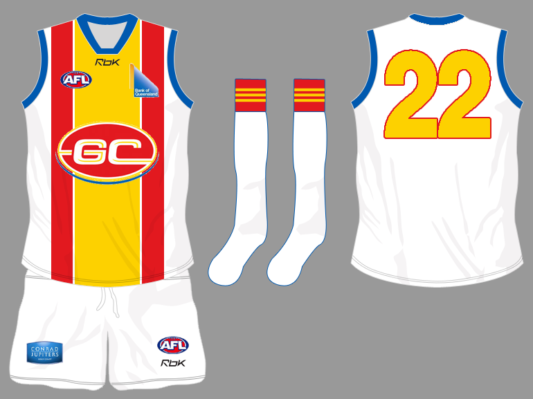
theres no big changes here. i added a thicker outline but that doesn't really matter.

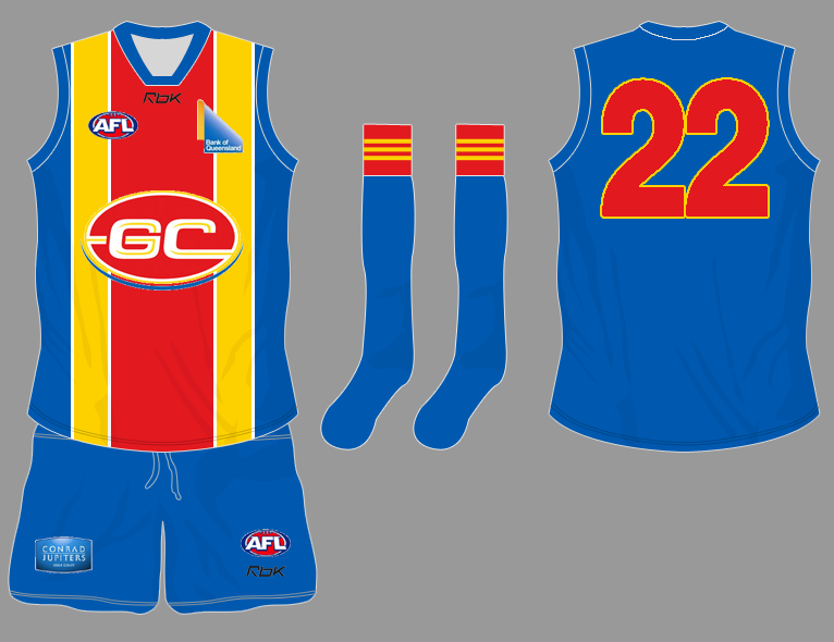
i've been thinking about shorts though. i had the idea of adding the wave-like bits on top and bottom of the shorts instead of just a coloured line but it didn't turn out like i hoped. so i took off the top ones and left the bottom ones, does it have potential?
 
Re: Design a Jumper Competition: 17th Team - Gold Coast

Imho, i dont like the GC ball logo so prominent on any guernsey. i know it's a cornerstone on your great design, and as far as designs go, yours is great, but if it were up to me (which it isnt) id have no GC ball logo. Just as a tiny badge on the left breast.

as for colors....gold/black/white would be a good unique brand. and stand out from not only brisbane but also crows. again, seems the club is hell-bent on the colors it has on the website and the mascot. the match against Southport is happening tonight, so we'll soon find out what they wore as a clue to the future, maybe.

if they kept their current color scheme, GloryandFames is pretty good. Same with aneale's surfboard watermark one (both leaving out the blue).
 

Log in to remove this ad.

Re: Design a Jumper Competition: 17th Team - Gold Coast

Lifesavers, Lifeguards, would be too much, cheesy too.
Savers would be better for being shortened, but still cheesy.
I dunno if that whole concept is the right brand imo.
But some IPL/Arena name should definitely be avoided at all costs.

agreed the flag is symbolic and using that in the design is enough. Doesn't need the name after them.
 
Re: Design a Jumper Competition: 17th Team - Gold Coast

yeah, i'll leave that one to rest. maybe i should move onto western sydney designs seeing as gold coast may be already out playing in their decided jumper.
 
Re: Design a Jumper Competition: 17th Team - Gold Coast

Dunno, I would think they'll run out in training guernsey style, otherwise you would have hoped for an announcement. Probably yellow top with big GC logo on it.
 
Re: Design a Jumper Competition: 17th Team - Gold Coast

Dunno, I would think they'll run out in training guernsey style, otherwise you would have hoped for an announcement. Probably yellow top with big GC logo on it.

maybe, the game hasn't really been mentioned anywhere but here, they're being very secretive.
 
Re: Design a Jumper Competition: 17th Team - Gold Coast

Here's the jumper.
GCVSHARKS_NEWS-WIDE_-344PX_EE259113_3801.JPG


FWIW, I prefer the predominantly blue design with the red, yellow and white vertical stripes. It makes more sense geographically and in terms of establishing an identity Coast people recognise. Sorry gold black white brigade.
 
Re: Design a Jumper Competition: 17th Team - Gold Coast

These are seriously the best choices for the strip. They regionalise the team. The blue is needed to market to those south of the Tweed. My only recommendation would be that it should be light blue, like the NSW State of Origin rugby league jumper. That would be a logical way to keep the strip and avoid a clash.

With the exception of gold, I don't understand how the black gold and white strip corresponds with Gold Coast life.
gcfc_a10.png


gcfc_a11.png
 

(Log in to remove this ad.)

Re: Design a Jumper Competition: 17th Team - Gold Coast

Better than resembling the Lions, and being identical to the Blaze and Titans. Who have the exact same colors and uniform designs as well (light blue with yellow side panels).

Also, gold isnt yellow. Meant to look duller/darker (just did a real quick edit).

The guernsey I'm in favour of wouldn't look exactly like the Blaze and Titans' at all. It has a dirty great red stripe down the guts. I'm wondering if you live on the coast or have been there for any extended period of time. A lot of people south of Goldie, I'd even go as far south as Byron, feel a clser affinity with life on the Goldie than they do life, for instance, in Sydney. This is our market. Nothing has been clarified re: the choice of black, gold and white then. It makes no sense to me.

As for resembling the Lions, with the change from the current bright blue to a light blue, the only like colours would then be yellow. And even if people were so pedantic as to cry clash, the clash strip would fix that problem anyway.
 
Re: Design a Jumper Competition: 17th Team - Gold Coast

I lived on the GC back around 2003/4.

GC bulletin's logo is gold/black/white.

In a sporting market, it pays to have a unique brand/colors/look. Currently, titans/blaze are exactly the same, and if the GC17 is about being "exciting and different" then yellow and red predominantly with a bunch of light blue trim, is just the same kind of thing again.

Remember, just my opinion, and im not dissing opponents of my thinking/ideas.
 
Re: Design a Jumper Competition: 17th Team - Gold Coast

As Arden described in the game thread, the guernsey is very fluro yellow like a roadworkers vest, like Parramatta Eels' jersey looks. In itself, one could say that's too Richmond clash-like being so bright yellow.

The look im trying to get is a dull dark (but shiny) gold, just before it starts looking vomit-green. Here's a kind of comparison between the two to highlight the difference in brightness, that the end result should mean the overall look from the stands is of a dark guernsey.

comparison-1.jpg
 
Re: Design a Jumper Competition: 17th Team - Gold Coast

I lived in the area for about 17 years. Believe me, there are many many people south of the Tweed who would rather their village was part of Queensland because they feel isolated from the rest of NSW. In marketing terms, to grow the club and to grow the game, a light blue as part of the strip is imperitive. Titans realise this, as do Blaze. They've obviously worked for unity of purpose - to help establish an identity nationally for the Gold Coast, and to dispense with notions of it as a place with a transient population.

As for the strips being the 'same', here is the Titans...
lg_titans08%20players%20jersey%20--%20home.jpg


...and here is the Blaze
2008+2009+NBL+Portraits+Gold+Coast+Blaze+-6PyoJZzcBzl.jpg


...and not a red stripe in sight. In fact, the red stripe on the front of the guernsey I favour, I think, makes that guernsey. It's bold and dominating, and reminiscent of where we come from.

Go Coast!
 
Re: Design a Jumper Competition: 17th Team - Gold Coast

In marketing terms, GC17 shouldn't try to copy other sports code colors from the same region. I know some regions do this. But if you look around the world, you have more teams from different sports in the same city emphasizing the differences. Chicago Bulls red/black. Chicago Bears blue/orange. Boston Celtics green/black. NE Patriots blue/red. Etc, etc.

And in market saturation, merchandise terms, having a unique stand-out supporter gear jersey/top is a staple of successfully increasing not only the team's sales, but also the code. New York Yankees has a brand product that stands out so much from other NY sports gear. Canberra Raiders, who use the lime green purely for that reason tho the region colors are blue/orange. When you look thru Canberra stores and see Brumbies jerseys and Raiders jersey, so different, it emphasizes the code more. Walking around the streets etc.

So people walking around the GC wearing very similar predominant light blue tops (blaze/titans/GC17) would not make the GC17/AFL stand out more, which is what the club and the AFL would want.

Again....just my opinion, and you're welcome to completely refute it, and stand by what you've said. Just offering some debate on that particular topic that GC17 should try to emulate the brand/look of other GC teams.
 
Re: Design a Jumper Competition: 17th Team - Gold Coast

i think the colours gc picked do a good job at representing the city but the sad thing is that those colours have been taken by adelaide and fitzroy(who are now going to be GC's rivals) and if they took the red out of it, you'd have west coast and if you took the yellow out you'd have bulldogs. this is why people are saying they should just be red and yellow which might work best but i don't mind the gold/black idea that people seem to be fans of which works well by standing out.
either way, you can't have the same colours as your rivals
 
Re: Design a Jumper Competition: 17th Team - Gold Coast

...But you've completely ignored the dominance of the wide red stripe down the middle of the guernsey.

As for marketing, GCFC are right to try to establish a deeper connection with Gold Coast residents. The reference the guernsey gives to surf lifesaving and therefore our perceptions of 'courage' is intelligent. Blue representing the surf and yellow the sand is also intelligent, and if that blue is lightened to appeal to NSW residents as well, we'll definitely have a winner. This is why it's a Coast jumper. It reflects life on the Coast.

The examples you mention in your post, far from being global, are simply American for a start. I don't know why the Yankees or the Patriots have the colours they do, but GCFC is approaching their marketing in a similar way by linking the identity of the team to the region. The Detroit Pistons are another example. The Boston Celtics made great choices with their strip and marketing and are now one of the most recognised sport brands in the world. Others, like the Chicago Bulls, seem to be straight up capitalist - here's a name and some colours. Sell it. Who in Australia had heard of the Chicago Bulls before Jordan.

Again, there is no real meaningful link with the strip you suggest and the identity of Coast fans with the place they represent. I hardly think having the same colours as the Gold Coast Bulletin's banner is a meaningful connection.

Don't get me wrong GG, I'm not taking a shot at you personally, I just don't think the black gold and white idea is very well considered.
 
Re: Design a Jumper Competition: 17th Team - Gold Coast

i think the colours gc picked do a good job at representing the city but the sad thing is that those colours have been taken by adelaide and fitzroy(who are now going to be GC's rivals) and if they took the red out of it, you'd have west coast and if you took the yellow out you'd have bulldogs.

This is why I think the dominant colours should be the red and yellow on the front of the guernsey, with light blue panels on the sides and back :rolleyes:
 
Re: Design a Jumper Competition: 17th Team - Gold Coast

...But you've completely ignored the dominance of the wide red stripe down the middle of the guernsey.

Not ignored it, but looking at it from a purview sense. Walking thru a store in Broadbeach and seeing a sea of light blue tops, supporter tees, caps, etc. The AFL brand doesnt stand out from the others.

The reference the guernsey gives to surf lifesaving and therefore our perceptions of 'courage' is intelligent. Blue representing the surf and yellow the sand is also intelligent

GloryandFame's guernsey imo is a great one....but it's a predominant red (not maroon either) and yellow top. Lifesaving cap. No blue at all. That would be better at least, as it would stand out in stores and on the streets. People would say/know, "ah that's a GC17 top, that's an AFL brand, should buy me one of those, they look spiff". The blue in that cap design would not be needed to signify 'sea'. The lifesaving cap in itself would sufficiently highlight that already.

The Boston Celtics made great choices with their strip and marketing and are now one of the most recognised sport brands in the world.

That's what Im emphasizing as good marketing/merchandise/brand strategy. It becomes globally recognized too. And the New England region's regional colors are red/white/blue, as the Pats have embraced. Yet, as you observe, the Boston Celtics have a globally identified brand. The GC itself has a very international exposure already. So having a very unique brand/color (whatever it is) would only be good for GC17 itself. It also has relation to the nickname you use. Boston Celtics therefore would look to emphasize green. NE Patriots would look to emphasize red/blue. So GC17's nickname would have a good say in the colors. GC Savers....red/yellow. GC Gladiators....gold/red. GC Dolphins....orange/teal. It seems to me GC17 erred in choosing the colors before choosing the nickname. Or, havent thought thru what nickname to use for those colors. Imo, yellow/red = Savers. Red/Gold = Gladiators. Either would better than having any blue whatsoever in the team brand.

Again, there is no real meaningful link with the strip you suggest and the identity of Coast fans with the place they represent. I hardly think having the same colours as the Gold Coast Bulletin's banner is a meaningful connection.

Not saying it's meaningful, but just that it's not absurd. Gold itself and Gold Coast is a very strong pointer there. It's in the very name! You cant ask for more brand advantage than that! The black is just a proposed color that would suit gold. But red and gold would work, in gloryandfame's design, made gold tho than yellow. Golden sands dont have to = bright yellow.

Don't get me wrong GG, I'm not taking a shot at you personally, I just don't think the black gold and white idea is very well considered.

Never worry about this. I have the thickest skin in the known universe, and i love to debate, and also i know all you guys from the Bomber board as well, and as I stated before, Essendon fans are often the coolest and most down to earth and amicable bunch around. So it's all good. Just bring the heat to the kitchen in debates/arguments and I'll always respect that.
 
Re: Design a Jumper Competition: 17th Team - Gold Coast

This is why I think the dominant colours should be the red and yellow on the front of the guernsey, with light blue panels on the sides and back :rolleyes:

to me thats still a bit too "fitzroy" but i tried it for you
GCFC53.gif

it's not exactly what you asked for and i can get rid of the gradients but i hope it captured what you wanted
 
Status
Not open for further replies.

Remove this Banner Ad

Back
Top