Spanna_
The secret ingredient is crime
That's not the point and you know it.What argument?
None of what I said could be construed as a dig or anything unless you're doing some extreme mental gymnastics.
Follow along with the video below to see how to install our site as a web app on your home screen.
Note: This feature may not be available in some browsers.
That's not the point and you know it.What argument?
None of what I said could be construed as a dig or anything unless you're doing some extreme mental gymnastics.
I really don't. Could you spell out what I did that was inciteful because I was putting out an earnest, rational view on the Crows branding particularly in relation to their geographical rival.That's not the point and you know it.
Fair enough, I was just alluding to that two page s**t fight a while back between Port fans and Adelaide fans on there team's branding and over which one represented SA.I really don't. Could you spell out what I did that was inciteful because I was putting out an earnest, rational view on the Crows branding particularly in relation to their geographical rival.
I really don't. Could you spell out what I did that was inciteful because I was putting out an earnest, rational view on the Crows branding particularly in relation to their geographical rival.
I never said Adelaide don't have history. I was responding to Murraj who said Adelaide should represent South Australian football history, which to me doesn't make all that much sense since Port's hundred plus years of being the winningest team in South Australia sort of makes that idea redundant.A Port supporter essentially saying "Port have history, Crows don't" is always going to sound inciteful, no matter how you spin it.

I never said Adelaide don't have history. I was responding to Murraj who said Adelaide should represent South Australian football history, which to me doesn't make all that much sense since Port's hundred plus years of being the winningest team in South Australia sort of makes that idea redundant.
Adelaide should just be its own thing instead of being the quasi SANFL representative in the AFL. It's not 1990 anymore. The Crows brand is undeniably wishy-washy, as was Port's post premiership, pre One Club.
Swear BF is absurdly sensitive people don't actually read the content of a post and just assume a Port supporter commenting on something Adelaide is malicious.
Why? The other SA team is a genuine embodiment of South Australian football history.
I love Sydney's logo man. Underrated.The current logo is undeniably dated, and a poor logo to boot - you can still reflect your history without pretending it's 1974. Sydney's logo is actually a really good example of that:

Ps let's all just save the Crows/Port history back and forth for another thread.
Looks fantastic, you should trace that baby into Photoshop or illustrator
Sydney should never change their logo. It's perfect.The current logo is undeniably dated, and a poor logo to boot - you can still reflect your history without pretending it's 1974. Sydney's logo is actually a really good example of that:
Ps let's all just save the Crows/Port history back and forth for another thread.

Love itHey guys, I realise that the thread's gone a lil cold here, but was just mucking around the other day and put this together. Tried to keep some traditional elements and create an image that could be used formally as well as on merch etc.
View attachment 358980
love the design, but the red looks a bit brownish/maroony to meHey guys, I realise that the thread's gone a lil cold here, but was just mucking around the other day and put this together. Tried to keep some traditional elements and create an image that could be used formally as well as on merch etc.
View attachment 358980
Fair call...love the design, but the red looks a bit brownish/maroony to me
hoops in the background?Hey guys, I realise that the thread's gone a lil cold here, but was just mucking around the other day and put this together. Tried to keep some traditional elements and create an image that could be used formally as well as on merch etc.
View attachment 358980


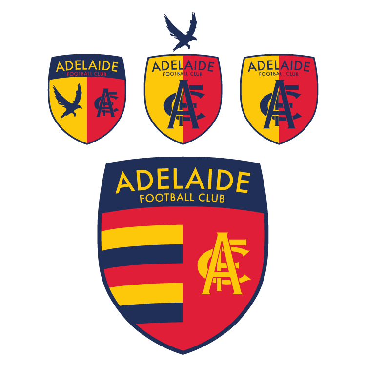
Like the big shield down the bottom. How would you incorporate this into the jumper?Originally I only planned to create a vector version of the monogram today (which I am happy to give out if anyone wants) but of course I wanted to use it on something straight away, so I put together some european style shields, in a modern style of course. I tried to keep it to simple, symbolic elements; the monogram, the WFAO crow and the hoops. Taking inspiration from the Austin Crows logo which has a half and half shield like this at the back.
In the end I wasn't to sure about including the WFAO crow on the shield itself, I like it above the shield but I think this messes with the proportions. but overall I think that the hooped one looks best, I can imagine it looking great on the gold jacket.
This isn't my final design, more just something to get an actual design in this thread.
The crows marketing has been unquestionably garbage since the 90s, although it's shown signs of improvement with the we fly as one campaign.
This is wrong.You're about a year late with that statement. The Crows have absolutely smashed Port off the field over the last year or so.
Our marketing has improved monumentally whilst Port's team has completely jumped the shark and is a laughing stock amongst many South Australians now.
On the topic of our logo, yes it could be improved but most of the ideas here are just as poor as the current one.
Hmmm not really.This is wrong.
You've improved to competent but we've gone from strength to strength.
Really.Hmmm not really.
This is wrong.
You've improved to competent but we've gone from strength to strength.
That would almost entirely be put down to the on fieldYou surely can't have said that with a straight face? Absolutely no sane person would argue that Port have improved off field from where they were in 2014. In the statewide and national consciousness the Crows have blown Port out of the water over the last year; no unbiased person would deny that.
That would almost entirely be put down to the on field