Sam S Santillo
Draftee
- Apr 23, 2016
- 2
- 0
- AFL Club
- Adelaide
Can you do all 50 states?
Follow along with the video below to see how to install our site as a web app on your home screen.
Note: This feature may not be available in some browsers.


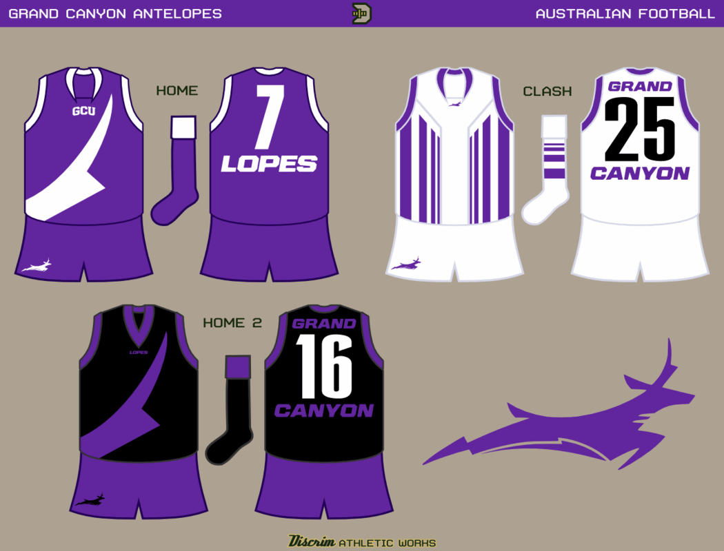
Grand Canyon in prison bars - taking over the world!As you can see, Photobucket's new policy hit me hard. I found new hosting, but a host of personal and PC issues have conspired to cause me to drift away for a while. Anyway, here's some newer stuff, finally. Out of Phoenix, Arizona, Grand Canyon U
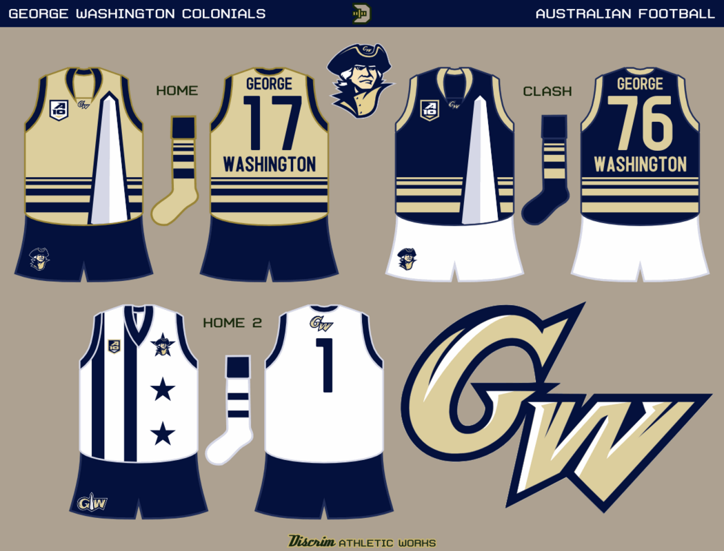
That damn Presidents' Day commercial...I wanna four score a deal with yoooooou...aww yeah...who's your founding father? Out of DC, the Colonials of George Washington
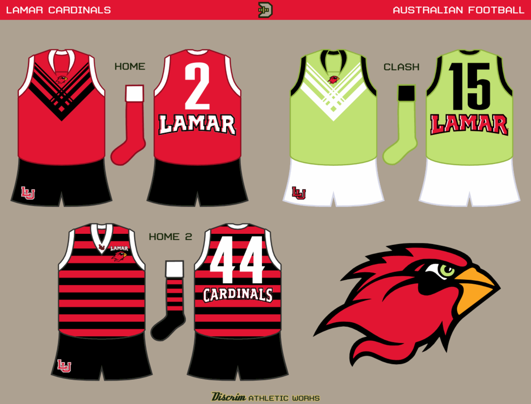
Lamar U out of Texas...bitch don't kill my vibe. Practically every college I know of whose team is the Cardinals(or its derivative, Redbirds) uses red with a hint of black. Which is largely why I made Lamar's clash jumper lime green.
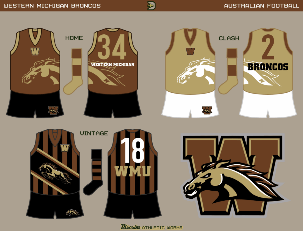
Lastly and most recently, Western Michigan
I put this post on my back doe.
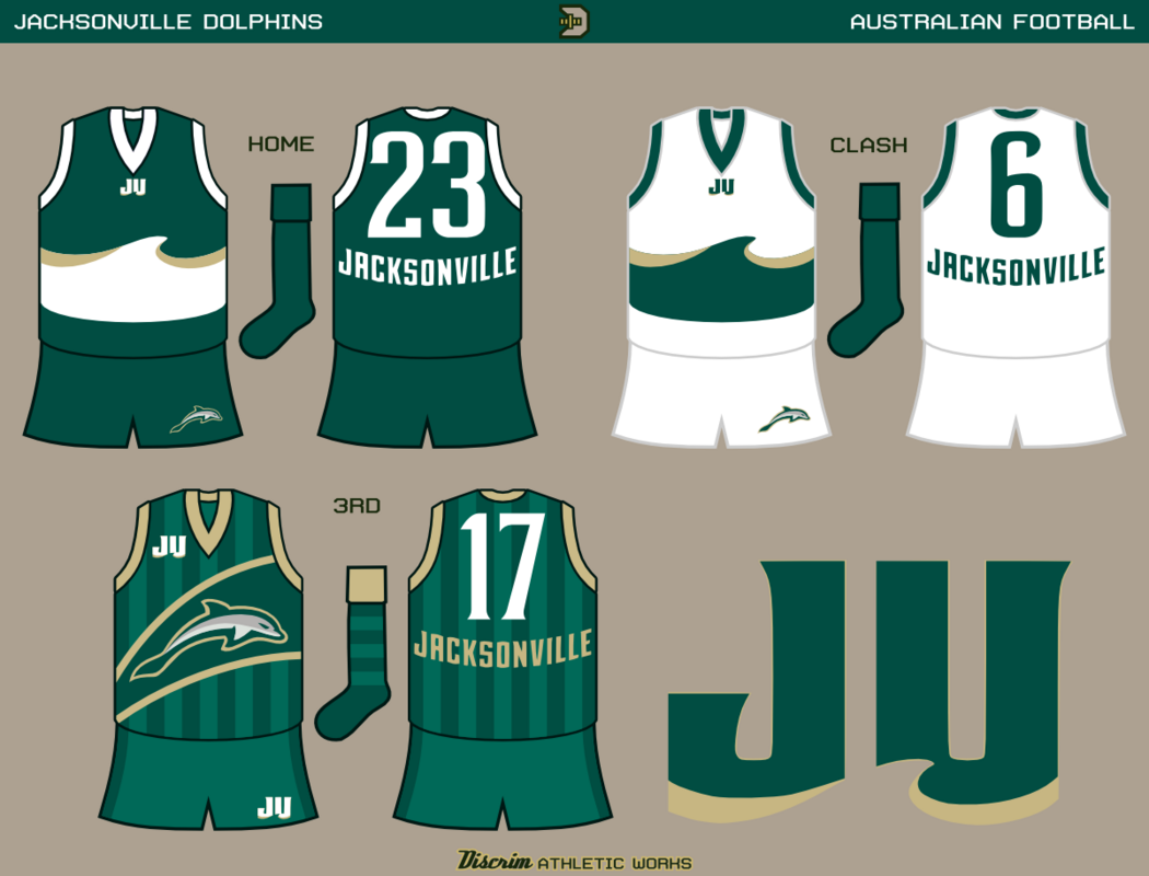

I dig the wave design, nice work!
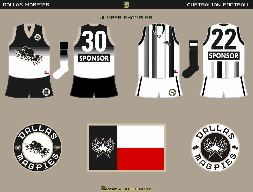
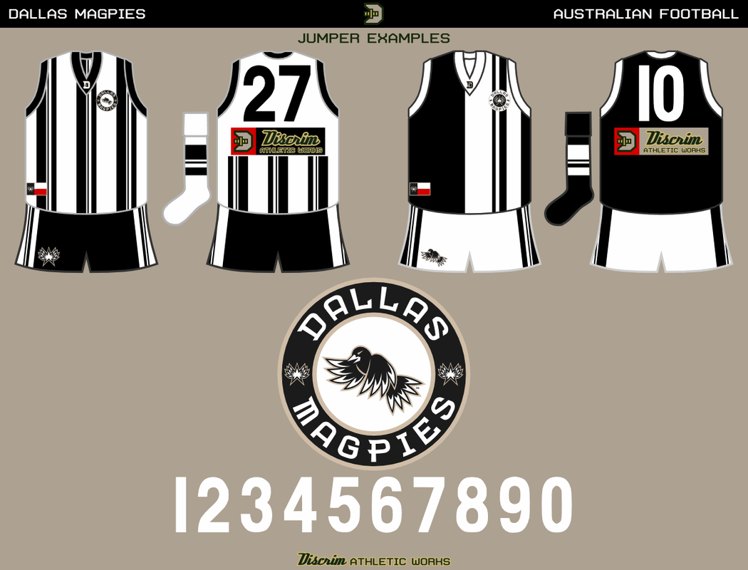
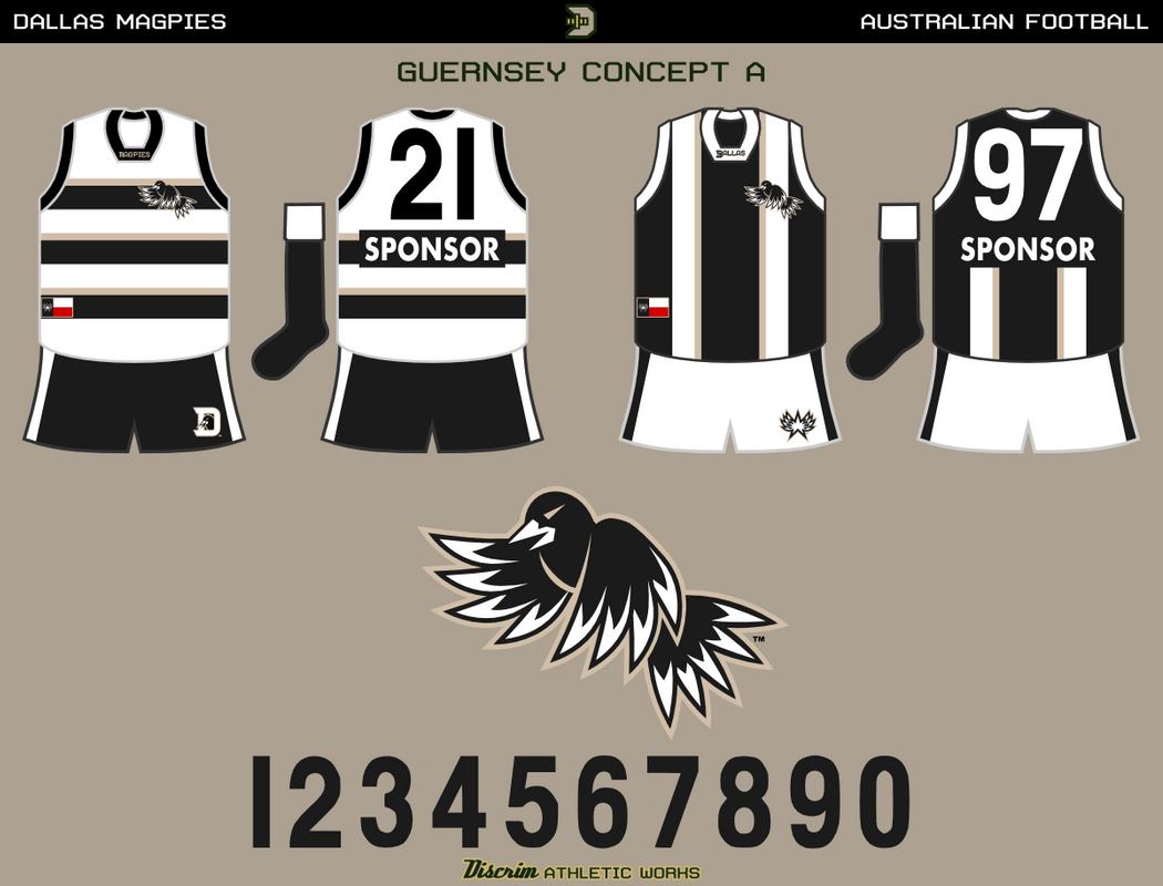
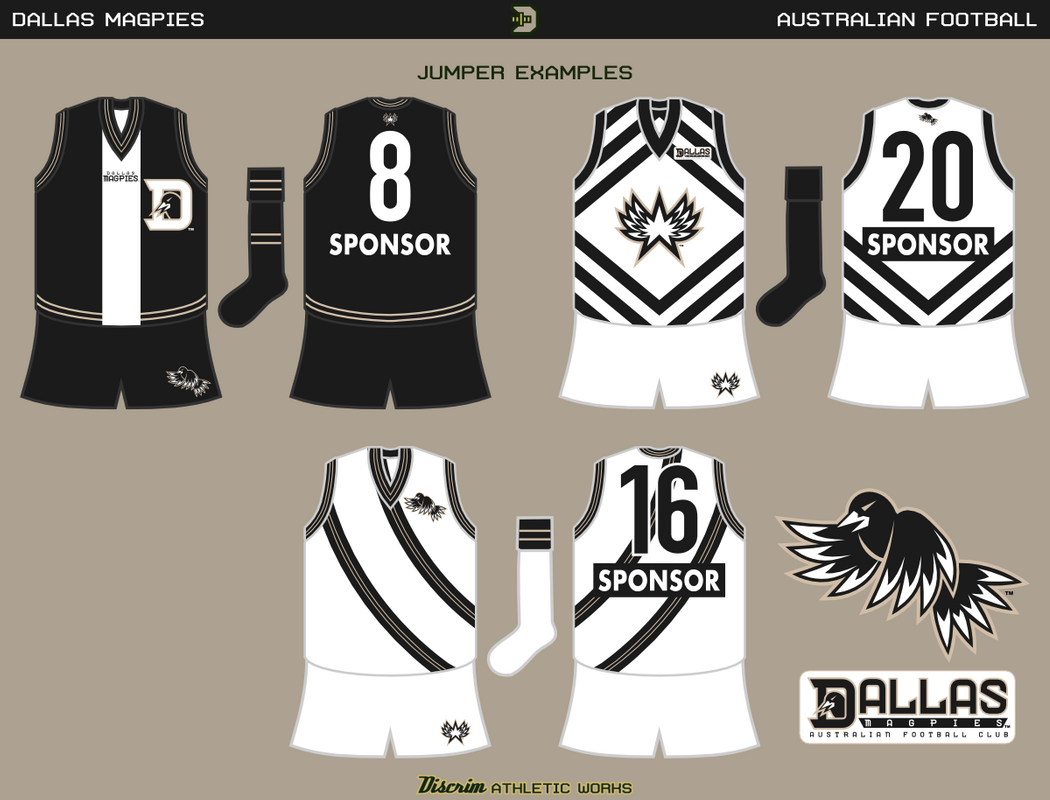
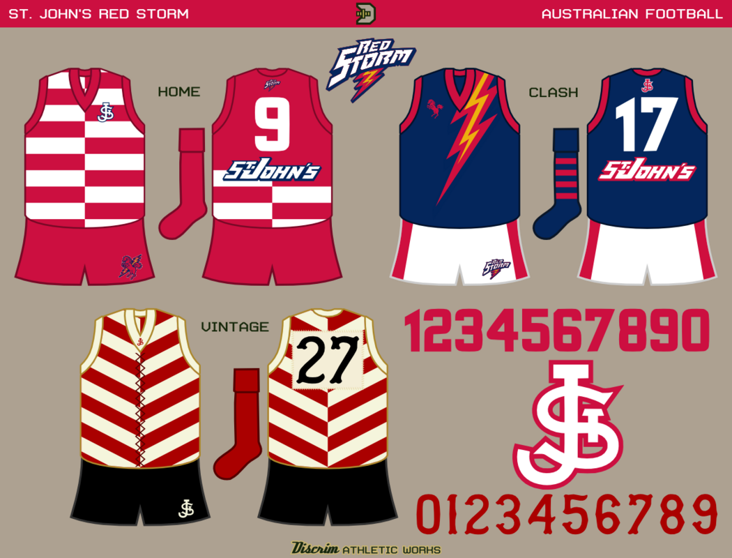
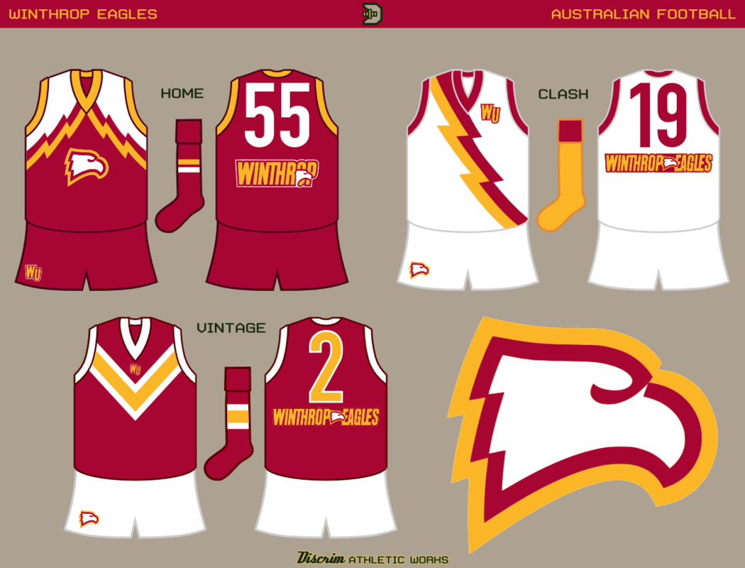
 ). I offered to instead do something of a refresh for em, mainly so it didn't look like it was meant for Port (meaning getting rid of all the lightning bolts). True, it seems the effort went unused, given they recently changed their mascot and colors, but I did get paid, so I figure you guys might appreciate checking out a few of the jumper ideas I sent them.