Discussion Fitzroy Lion Logo Discussion

Remove this Banner Ad

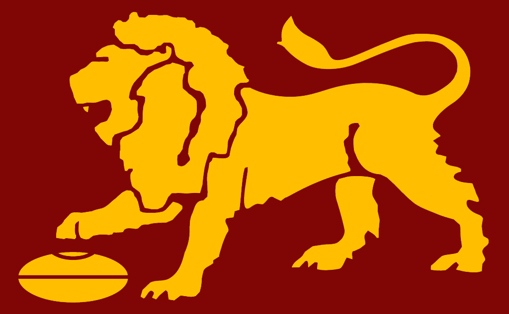
What meaning? The club never won a premiership as The Lions and had 10-20 odd years of absolute s**t to go through before they were finally put out of their misery with the merger. The ONLY positive connotation that the Lion logo holds is the threepeat of Brisbane.

By that logic I should have had no attachment to the Swans' red & white colours or name until 2005 seeing as the club hadn't won a premiership in them during my lifetime, and had been through all manner of misery.

Meaning isn't bestowed upon colours, a name or a logo by success. If I was a Fitzroy supporter my pride in that logo would be derived from its survival against all the odds, I suspect.
 
If youre talking about the top one in this quote...

... then that is the Costa line, bar the shading.

The "Costa design" I was referring to is the one that has been posted numerous times. That design has always included the shading and the maroon outline, both of which are completely unnecessary.

As I said, of the other designs that have been posted, the one without shading (or the maroon outline) is the one I'd be most comfortable with. (Yes I know the outline is the same as the Costa one).
 

Log in to remove this ad.

What Fitzroy people accept as the Fitzroy Lion was originally the Scanlen's Footy Card Fitzroy Lion, and not the original Fitzroy Lion as adopted by the footy club in 1957.
The lion appeared on the club jumper from 1968.

Although the VFL's marketing adopted 6 Scanlen's logos as their own in 1976 when they formed the VFL Licensing Dept and associated merchandise, and Fitzroy were one of them, the club itself used their own logo right up until 1980 when it was merged into the sponsors logo.

http://www.footycards.com.au/images...L_Scanlens_88_Warwick_Irwin_Fitzroy_Lions.jpg
My trace of the original Fitzroy lion is :
Fitzroy%20Lion_zpspqhwu22h.jpg

This is what was embroidered onto club jumpers 1968-1979, and appeared on membership tickets in the same era.
1968 - 1980 - 22 years of this lion
1976 - 1996 - 20 years of the Scanlen's "Fitzroy Lion".

I'd be happy if Brisbane went back to something similar to this one.
 
Last edited:
What Fitzroy people accept as the Fitzroy Lion was originally the Scanlen's Footy Card Fitzroy Lion, and not the original Fitzroy Lion as adopted by the footy club in 1957.
The lion appeared on the club jumper from 1968.

From 1957 when Fitzroy originally adopted the Lions moniker, the Club originally used a Lion rampart as their logo. However many at Fitzroy thought it was too English and "toffy". In 1965 Fitzroy committeeman and former player George Coates asked the chief art designer at his company to come up with a new design. The art designer was asked to draw a lion with his paw on a football. This was the lion that appeared on the Fitzroy jumpers from 1968 onwards.

Fitzroy were certainly using what is essentially the current logo used by the Brisbane Lions at least as early as the mid 70s, as can be seen from the following images.

b78fdd04cf0f5ff642f7ac07b13b0ff7-tn.jpg


72033bd0e8544ee2cff2f32a4b4446e3-tn.jpg

s-l225.jpg
While still a Lion Statant, in heraldic terms, with four legs down, one on a football.
My point is that the lion used on the jumpers until 1980 is different from the Lion used on the 'official VFL' logo.
s-l225.jpg
 
Last edited:
For arguments sake can someone post an example of what a 'clean up' might look like next to the current lion?

I had a quick go at a clean up. If I had more time it would be executed better, but it shows what sort of change i'm proposing.

In GIF form for comparison's sake:

XT3nSkj.gif


And without the animation:
b8kmZmF.png
 
What Fitzroy people accept as the Fitzroy Lion was originally the Scanlen's Footy Card Fitzroy Lion, and not the original Fitzroy Lion as adopted by the footy club in 1957.
The lion appeared on the club jumper from 1968.

Although the VFL's marketing adopted 6 Scanlen's logos as their own in 1976 when they formed the VFL Licensing Dept and associated merchandise, and Fitzroy were one of them, the club itself used their own logo right up until 1980 when it was merged into the sponsors logo.

http://www.footycards.com.au/images...L_Scanlens_88_Warwick_Irwin_Fitzroy_Lions.jpg
My trace of the original Fitzroy lion is :
Fitzroy%20Lion_zpspqhwu22h.jpg

This is what was embroidered onto club jumpers 1968-1979, and appeared on membership tickets in the same era.
1968 - 1980 - 22 years of this lion
1976 - 1996 - 20 years of the Scanlen's "Fitzroy Lion".

I'd be happy if Brisbane went back to something similar to this one.

I reckon a cleaned up version of this Lion would be great. The aggressive face is much better than the current Lion.
 
I had a quick go at a clean up. If I had more time it would be executed better, but it shows what sort of change i'm proposing.

In GIF form for comparison's sake:

XT3nSkj.gif


And without the animation:
b8kmZmF.png
Awesome. Every line and shape from the current lion but far cleaner.
 
I had a quick go at a clean up. If I had more time it would be executed better, but it shows what sort of change i'm proposing.

In GIF form for comparison's sake:

XT3nSkj.gif


And without the animation:
b8kmZmF.png
Face looks munted but the rest is pretty good. I feel like the blow could be softened by adding an FFC monogram on the front of the left shoulder
 
Face looks munted but the rest is pretty good. I feel like the blow could be softened by adding an FFC monogram on the front of the left shoulder

Yeah that head does look a bit dozy. Hey El_Scorcho do you think you could give your redrawn Lion a face transplant with a spruced up version of the aggressive Lion that Mero posted above?

I reckon that combo would be spot on.
 

(Log in to remove this ad.)

It's absolutely what I would want to see El_Scorcho , and I have zero idea how Fitzroy faithful could honestly complain about that.
 
Noticed how they've all left now.
Yeah those people relaxing with their family! Psssssh.

The new idea is good, it's not offensive, but I just don't want it changed. I genuinely think the soft, rickety lines are charming in their own way. The lion might not be intimidating, but it is proud and staunch. It reminds me a lot of how I imagine Fitzroy were seen in their last few years... it's another small thing that adds up to their determined, up against it mentality, despite the lack of success. Crests tend to sum up a club's colours or name – they never sum up a club's character. This does.

And in defeat, we'll always try
 
This conversation is like the discussion you have with your mate when his sister is tryna get slain. Everyone wants it to happen but him, even though she's begging for it.
Why would we want our mate's sister to get murdered in a violent way?
 
The update looks fine, and most fans looking at it dispassionately would say it looks better. From the point of view of this board it's a winner.

It should be implemented though because the club is about more than simply the design. Brisbane has a more complicated history than most clubs, and the PPL fiasco has left fans suspicious. No change should be made until the design is strongly reestablished.

Non-Brisbane people casually dismissing the club's history have no more credibility than someone saying PAFC should let the prison bars go and move on.
 
Non-Brisbane people casually dismissing the club's history have no more credibility than someone saying PAFC should let the prison bars go and move on.

False analogy is false.

Port mothballing the prison bars forever would be akin to Brisbane not using the Fitzroy Lion at all. No one is saying this should happen. All that's being suggested is a minor tidy up, which if you want to relate it back to the prison bars, would be say the removal of the faux laces that were printed on the guernsey until recently.

No one is disrespecting either Brisbane or Fitzroy's history by adding a bit of polish.
Brisbane just finished a failed attempt at dropping the Fitzroy lion, and my point is that this should be kept in mind during this discussion. All the casual "not fit for the current age, Fitzroy fans are living in the past and must move on" comments ignore the context.

It'd be easy to argue that PAFC should use much more teal to remove clashes with half the league, but that would be an ignorant comment that ignores the complexities of the club's history. The analogy is not perfect with Fitzroy, but not a million miles off.

I do think if it was not for the historical complications the flat rendering of teh Costa lion would be an improvement though.
 

Remove this Banner Ad

Back
Top