

The Benfica one is also nice, but something about the Roma is very aesthetically pleasing.
Navigation
Install the app
How to install the app on iOS
Follow along with the video below to see how to install our site as a web app on your home screen.
Note: This feature may not be available in some browsers.
More options
-


LIVE: Richmond v Melbourne - 7:25PM Wed
Squiggle tips Demons at 77% chance -- What's your tip? -- Team line-ups »
You are using an out of date browser. It may not display this or other websites correctly.
You should upgrade or use an alternative browser.
You should upgrade or use an alternative browser.
Football Kits
- Thread starter pantskyle
- Start date
- Tagged users None
- Mar 30, 2013
- 13,372
- 32,892
- AFL Club
- Western Bulldogs
- Other Teams
- Tottenham Hotspur
Benfica kit shits all over that Roma kit. Adidas is class
I'm aware it's not a particularly popular opinion, but I reckon even Puma has overtaken Nike in recent years
This "vapor" kit garbage is utter dross
NUFC Tiger
Brownlow Medallist
- Apr 25, 2011
- 18,678
- 16,987
- AFL Club
- Richmond
- Other Teams
- NUFC, Socceroos, FGR, NewcastleJets
You should make the blue star your official badge
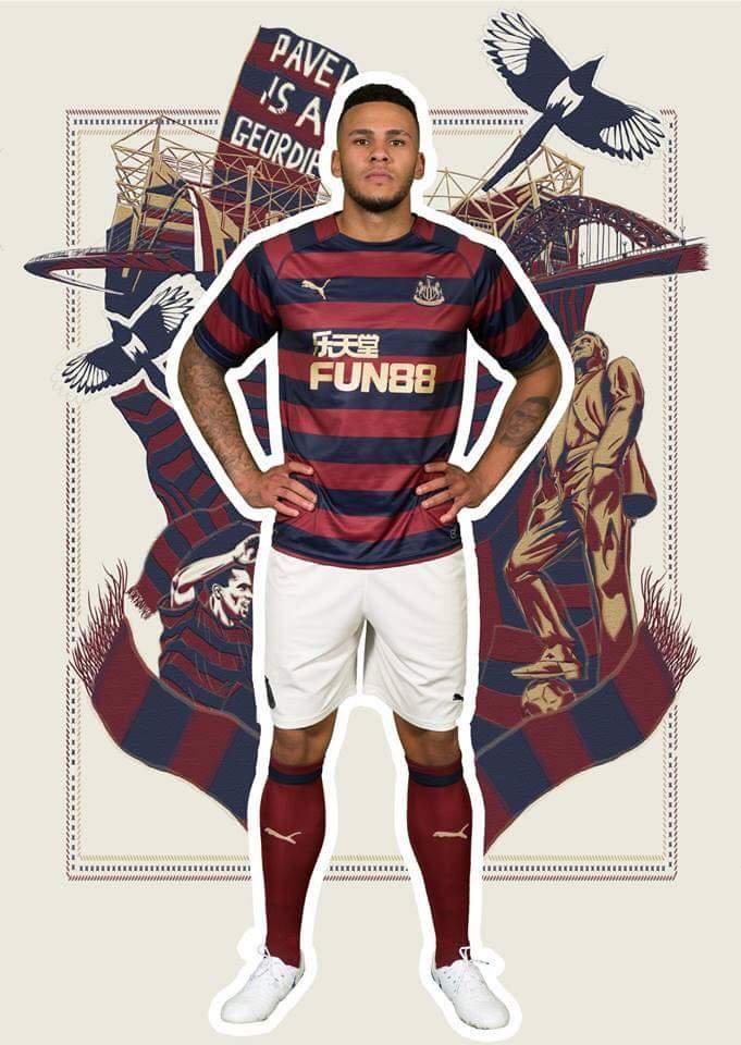
Definitely looks better than the Fun 88 logo (though I do like the gold print instead of the bright fluro blue used on the home kit - very Wonga-esque).


- Mar 30, 2013
- 13,372
- 32,892
- AFL Club
- Western Bulldogs
- Other Teams
- Tottenham Hotspur
It's the kind of logo that strikes fear into your opponents right from the kick-offDefinitely looks better than the Fun 88 logo (though I do like the gold print instead of the bright fluro blue used on the home kit - very Wonga-esque).
View attachment 520867
NUFC Tiger
Brownlow Medallist
- Apr 25, 2011
- 18,678
- 16,987
- AFL Club
- Richmond
- Other Teams
- NUFC, Socceroos, FGR, NewcastleJets
Officially revealed. Definite buy for me. 


Sent from my SM-G950F using Tapatalk


Sent from my SM-G950F using Tapatalk
- Moderator
- #606
Very nice.
Art Vandelay_
TheBrownDog
- Oct 28, 2012
- 104,468
- 142,370
- AFL Club
- Geelong
- Other Teams
- Bushrangers - Tottenham
Quite like it.
SM
Bigfooty Legend
How so? What is it about the shade that you don’t think works?
Just looks a bit tacky I think.
- Aug 20, 2010
- 4,860
- 5,377
- AFL Club
- Collingwood

- Other Teams
- FC Bayern, Chelsea FC, Raiders
- Banned
- #610
Much better than last seasons
I like the home shirt better than last seasons messy design.
Green away top is something we wore back in the late 70's early 80's and being revived.
Much better than last seasons
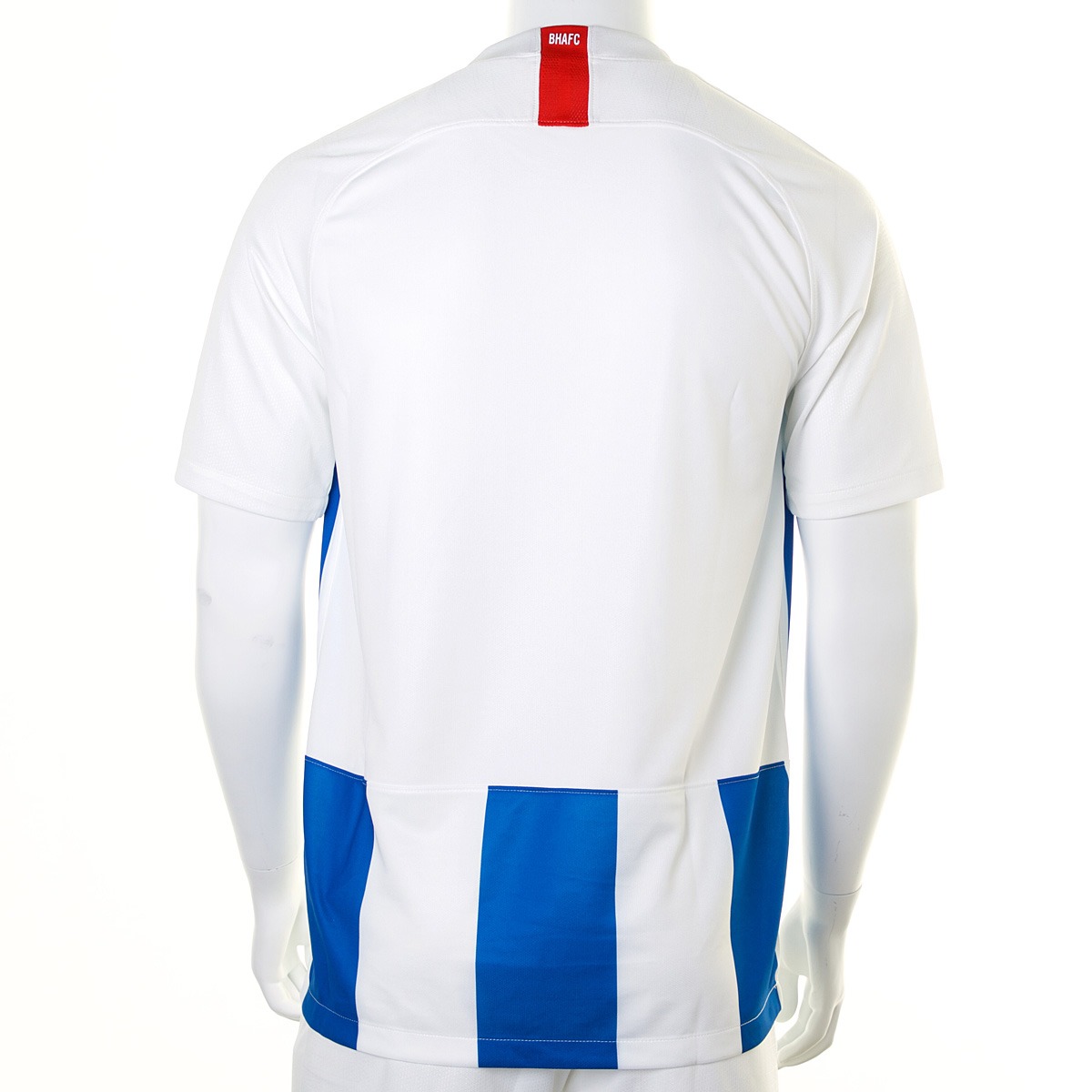
From the front, the back of the home kit is a bit gash. They can't seem to get it right with the stripes.
The away kit actually is quite nice in better photos.
I think Nike just make a lot of s**t kits.
Wish we'd stayed with Errea.
Last edited:
- Aug 20, 2010
- 4,860
- 5,377
- AFL Club
- Collingwood
- Other Teams
- FC Bayern, Chelsea FC, Raiders
- Banned
- #612
From the front, the back of the home kit is a bit gash. They can't see to get it right with the stripes.
The away kit actually is quite nice in better photos.
I think Nike just make a lot of s**t kits.
Wish we'd stayed with Errea.
Nike do make alot of s**t kits lol Adidas imo is still the best
- Sep 7, 2008
- 54,029
- 36,945
- AFL Club
- Carlton
- Other Teams
- Philadelphia Eagles
That away kit is very nice. Very clean and love the colour.
That away kit is very nice. Very clean and love the colour.
Certainly the pick of the two.
peternorth
Moderator
- May 6, 2005
- 127,425
- 75,552
- AFL Club
- Richmond
- Moderator
- #616
A bit s**t.
i suspect with number and name it will look better
i suspect with number and name it will look better
Too much white. Though that mock up is possibly using smaller number/lettering than will be used.
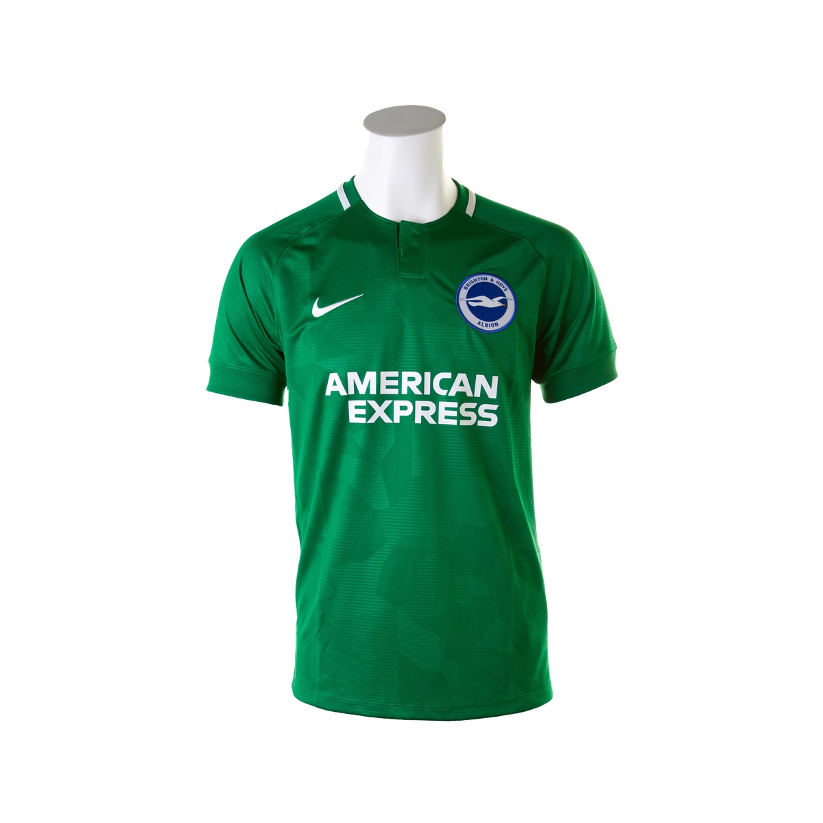
Should be a goalkeeping kit. Green is horrible.Certainly the pick of the two.
Should be a goalkeeping kit. Green is horrible.
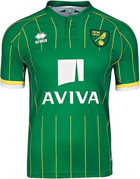
It's a throw back colour to our home kits as Brighton United and Brighton Rangers in the 1898-1900 period.
Tony Bloom is a fan of club history.
- Sep 7, 2008
- 54,029
- 36,945
- AFL Club
- Carlton
- Other Teams
- Philadelphia Eagles
Disagree. A good green kit can look magnificent.Should be a goalkeeping kit. Green is horrible.
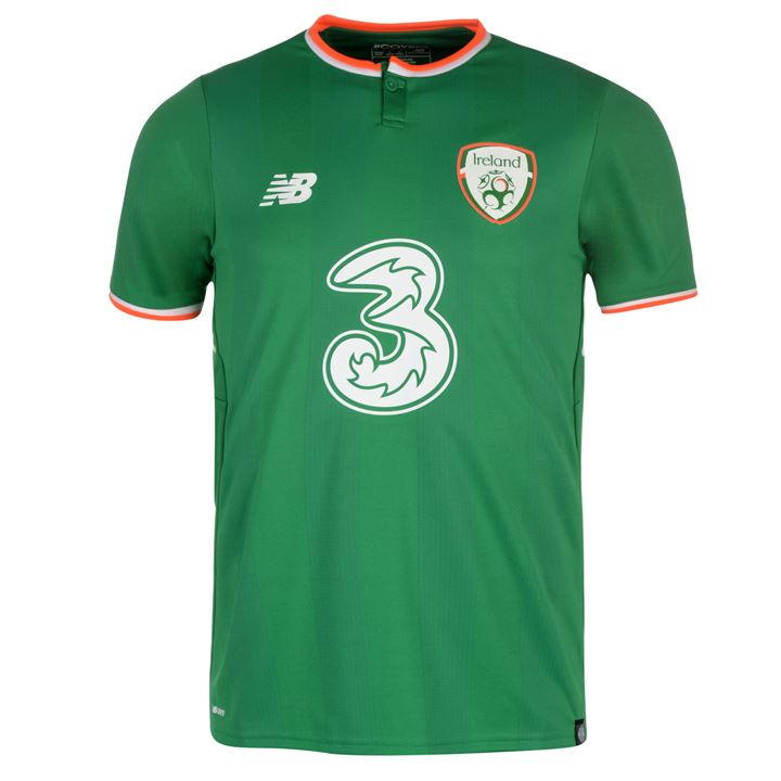
Take this for example.
I completely disagree lol. That looks ******* horrific lol.Disagree. A good green kit can look magnificent.
Take this for example.
- Sep 7, 2008
- 54,029
- 36,945
- AFL Club
- Carlton
- Other Teams
- Philadelphia Eagles
Fair enough. Might be an unpopular opinion of yours haha.I completely disagree lol. That looks ******* horrific lol.
peternorth
Moderator
- May 6, 2005
- 127,425
- 75,552
- AFL Club
- Richmond
- Moderator
- #623
Looks like we got a disagreement!
peternorth
Moderator
- May 6, 2005
- 127,425
- 75,552
- AFL Club
- Richmond
- Moderator
- #624
I think green looks grouse on keepers. It can look good on outfield players
In fact Im wearing green right now. lol
In fact Im wearing green right now. lol
Yeah green keeper kits are good.
Similar threads
- Replies
- 4
- Views
- 307
- Replies
- 0
- Views
- 1K
- Replies
- 69
- Views
- 4K
- Replies
- 7K
- Views
- 114K
- Replies
- 123
- Views
- 5K
- Replies
- 5
- Views
- 609
