Gold Coast SUNS guernsey discussion

Remove this Banner Ad

Log in to remove this ad.

Random thought, we have brought in 2 players this trade period, but neither has appeared in “Suns colors” on socials, which is normal practice for all clubs… could this be an indication of a new guernsey to be released.? Or wishful thinking ahah


On iPhone using BigFooty.com mobile app

Would be nice

Ben long is currently in Texas

And

Tom Berry is in Bali
 

(Log in to remove this ad.)

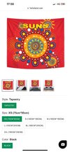
Not sure if I’m alone in this thought but I’d love to see us use an indigenous style guernsey year round.

Indigenous artwork/patterns similar to our usual indigenous jumper with a Gold Coast skyline on to the chest similar to the opera house on Sydneys regular jumper would be a great way to further establish our connection to the NT and FNQ but it would be unique and aesthetically appealing as well.

Whatever it is though, I’ll be happy as long as the logo disappears
 
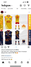
7AFL just posted some designs done by an artist for all clubs for an ‘Adidas reverse retro throwback’ look. It’s on their instagram.

It’s not too dissimilar from our original design, just changing of colours, so it’s hardly inspirational. It’s just interesting seeing how other people have their take on mixing it up.

But yes, something needs to be done.

Also, I do like our Indigenous round kit most of the time.
 

Attachments

  • 1FA94140-8108-4B0B-BA66-CEF582F33717.png
    1FA94140-8108-4B0B-BA66-CEF582F33717.png
    535.3 KB · Views: 123
7AFL just posted some designs done by an artist for all clubs for an ‘Adidas reverse retro throwback’ look. It’s on their instagram.

It’s not too dissimilar from our original design, just changing of colours, so it’s hardly inspirational. It’s just interesting seeing how other people have their take on mixing it up.

But yes, something needs to be done.

Also, I do like our Indigenous round kit most of the time.
I quite like the design, but the logo needs to be updated ASAP.

On SM-G996B using BigFooty.com mobile app
 
7AFL just posted some designs done by an artist for all clubs for an ‘Adidas reverse retro throwback’ look. It’s on their instagram.

It’s not too dissimilar from our original design, just changing of colours, so it’s hardly inspirational. It’s just interesting seeing how other people have their take on mixing it up.

But yes, something needs to be done.

Also, I do like our Indigenous round kit most of the time.
The artist is Zoops, his portfolio is on the graphic design board
 
Not sure if I’m alone in this thought but I’d love to see us use an indigenous style guernsey year round.

Indigenous artwork/patterns similar to our usual indigenous jumper with a Gold Coast skyline on to the chest similar to the opera house on Sydneys regular jumper would be a great way to further establish our connection to the NT and FNQ but it would be unique and aesthetically appealing as well.

Whatever it is though, I’ll be happy as long as the logo disappears

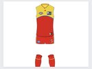
Like replace the logo with this on our regular red and yellow home guernsEy? IMG_6808.JPG


On iPhone using BigFooty.com mobile app
 
7AFL just posted some designs done by an artist for all clubs for an ‘Adidas reverse retro throwback’ look. It’s on their instagram.

It’s not too dissimilar from our original design, just changing of colours, so it’s hardly inspirational. It’s just interesting seeing how other people have their take on mixing it up.

But yes, something needs to be done.

Also, I do like our Indigenous round kit most of the time.
The artist is Zoops, his portfolio is on the graphic design board
Funny how the world is so small haha. I personally think a yellow guernsey and red shorts combo is the best look. Nails that Lifeguard aesthetic so fitting for the Gold Coast imo. The premise was the reverse the colours of retro guernseys so that was the inspiration. I'll blatantly plug my folio down below.
 
Funny how the world is so small haha. I personally think a yellow guernsey and red shorts combo is the best look. Nails that Lifeguard aesthetic so fitting for the Gold Coast imo. The premise was the reverse the colours of retro guernseys so that was the inspiration. I'll blatantly plug my folio down below.
Nailed it mate.
That crom jersey is the actual sex
 
7AFL just posted some designs done by an artist for all clubs for an ‘Adidas reverse retro throwback’ look. It’s on their instagram.

It’s not too dissimilar from our original design, just changing of colours, so it’s hardly inspirational. It’s just interesting seeing how other people have their take on mixing it up.

But yes, something needs to be done.

Also, I do like our Indigenous round kit most of the time.
I think Zoops has really nailed it, This screams "Gold Coast" way more than the predominantly red home kit we've always had

Another thing that I'm likely to cop heat for but want to go on record with - I don't hate the "stripped down" GC logo he's used, I actually quite like it.

The thing that takes that logo into the realm of "Worst logo in sports" (not my words) is all the other crap like the sun beams, gradient and the clunky word mark ect. That they've tacked on over the top. Keep it simple stoopids

I always rated the wave too, It's no worse than the Giants "G" that now just kinda sits weirdly in open space on their kit these days
 

Remove this Banner Ad

Back
Top