http://www.realfooty.com.au/news/ne...-for-gold-coast/2008/08/15/1218307237918.html
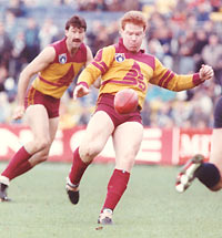
THE traditional jumper with stripes or a V-yoke might appeal to purists and romantics, but it does not appeal to the new Gold Coast team.
When the new team enters the AFL in 2011 it will do so in a modern, "sexy" jumper, not a traditional or old-fashioned one depending on your perspective, according to GC17 director Graeme Downie.
The consortium this week appointed a coach, yesterday advertised for a chief executive and currently has a handful of teenagers signed to play for it in the TAC and VFL over the next two years.
The club has yet to finalise a decision on its name or the colours it will carry, but has indicated the style of the jumpers will be modern.
"We will have a big announcement in a few weeks time. It is a long process," Downie said. "We want to get the logo and the colours right, and we are still working on those."
Blue and yellow, representing the sand and water of the famed Gold Coast beaches, might have been a favoured option for a Gold Coast side, but with West Coast already wearing these colours, and the local National Rugby League side, the Gold Coast Titans, also wearing blue and yellow, this would appear an unlikely choice.
"You don't want to follow them (the Titans), but there are plenty of options," Downie said.
"As for the style of the jumper, I don't think we will be coming up with a yoke or stripes. That's the old days.
"What we come up with will have a sexy feel about it without being ridiculous.
"Something more in keeping with the times. Collingwood's jumper is fantastic and it still works, but that is from a hundred years ago.
"The V that some clubs wear, Sydney wears, that is the same, and we would not go that way."
Of the newer teams to enter the AFL — Fremantle, Port Adelaide, Adelaide and West Coast — only Adelaide could be said to have chosen a traditional home jumper.
The others have all included multiple colours and slashes and swipes to varying degrees of success.
"There are a lot of factors to weigh up, commercial issues and the like, and we will have consultative groups, but really the best way to do it is to get a dozen fans in the room and sit them down and show them the options and say 'make your choice'," Downie said.


