
Classic!We had 3 Captains run and one was from some very angry wags
Navigation
Install the app
How to install the app on iOS
Follow along with the video below to see how to install our site as a web app on your home screen.
Note: This feature may not be available in some browsers.
More options
-


LIVE: St Kilda v Western Bulldogs - 7:30PM Thu
Squiggle tips Saints at 51% chance -- What's your tip? -- Team line-ups »
You are using an out of date browser. It may not display this or other websites correctly.
You should upgrade or use an alternative browser.
You should upgrade or use an alternative browser.
Gold Coast SUNS guernsey discussion
Big Red Machine
Der Sonnenkönig
- Moderator
- #827
TheKITC
Cancelled
I really like the Suns, always have a cheeky barrack for them when I can, but...
It has to be one of the most boring, bland and worst sporting uniforms in the world. BF is littered with options that are considerably better. I'm confused why it was allowed in the first place and baffled it is allowed to continue.
It has to be one of the most boring, bland and worst sporting uniforms in the world. BF is littered with options that are considerably better. I'm confused why it was allowed in the first place and baffled it is allowed to continue.
When you consider that Port and Freo have significantly changed up their jumpers it’s baffling that we haven’tI really like the Suns, always have a cheeky barrack for them when I can, but...
It has to be one of the most boring, bland and worst sporting uniforms in the world. BF is littered with options that are considerably better. I'm confused why it was allowed in the first place and baffled it is allowed to continue.
it only took the bears 5 years to ditch their weird, contemporary design for something more traditional. surprised it's taken the suns this long
It’s pissing me off, frankly. A club that has clearly got identity problems and needs to be strongly branded can’t identify its guernsey being a big problem? AFL administrators are hopelessI really like the Suns, always have a cheeky barrack for them when I can, but...
It has to be one of the most boring, bland and worst sporting uniforms in the world. BF is littered with options that are considerably better. I'm confused why it was allowed in the first place and baffled it is allowed to continue.
- Sep 30, 2010
- 9,029
- 10,558
- AFL Club
- Gold Coast
- Other Teams
- Tampa Bay Buccaneers, TB Lightning,
- Moderator
- #832
I really like the Suns, always have a cheeky barrack for them when I can, but...
It has to be one of the most boring, bland and worst sporting uniforms in the world. BF is littered with options that are considerably better. I'm confused why it was allowed in the first place and baffled it is allowed to continue.
This is not a go at you despite my long time feelings for Carlton. I see you have come in pretty respectfully, but... How do you get to ours being boring and bland? Yours is literally one colour with a jumble of letters. Yes 130 years on it has a lot of proud history. But to anyone watching footy for the first time Carltons would be one of the most boring jumpers in the comp.
For the record our jumper is puss, haha! I'd rather it was dumbed down a bit though, opposite of boring and bland. It is bright and almost has a corporate reek to it
The jouneyman
Team Captain
- Mar 11, 2018
- 459
- 333
- AFL Club
- Collingwood

- Mar 14, 2014
- 39,320
- 72,365
- AFL Club
- Gold Coast
- Other Teams
- Las Vegas Bears
God that’s so much better then ours. How embarrassingWest gippsland football league in the sun's colors I like it
The jouneyman
Team Captain
- Mar 11, 2018
- 459
- 333
- AFL Club
- Collingwood
God that’s so much better then ours. How embarrassing
I prefer our logo tbh
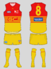
Put this together based on a wizardwaffle design:

Thoughts, suns supporters? Would you like to see your club wear something like this? I'm a fan of the red jumper with yellow sides so I wanted to maintain that. It's unique in the AFL context and it's not the problem with the current design, the extremely 2000s logo is.


Thoughts, suns supporters? Would you like to see your club wear something like this? I'm a fan of the red jumper with yellow sides so I wanted to maintain that. It's unique in the AFL context and it's not the problem with the current design, the extremely 2000s logo is.
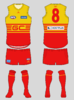
not sure a new logo/monogram in the middle fixes the dated & uninspiring look we've got, in my opinion.Put this together based on a wizardwaffle design:
View attachment 783898 View attachment 783902
Thoughts, suns supporters? Would you like to see your club wear something like this? I'm a fan of the red jumper with yellow sides so I wanted to maintain that. It's unique in the AFL context and it's not the problem with the current design, the extremely 2000s logo is.
not sure a new logo/monogram in the middle fixes the dated & uninspiring look we've got, in my opinion.
how much would you like to see it change? any ideas?
below are a few of the ideas i've come up with over the years, from newest to oldest.how much would you like to see it change? any ideas?
i like the "GC" part of our current logo and reckon it could still be used in a revamp. im not a huge fan of having three primary colours as our main colours, especially where there are two other clubs that are very close. red & yellow symbolising the surf life savers is alright, i suppose, but if we are to use our third colour in our actual guernseys besides the just clash ("we are the ones in the red, gold and blue" lol) that would be better, just gotta figure out a way to whilst maintaining an effective brand & image.
if the afl still wants white clash strips then that becomes tricky. one of the options i came up with below shows a home guernsey with red & gold, an away guernsey as gold & blue which if worn for away games you could play the "take the beach with you" marketing card perhaps, and a white clash guernsey with red & gold to symbolise surf life savers whilst also utilising a traditional sash.
over on the footy jumpers forum, there's plenty of other ideas floating around too. i think if the club are brave and committed to it, they'd be able to come up with a slight refresh that would enhance our guernsey and give the naysayers one less reason to call our club "plastic"/"franchise".
wasnt trying to have a dig at your concept, i do like monograms, the simplicity and traditional look of carlton's is a classic but i'm not sure how well we'd be able to pull it off.
Attachments
i think the fact that they're two round letters that fit perfectly into an image of the sun is perfect, it works better than any other club's monograms on that level
RowellAnderson12
Norm Smith Medallist
- Nov 4, 2019
- 6,561
- 8,699
- AFL Club
- Gold Coast
- Other Teams
- Liverpool, Max Verstappen, Pacers, DR3
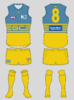
Not sure about the logo but i do like the white kitPut this together based on a wizardwaffle design:
View attachment 783898 View attachment 783902
Thoughts, suns supporters? Would you like to see your club wear something like this? I'm a fan of the red jumper with yellow sides so I wanted to maintain that. It's unique in the AFL context and it's not the problem with the current design, the extremely 2000s logo is.

- Mar 14, 2014
- 39,320
- 72,365
- AFL Club
- Gold Coast
- Other Teams
- Las Vegas Bears
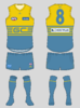
the training top is the best of the lot, No collar logo looks weirdView attachment 784898
It looks like the Hostplus logo does have a blue box around it after all. No ISC collar logo though.
like i said before, these are renders. the final guernsey, which we may see tomorrow night, will have is below the collar.
RowellAnderson12
Norm Smith Medallist
- Nov 4, 2019
- 6,561
- 8,699
- AFL Club
- Gold Coast
- Other Teams
- Liverpool, Max Verstappen, Pacers, DR3
Absolutely devostated, King's and Luko's long sleeves aren't for sale........ Just like last years long sleeves. I know we don't have much of support base but surely we can pre-order some. Training tee is probably the only one i'm looking at
SaadyArmy
Team Captain
- Jan 31, 2017
- 357
- 389
- AFL Club
- Gold Coast
Interesting to see that you're still using the design from your old clash guernsey.
It’s only one year old so why wouldn’t we
On iPhone using BigFooty.com mobile app
SaadyArmy
Team Captain
- Jan 31, 2017
- 357
- 389
- AFL Club
- Gold Coast
Absolutely devostated, King's and Luko's long sleeves aren't for sale........ Just like last years long sleeves. I know we don't have much of support base but surely we can pre-order some. Training tee is probably the only one i'm looking at
Long sleeve training jersey ?
On iPhone using BigFooty.com mobile app
Similar threads
- Replies
- 1
- Views
- 409
