Poll Gold Coast Suns Guernsey Rebrand V2.0

Best GC Guernsey design


  • Total voters
    112

Remove this Banner Ad

View attachment 1261544
This! The colours are perfect. Two colours only, which helps brand identity. Pity this team may take it before the Suns. What an opportunity lost?

Yep i was suprised they didn't go yellow top and red shorts originally but it seemed like they wanted to clash as much as possible with brisbane and the swans instead of being different.
 
You guys are again missing the best one ever posted on here (can't remember who it was). I have actually altered the back of the Jersey slightly to add the fading chevrons to the lower back, the same as their training jumper of a few years ago, but this design is clean, original and uses the GC letters in a new and innovative way.

View attachment 1261608
View attachment 1261610
This would be Freight Train's design. I was digging to find this one because it perfectly sums up what I was saying previously about utilising the GC of the logo. It's a unique take on a traditional footy design.
 
Yeah it's truly amazing how millions upon millions are poured into creating a new club and the AFL wound out this garbage jumper design for a new team. It's actually not as bad as it was at first either, at first it used exactly the same colours as Brisbane's away Guernsey and also had white numbers on the back for some reason, meaning that from the back with the red back, white numbers and red shorts it looked exactly the same as the Swans lol. Seriously who did they get to come up with this idea? if they paid a design team I would be pretty disappointed i could have mocked up something better on ms paint.
 

Log in to remove this ad.

06_BLACK.png
Absolutely in love with this one. The charcoal scheme goes so well with the red and yellow.
 
as our season draws to a close, couple other ideas based on previous designs.

curved design based on our old clash guernsey.
Curved-Yoke.png


based on a similar guernsey posted on this forum before, with the straight colour break reminding me of surf life saving flags.
SLS-Design.png
I've just never understood why they've kept the cluttered logo (red outlined by white with the little slither of blue) across all their jerseys and never tried simplifying and making it more visually appearing similar to the Giants G. It's not the greatest logo in the world but with a bit of work it can definitely stand out more
 
Last edited:
I've just never understood why they've kept the cluttered logo (red outlined by white with the little slither of blue) across all their jerseys and never tried simplifying and making it more visually appearing similar to the Giants G. It's not the greatest logo in the world but with a bit of work it can definitely stand out more

It's not the greatest logo in the world, it's up there with one of the worst logos in the world. How they haven't updated their logo yet is extremely amateur.

I remember when I was in grade 3, I loved drawing the retro eagle head and then the early 00's eagle head in my scrap books etc. It's what helped me become a wc supporter. How are kids these days going to fall in love with a 'GC' in a circle!?
Don't you get it? It's a surfboard! It's abstract, kids will love it! /s
 
Hey guys this is my first ever post/reply on this forum, got onto BigFooty fairly recently coz I just love guernsey designs and thinking of redesign ideas for some of the boring/terrible ones we’ve got in the AFL today (chiefly the Suns), and I particularly wanted to propose an idea for a GC clash/away kit that I’ve had in my head for a while, I just don’t have photoshop or the skills or anything so I was hoping someone might wanna flesh it out if they’re bored or just wanna play around, either way just putting it out there!

Here’s my thinking: I know there tends to generally be two opposing schools of thought re. guernsey concepts, with the ends of the spectrum being those who want to keep it like super traditional/simple (e.g. stripe patterns, sashes, V’s, etc.) , vs wanting to switch it up and try new, more modern and/or animated designs.
I sit somewhere in the middle I reckon, and I personally think it just depends on the club and its heritage. For example, I’m all for the older clubs with rich heritages using timeless classic designs because it’s just on-brand and iconic and essentially if it ain’t broke don’t fix it—but, when it comes to these newer league-born clubs like GC and GWS (and in some respects Port Power because they have a super rich history from the SANFL ofc but I’d love them to #BringBackTheTeal and embrace the “Power” brand a whole lot more) I feel like for these teams it’s perfectly suitable and on-brand to go for more modern designs. To put it simply I’d say if there’s one thing almost as lame as an old club switching things up with some awful, overly contemporary and tacky kit design, it’s a young club trying to go for a super conservative and try-hard retro look. I mean yeah with a lot of the trad designs it’s hard to go wrong of course, but I feel these younger clubs should embrace their youth and try something modern and unique.

Probs rambled on a bit there and made this quite long so I’ll post some reference pics and my idea/s for specific kit designs in a separate comment. I’d love to hear some other thoughts on this trad vs modern philosophy of mine tho.
 
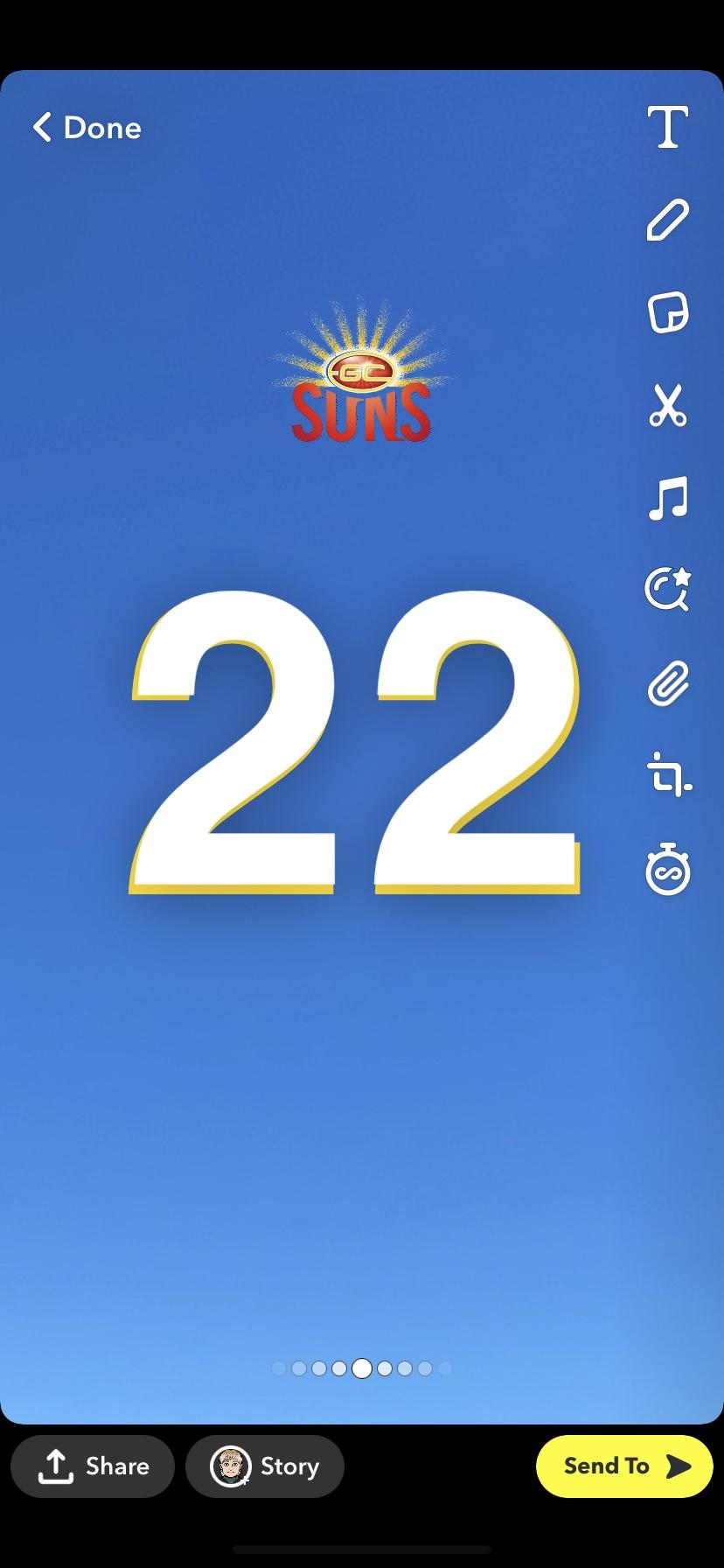
I’d love to see this Suns clash concept fleshed out properly, so basically my thinking is to embrace the bright sun and clear blue sky, and with GC’s current ‘azure’ clash I find it looks way too lazy for lack of a better word. I just love the idea of the blue sky colour but with a gradient to a lighter sky blue on the bottom part of the guernsey because that’s what the sky looks like on the horizon on a sunny clear day and it’s super nice imo. As for the sun/logo I’d like to see what a realistic-ish looking glaring sun with rays and all would look like?

These reference images are just from photos I’ve taken where the sky has the nice subtle gradient. (+ the incredibly average Snapchat draft of the numbers on the back lol)

67d49ea17a7885514bbd49e37dca91e7.jpg
92b233610d8d17d4313f1cc2a1a76432.jpg
fca3aca2a43d8d0e63ee491ae24ea027.jpg
d8e8333f4579cbbe8d477df121668a59.jpg


And just white shorts are fine honestly, I reckon continuing gradients from guernseys onto shorts is a bit overkill imo. White would balance nicely.

The realistic sun on the front would be white in the centre but have the golden yellow glow on the outside. The numbers on the back would complement this by being white with a gold/yellow outline. For the collar and cuffs I was thinking probs just yellow and maybe a thinner white or red accent sort of how Under Armour have the accented red lines on Essendon’s jumper?

Feel free to experiment and propose diff ideas though, I’m just bored and thought I’d finally post on here.
Would this be a little too similar to the Titans, though?
Rebel_62440401_blue_hi-res.jpg
 

(Log in to remove this ad.)

GC suns guernsey preferred options following many years of designs on this website.
Version 2.0 to collate best designs so far.
Poll in OP.
Edit. When I get time I'll find creators names to add to each design.

Option 1
View attachment 1252861View attachment 1252862View attachment 1252863

Option 2
View attachment 1252865

Option 3
View attachment 1252866

Option 4
View attachment 1252867

Option 5
View attachment 1252868

Option 6
View attachment 1252869

Option 7
View attachment 1252870

Option 8
View attachment 1252871

Option 9
View attachment 1252872
Option 10
View attachment 1252873

Option 11
View attachment 1252876

Option 12
View attachment 1252877

Option 13
View attachment 1252878

Option 14 (current)
View attachment 1252879
I had a similar idea with the sash, years ago. ice_video_20190430-210650[(000124)2019-04-30-21-08-15].JPG
 
Would this be a little too similar to the Titans, though?
Rebel_62440401_blue_hi-res.jpg

Hmm, nah I don’t reckon, only similarity I see is the fact it’s a blue gradient (and a way different shade at that), a Gold Coast team and the yellow yoke/V shares the yellow of the Suns but the way it’s laid out and everything, wouldn’t share that much likeness at all I don’t think.
 
I mean yeah the bottom half’s blue is a sky blue but it’s way darker at the top and the gradient begins much higher up the chest so doesn’t really resemble the sky look I referenced
 
I mean yeah the bottom half’s blue is a sky blue but it’s way darker at the top and the gradient begins much higher up the chest so doesn’t really resemble the sky look I referenced
It is a similar base concept though, dark to light blue gradient, also at a club in the Gold Coast, not sure if it would fly
 
It is a similar base concept though, dark to light blue gradient, also at a club in the Gold Coast, not sure if it would fly

Yeah fair call. Nonetheless would be an interesting concept to see. Tbh would just be a fun lil experiment to play around with all 18 teams and do a one-off guernsey design for each one that embraces the realism of the team’s mascot or whatever (similar to that thread of those realistic team logos), many would probably look wacky as hell but would just be fun to see, as it’s own Pimp my Preseason comp potentially? And not like suuper realistic but embracing certain elements of the team’s mascot/name
 
It is a similar base concept though, dark to light blue gradient, also at a club in the Gold Coast, not sure if it would fly
I don’t necessarily think it would be a bad thing for elements and a general aesthetic to be shared. A lot of cities carry the same sporting colours and even branding/nickname across codes, whilst still being very much independent and recognisable entities. Pittsburgh in black and yellow. Salford/West Manchester has 2 sides in the top divisions playing in red and black nicknamed the Red Devils. Leeds has 3 sides in blue, yellow, and white. I think it’s probably natural that GC teams will evolve convergent toward something recognisable of the city, and for the better.
 
I don’t necessarily think it would be a bad thing for elements and a general aesthetic to be shared. A lot of cities carry the same sporting colours and even branding/nickname across codes, whilst still being very much independent and recognisable entities. Pittsburgh in black and yellow. Salford/West Manchester has 2 sides in the top divisions playing in red and black nicknamed the Red Devils. Leeds has 3 sides in blue, yellow, and white. I think it’s probably natural that GC teams will evolve convergent toward something recognisable of the city, and for the better.
It probably isn't a bad thing, but it also means your indentity gets lost. You're also referring to clubs in different sporting codes with proper established and largish supporter bases. Unfortunately the expansion Gold Coast clubs (Titans and Suns) are still trying to build theirs 10 years on, and losing part of that identity isn't ideal.
 
Back
Top