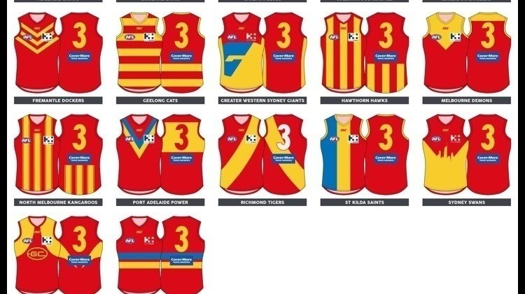
GC suns guernsey preferred options following many years of designs on this website.
Version 2.0 to collate best designs so far.
Poll in OP.
Edit. When I get time I'll find creators names to add to each design.
Option 1


Option 2

Option 3

Option 4

Option 5

Option 6

Option 7

Option 8

Option 9
Option 10

Option 11
Option 12

Option 13

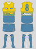
Option 14 (current)

Version 2.0 to collate best designs so far.
Poll in OP.
Edit. When I get time I'll find creators names to add to each design.
Option 1


Option 2

Option 3
Option 4

Option 5

Option 6

Option 7

Option 8

Option 9

Option 10

Option 11
.png")
Option 12
Option 13

Option 14 (current)

Last edited: