- Mar 24, 2018
- 918
- 715
- AFL Club
- Collingwood

- Other Teams
- Boston Celtics Melbourne Stars
ption 9

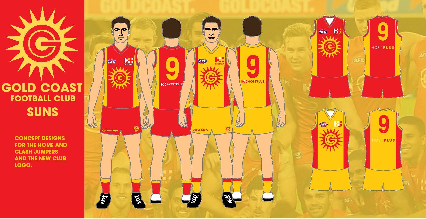
Like this jumper, but maybe different colours.
Follow along with the video below to see how to install our site as a web app on your home screen.
Note: This feature may not be available in some browsers.
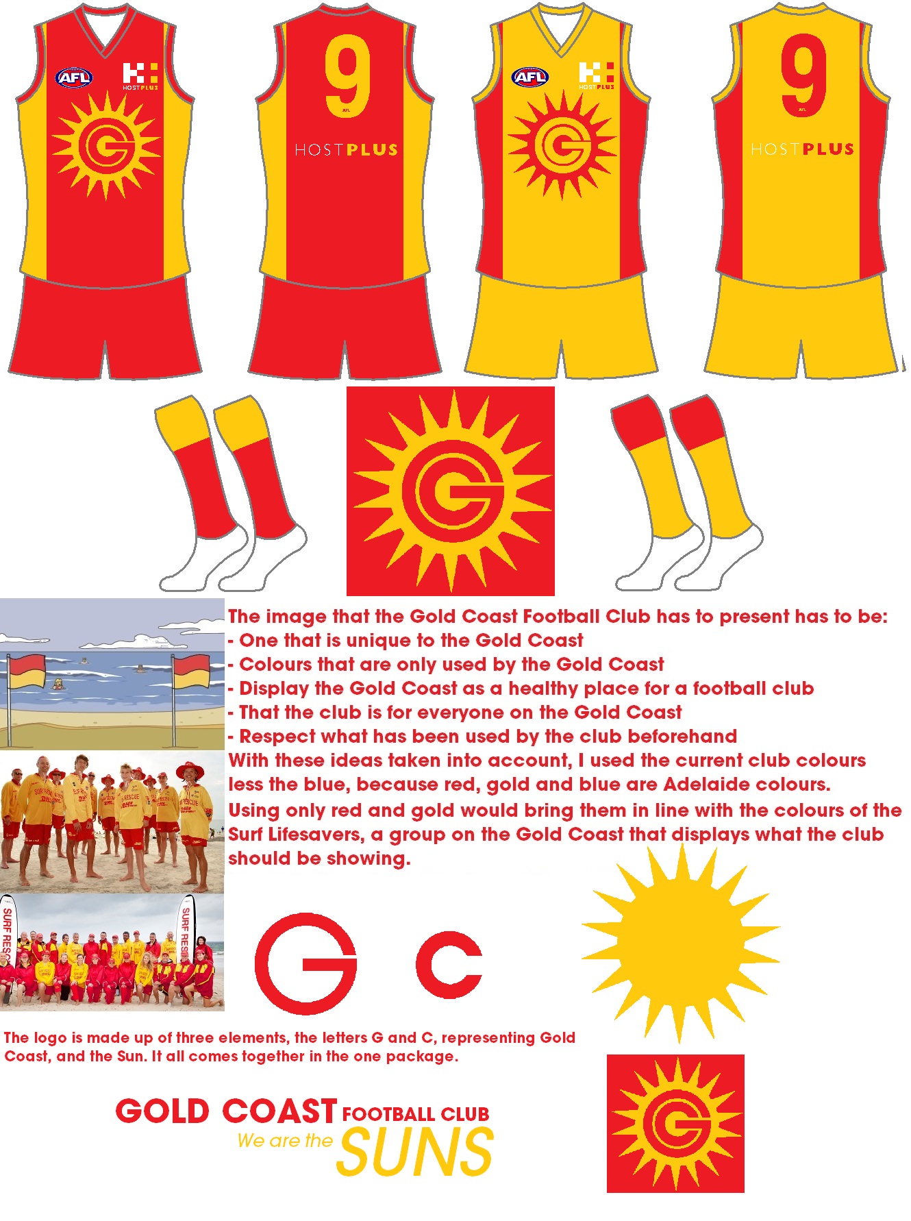
ption 9
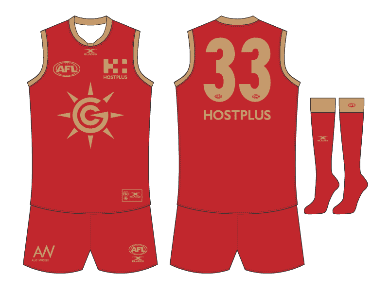
I was never completely sure about this colour combo but from a branding point of view, I think metallic gold should be part of their colours.Like this jumper, but maybe different colours.
Good point something different is always good.I was never completely sure about this colour combo but from a branding point of view, I think metallic gold should be part of their colours.
There's not many unique colours left in the league and there's a very obvious connection there.
That's why I think they should embrace the yellow/gold. No other club uses it as a primary colour.I was never completely sure about this colour combo but from a branding point of view, I think metallic gold should be part of their colours.
There's not many unique colours left in the league and there's a very obvious connection there.
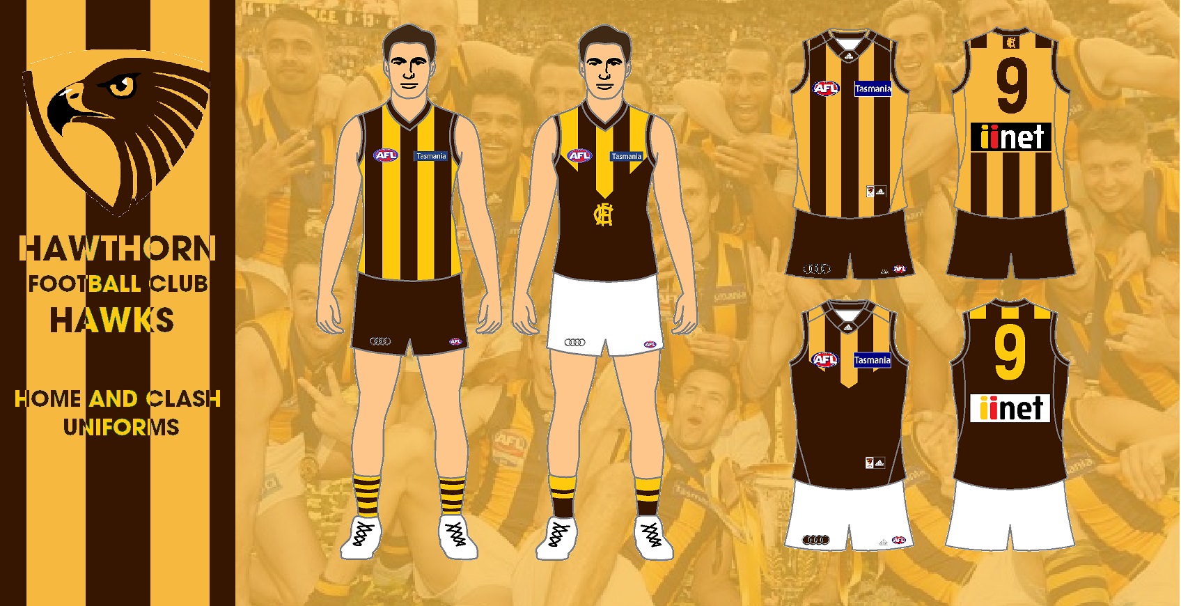
One club has embraced Gold as their primary colour, Hawthorn.That's why I think they should embrace the yellow/gold. No other club uses it as a primary colour.

Whatever they wear at home is up to them and whatever they wear away will have white shorts, so I don't think a clash is really a problem outside of Hawthorn, and from a contrast perspective, GWS. If they maintained the three colours, a blue clash would take care of both of those.I was watching the PNG Kumuls just before and I thought their kit suited the Gold Coast better than the current strip.
The current red jumper and shorts is just too red heavy. The colours are meant to be drawn from the lifesaving flags, which are 50/50 red and yellow. And if you look at what the volunteer lifesavers wear, it's red shorts and yellow long sleeve shirt.
Yellow guernsey and red shorts would look so much better, both colours are still considered light according to the AFL. Would probably cause some clashes but purely from an aesthetics and branding standpoint, this is infinitely better.
View attachment 573260


.png")

Guernsey looks to plain with a monogram. Plus not sure a monogram really works for GC.A poster on our board suggested to put the "SUNS" part of the logo up the top after "GOLD COAST", think it would definitely look better up there so might give that a go another day (it's annoying me looking at it the way it is now haha).
made a couple simplified versions of it, along with plonking it front and center on a guernsey. blank canvas for now, any suggestions?
View attachment 573780
View attachment 573786
View attachment 573782
not sure i follow the half shading bit. could you show what you mean with a pic?I feel like it needs half half shading, if that makes sense. Similar to what Carlton has on their jumper this year, but keeping the outline. Though that is already a good looking logo. Well done.
A bit unbalanced but a really nice start. Quite like the one with the dark grey text around it, the whole thing is feeling like a US college team to me.A poster on our board suggested to put the "SUNS" part of the logo up the top after "GOLD COAST", think it would definitely look better up there so might give that a go another day (it's annoying me looking at it the way it is now haha).
made a couple simplified versions of it, along with plonking it front and center on a guernsey. blank canvas for now, any suggestions?
View attachment 573780
View attachment 573786
View attachment 573782
Back to Gold Coast, I honestly don't see why they can't rip off this design, but where the Bulldogs have their hoops placed.
Great colours that work well with the white.
The picture is low quality, but it shows what I’m trying to say.not sure i follow the half shading bit. could you show what you mean with a pic?

ahh gotcha! will give it a go.The picture is low quality, but it shows what I’m trying to say.
View attachment 573797
gave it a shot.The picture is low quality, but it shows what I’m trying to say.
View attachment 573797
.png")
-(v2).png")
-(v2).png")
.png")
-(v2).png")
-(v2)2.png")
Love it
 maybe just add the stroke from before and it will be spot on I reckon.
Guernsey looks to plain with a monogram. Plus not sure a monogram really works for GC.
Maybe try a thick yellow sash with the logo in the sash.
.png")
First one with the stripes down the bottom looks really really good. Takes a classic element (stripes) and changes it enough to be unique (not in the middle but down the bottom, plus monogram)with the bevel logo on the striped guernsey
View attachment 574134
bulldogs location stripes with logo
View attachment 574137
bulldogs location stripes without logo
View attachment 574138