Bwillow11
All Australian
- Sep 16, 2016
- 680
- 471
- AFL Club
- Collingwood

- Other Teams
- Melbourne Stars
This is ridiculously good! Nice job. Perhaps the hoops can be moved down a tiny bit if anything.
Follow along with the video below to see how to install our site as a web app on your home screen.
Note: This feature may not be available in some browsers.
LIVE: Richmond v Melbourne - 7:25PM Wed
Squiggle tips Demons at 77% chance -- What's your tip? -- Team line-ups »
i think i have emailed the club with a couple designs a few years back and i did get a response! a smaller club like ours would also get less emails like that to sift through so chances of getting acknowledged is higher than others i suppose.Yeah definitely do it. I've tried contacting Collingwood a few times but to no avail. A smaller club like GC would have more time at its disposal could probably take your consideration in. And with the recent Carlton jumper fiasco it appears that actions on this board can spiral into real world consequences.
Just an idea but if we made up your design onto a realistic template and made it look all official and post it saying it was leaked or something and then it circulated around, depending on how positive the feedback was it could probably make its way to someone affiliated with GC and bang. It's exactly what happened with the Carlton clash but this time its actually fake haha
Wow that presentation looked amazing. Something like that would be hard to ignore especially for GC. Give it a shot, would love to see the outcome of it. You could even try putting through the GC Board and running a poll on if they would prefer it over the current and you can bring those stats to them to show the designs is well received.i think i have emailed the club with a couple designs a few years back and i did get a response! a smaller club like ours would also get less emails like that to sift through so chances of getting acknowledged is higher than others i suppose.
could be an option! haha. although it did seem to rush carlton into publishing an outcome, albeit pretty rushed by the looks of the photoshop job haha. i was more thinking of trying to figure out a way to present them more professionally if i was going to send it to the club. i love the presentation standards of some of the rebranding posts on behance.net (e.g. https://www.behance.net/gallery/57508019/Denver-Nuggets-Rebrand), so was thinking of trying to find some way to highlight the little parts of the guernseys that represent different themes of the gold coast.
Beautiful
")
a poll could work, but being a fairly small community on our board it's a small sample size of a poll. i liked when members had a say on guernseys like the lions logo, carlton's monogram, our clash guernsey a year or so ago. perhaps if the club does want to go down the path of a re-design a member based poll would help decide. although i still think the AFL has a bit more of a say with those sorts of things, especially for our club being relatively new. who knows haha.Wow that presentation looked amazing. Something like that would be hard to ignore especially for GC. Give it a shot, would love to see the outcome of it. You could even try putting through the GC Board and running a poll on if they would prefer it over the current and you can bring those stats to them to show the designs is well received.
i like your thinking, with the yellow ellipse at the top and changing the red to blue symbolises a yellow sun at the top of the front of the guernsey with the yellow curves imitating sun rays. i switched up the direction of the curves on the rear so the lines can continue around the side of the guernsey smoothly. i think it sorta looks like waves crashing over a beach now.Beautiful
You could even incorporate blue at the bottom somehow to look like a yellow/sandy beach and then water?
Looks perfect either way

Only thing I could add is maybe have the rays gradually get thinner as they go down the page. Like as they get further away from the “sun”.
Wicked. Same comment re gradual thinning the hoops. Ie relatively thick hoops under the sun/beach and gradually thinner.a poll could work, but being a fairly small community on our board it's a small sample size of a poll. i liked when members had a say on guernseys like the lions logo, carlton's monogram, our clash guernsey a year or so ago. perhaps if the club does want to go down the path of a re-design a member based poll would help decide. although i still think the AFL has a bit more of a say with those sorts of things, especially for our club being relatively new. who knows haha.
i did put something together and sent it off to them. will let you know what they say, if they do respond haha.
i like your thinking, with the yellow ellipse at the top and changing the red to blue symbolises a yellow sun at the top of the front of the guernsey with the yellow curves imitating sun rays. i switched up the direction of the curves on the rear so the lines can continue around the side of the guernsey smoothly. i think it sorta looks like waves crashing over a beach now.
View attachment 583455
do you mean this or the yellow rays getting thinner (red curves getting larger)?Only thing I could add is maybe have the rays gradually get thinner as they go down the page. Like as they get further away from the “sun”.

Kinda. But the yellow and red rays have the same width as you go down. Ie more rays bundled towards the bottom. That way the fade away is more obvious.do you mean this or the yellow rays getting thinner (red curves getting larger)?
View attachment 583476
Brilliant. Could be used as a clash guernsey?a poll could work, but being a fairly small community on our board it's a small sample size of a poll. i liked when members had a say on guernseys like the lions logo, carlton's monogram, our clash guernsey a year or so ago. perhaps if the club does want to go down the path of a re-design a member based poll would help decide. although i still think the AFL has a bit more of a say with those sorts of things, especially for our club being relatively new. who knows haha.
i did put something together and sent it off to them. will let you know what they say, if they do respond haha.
i like your thinking, with the yellow ellipse at the top and changing the red to blue symbolises a yellow sun at the top of the front of the guernsey with the yellow curves imitating sun rays. i switched up the direction of the curves on the rear so the lines can continue around the side of the guernsey smoothly. i think it sorta looks like waves crashing over a beach now.
View attachment 583455
Should just be able to drag each image on to your desktop?I just tried cutting and pasting my favourite designs from this thread but it didn't work. I'll try again later.


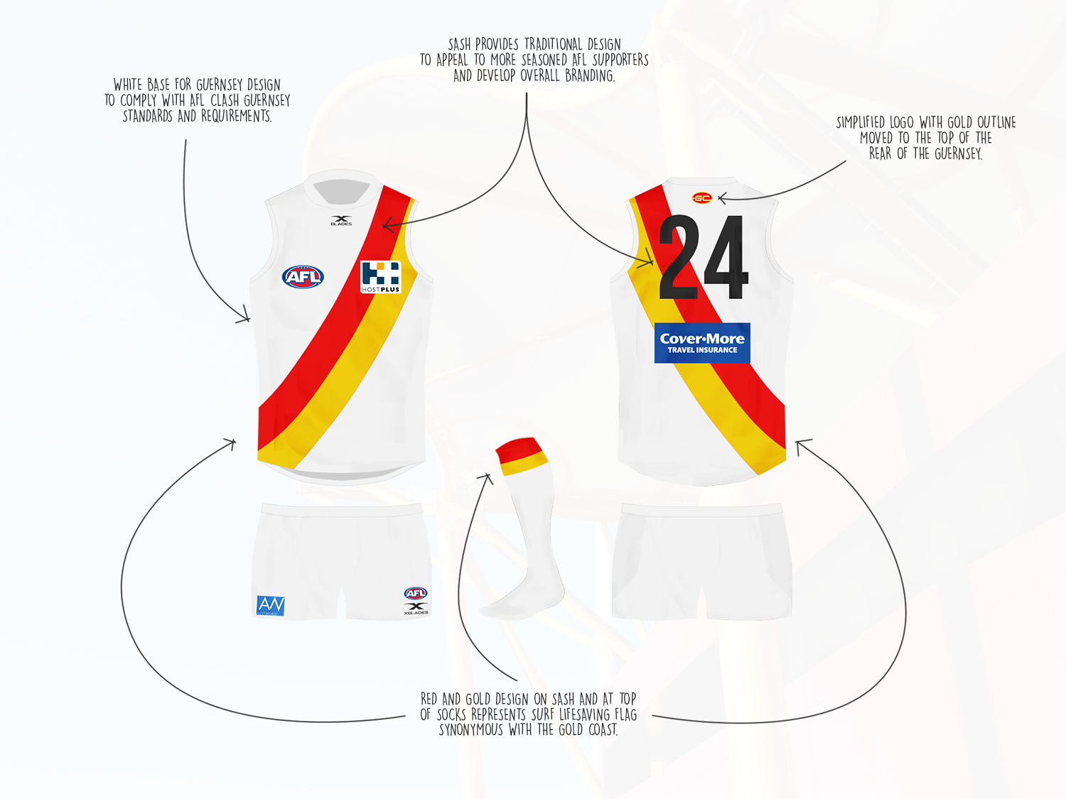
Great work mate.for what it's worth, this is what i emailed to the club. i've seen a few people on here get their designs made into international & state league guernseys, so i'm definitely not expecting these to actually get implemented. just hoping that they see there's people pushing for it and i hope in the next couple of years they go down that path.
View attachment 583878 View attachment 583879 View attachment 583880 View attachment 583881
haven't given your last suggestion a go just yet, 1990crow, studies got in the way a bit.
This clash guernsey is so good, would be one of the best in the league imo, hopefully it gets in front of the right people.
Should just be able to drag each image on to your desktop?


The club might make some of these as a training guernsey?Cheers. Was on my phone before, but now I'm on a desktop it's a bit easier. Sorry about not putting creators names with the designs, you can easily find them elsewhere on this thread.
I'm certainly not trying to take credit for anything, simply saying in a thread full of awesomeness, these designs in particular are really good, and merit serious consideration by the club.
View attachment 583922 View attachment 583923 View attachment 583924 View attachment 583925 View attachment 583926 View attachment 583927 View attachment 583928 View attachment 583929 View attachment 583930 View attachment 583931
Any response from GC?for what it's worth, this is what i emailed to the club. i've seen a few people on here get their designs made into international & state league guernseys, so i'm definitely not expecting these to actually get implemented. just hoping that they see there's people pushing for it and i hope in the next couple of years they go down that path.
View attachment 583878 View attachment 583879 View attachment 583880 View attachment 583881
haven't given your last suggestion a go just yet, 1990crow, studies got in the way a bit.
Have to say I prefer the "rays" starting further up the Guernsey as they are in this version. Halfway down looks a little weird.Cheers. Was on my phone before, but now I'm on a desktop it's a bit easier. Sorry about not putting creators names with the designs, you can easily find them elsewhere on this thread.
I'm certainly not trying to take credit for anything, simply saying in a thread full of awesomeness, these designs in particular are really good, and merit serious consideration by the club.
View attachment 583922 View attachment 583923 View attachment 583924
negative. oh well, worth a shot i suppose.Any response from GC?
Their lossnegative. oh well, worth a shot i suppose.