Gcsuns_Gourami
Debutant
- Oct 13, 2019
- 79
- 68
- AFL Club
- Gold Coast
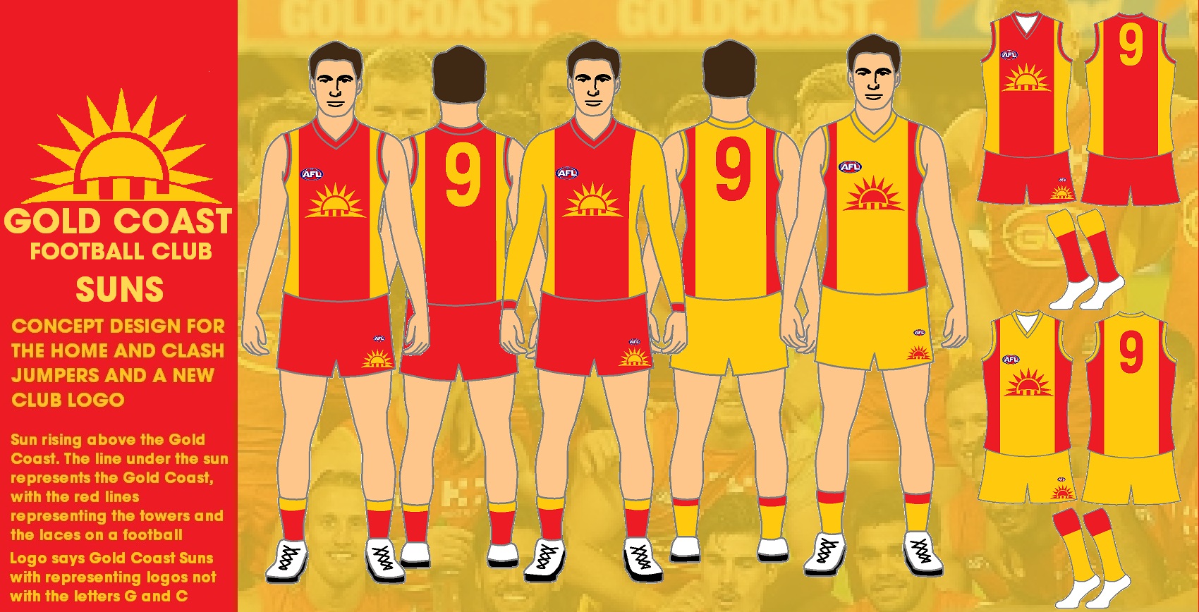
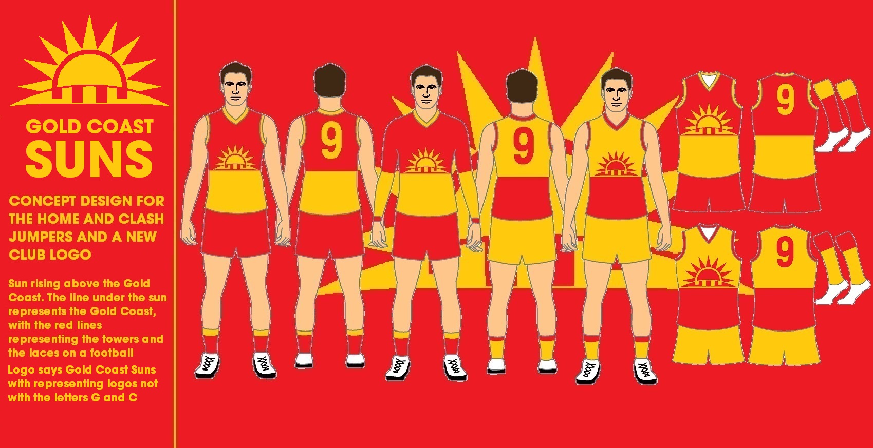
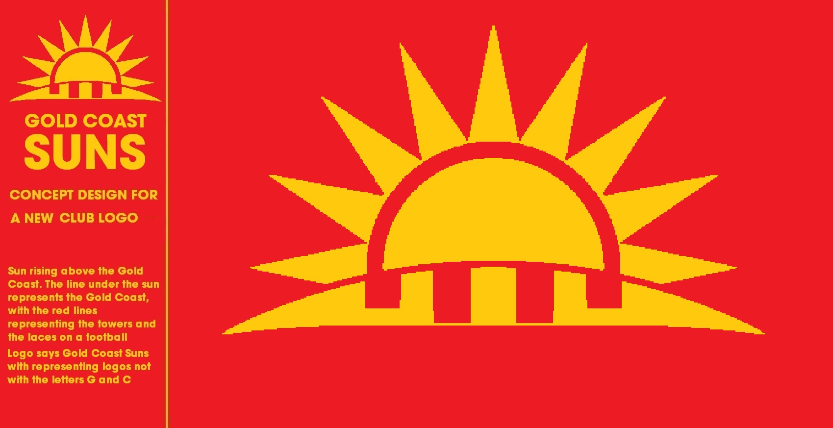
gold coast titans have that already there'd be too much confusionSky blue and yellow to represent the beach and water (if West coast are okay with that, if not, green to represent the Queenslands tropics


")