Discussion Gridiron (College/NFL/etc) Uniforms Discussion

Remove this Banner Ad

Confirmed uniform updates for the 2020-21 NFL Season thus far;

:nflrams: 
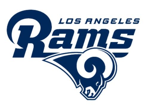
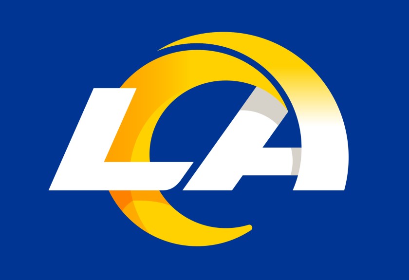
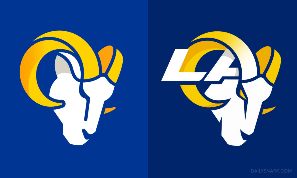
Los Angeles Rams RELEASED, rebranding of logo and uniforms: https://news.sportslogos.net/2020/03/23/los-angeles-rams-reveal-new-logo-color-scheme/

:nflbucs: 
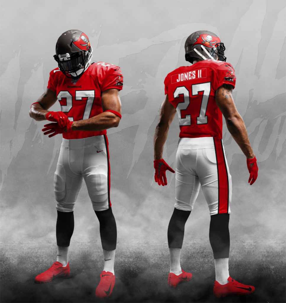
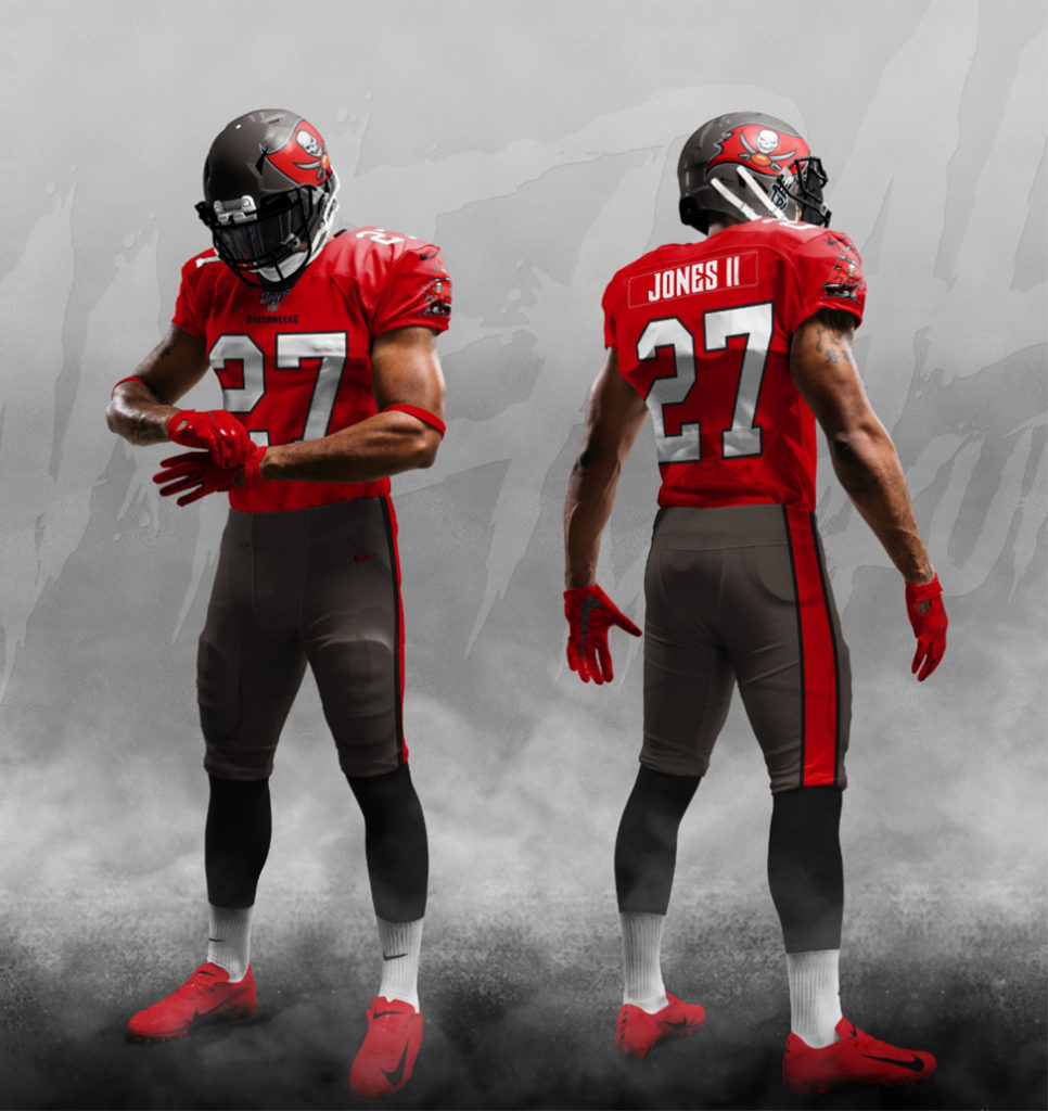
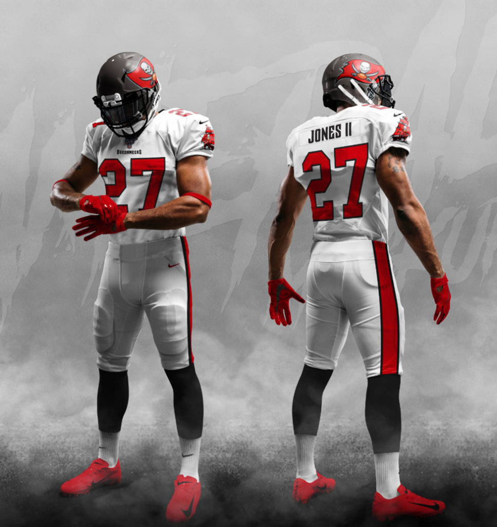
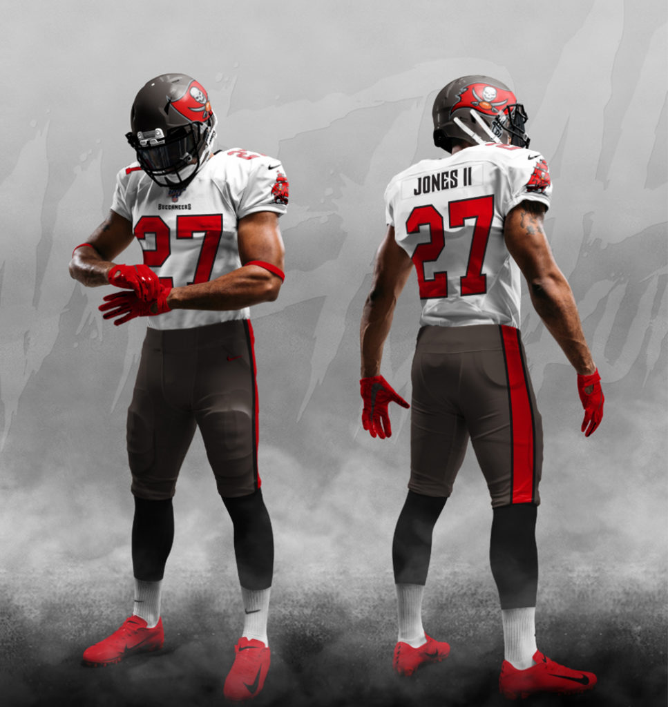
Tampa Bay Buccaneers RELEASED, return to early 2000's Superbowl style, new era with TB12: https://news.sportslogos.net/2020/04/07/tampa-bay-buccaneers-unveil-new-uniforms-2/

:nflfalcons: Atlanta Falcons RELEASED, return to a black-based home, new alternate: https://news.sportslogos.net/2020/0...w-uniforms-ahead-of-schedule-following-leaks/

:nflbrowns: Cleveland Browns RELEASED, redesign of kits to a more classic browns look: https://news.sportslogos.net/2020/04/15/cleveland-browns-unveil-new-uniforms/

:nfllac: Los Angeles Chargers RELEASED, powder blue home unis, yellow pants, royal/dark blue alternates, numbers on helmet: https://news.sportslogos.net/2020/04/21/los-angeles-chargers-unveil-new-uniforms/

:nflcolts: Indianapolis Colts RELEASED, minor uniform changes, new number and wordmark font, new secondary logo: https://news.sportslogos.net/2020/0...secondary-logo-and-wordmark-updated-uniforms/

:nflpatriots: New England Patriots RELEASED, alternate Boston-inspired uniform design promoted to home, white version too: https://news.sportslogos.net/2020/04/20/new-england-patriots-unveil-new-uniforms-for-2020/
 

Just an update with the Tampa Bay uniform, according to Bruce Arians (Head Coach), he reckons that the new uniforms look more like the early 2000's kit when they won the Super Bowl which makes sense with the promo video saying 'Return to Glory'.

Not a huge fan of the pewter colour, not a huge hater either though. Just hope the tangerine orange is still involved in the uniform somehow.
The only other issue I have is the amount of teams that will have red jerseys. 5 teams have Red home jerseys in the NFL, maybe 6 if you count the Redskins. Now I know this is hard to overcome especially with 32 teams in the league but the least they can do is be creative and break up the red space with other colours, kind of like their current kit.

1583105099430.png
 
Rams new logo leaked from draft hats: https://www.si.com/extra-mustard/2020/03/08/rams-rebrand-hat-logo-possible-leaks

LA_Rams_logo_2020.jpg
NEW

Dear God...
This looks so bad. Looks more like what the Chargers logo would look like, and it's still so bad.

5bd867548d1f7a3d71fd5481d7f5cf63.jpg
OLD
 
That's a shoker. Looks like a better Chargers logo to be honest. I thought the Rams already had one of the best logo branding in the NFL so boggles me why they needed to change anything at all.
 

Log in to remove this ad.

I don't hate it.

A lot of folks on Facebook blowing up about it.

Would be awesome if it was all a bluff and this is actually a secondary logo, that would be :fire:
It's sort of the situation where the current logo was great, modern and iconic (having history with the Kurt Warner era in St. Louis), so there was no need to "fix" anything.
Then they go out and "fix" it and it looks like that. The concept itself is fine, just in combination with the Chargers also unveiling an LA wordmark-style logo and having a yellow band as part of their identity (and the fact that it just looks unrefined and amateur) makes you wonder who signed off on this if it does become the logo.

I don't think they're trying to fix anything. The NFL landscape in California is changing, Chargers and Rams to LA and new Stadium, and Raiders off to LV.

I think they're just do something new for a few years to re establish themselves as a LA team. They'll eventually go back to the Ram, but this will be seen as the return to LA logo.

That's if it is the actual logo, I still need convincing it's not secondary haha
 
I don't hate it.

A lot of folks on Facebook blowing up about it.

Would be awesome if it was all a bluff and this is actually a secondary logo, that would be :fire:
I think there’s a fair chance it’s a secondary.
If it is the primary - it is actually the first new NFL logo in quite a while - the prior being the dolphins - all other recent logo changes have been updated versions of existing logos - eg. Carolina, Jacksonville, Tampa Bay, Minnesota. It is very rare for an NFL team’s branding to be completely overhauled.
I saw a photo of a 49ers draft cap in the exact same style as this cap.
1583789730032.png

So unless this is just an early logo concept which somehow got out, I'm fairly certain this is the primary logo.
 
View attachment 837968

Jesus that’s amateurish, the SF is iconic. Who thought this was a better option? Peak 1990’s design trope.


On iPhone using BigFooty.com mobile app
I don't mind that as a secondary or even tertiary logo but to think they could have replaced that with their original logo is crazy and just goes to show the power of fan backlash. Does has a huge 90's vibe.
 
Looks like concepts of Tampa's new unis have been revealed: https://dailysnark.com/we-have-our-first-look-at-the-new-tampa-bay-buccaneers-uniforms/

Screen-Shot-2020-03-17-at-11.47.15-PM-967x1024.jpg
Screen-Shot-2020-03-17-at-11.47.10-PM-966x1024.jpg

Screen-Shot-2020-03-17-at-11.47.20-PM-967x1024.jpg
Screen-Shot-2020-03-17-at-11.47.25-PM-967x1024.jpg


Removed shoulder pad design, definitely looked more like 2002 (or 2003?) SB team kits.
Number font now just a basic stencil, wish they'd make a better version of their previous font, but I guess it's meant to fully emulate the old unis.

Not bad overall, really don't know what I was expecting. Wish they'd try to look a little different to the Falcons given they're in their division.
 

(Log in to remove this ad.)

1585005675846.png 1585005711785.png

Seriously though, this is a lot better than what it was before. The secondary logo is not bad either, although it couldn't hurt to round those edges just a bit at the bottom.
 
I love what they have done here! Think the word gets thrown on here a lot but this feels really modern, it doesn't present like a traditional sports brand which I really like. It's about time that teams started to move outside the box with their branding, to something that utilises what digital mediums can offer. If you go on the site for the new branding https://ramsnewlook.com/ you can see how the whole brand comes together and works with little animations for each of the marks and get a feel for how stadium graphics and social media content is going to look, it all feels really slick.
 
I love what they have done here! Think the word gets thrown on here a lot but this feels really modern, it doesn't present like a traditional sports brand which I really like. It's about time that teams started to move outside the box with their branding, to something that utilises what digital mediums can offer. If you go on the site for the new branding https://ramsnewlook.com/ you can see how the whole brand comes together and works with little animations for each of the marks and get a feel for how stadium graphics and social media content is going to look, it all feels really slick.
Great site. Definitely see the greater picture now, I think it was more a case of that leaked draft hat logo being so minimalised to the point it looked cheap and old-fashioned.

icon-3-1024x614.jpg

LEFT: Current Alt logo
Right: Redesign

Someone did up the secondary logo, giving it sharper edges and an overall more menacing look. Honestly think this would be fantastic as a primary logo.
New word mark and font is great.

This turned out a lot better than it looked like it would.
 
All in all, I think the LA teams have done alright for themselves
Yeah I'd give them the pass mark and more.
I think the only thing the bugs me the most with the Chargers in LA is that it's just two teams with essentially blue and yellow colour schemes. Obviously they aren't exactly the same brand but when you look at other two-team-one-city situations like Lakers and Clippers, one is purple/gold, one is blue/red, very distinct. And the Jets and Giants in NY as well, one is green, one is blue. Not saying any team should rebrand because their identities by themselves are great but it's just more of an aesthetic pet peeve.

Make it easier for Stadium decor
 

Remove this Banner Ad

Back
Top