Workshop GWS Jumper Designs/Discussion

Remove this Banner Ad

Oct 27, 2016
5,938
10,623
AFL Club
Collingwood
Other Teams
Packers, Raptors, Renegades
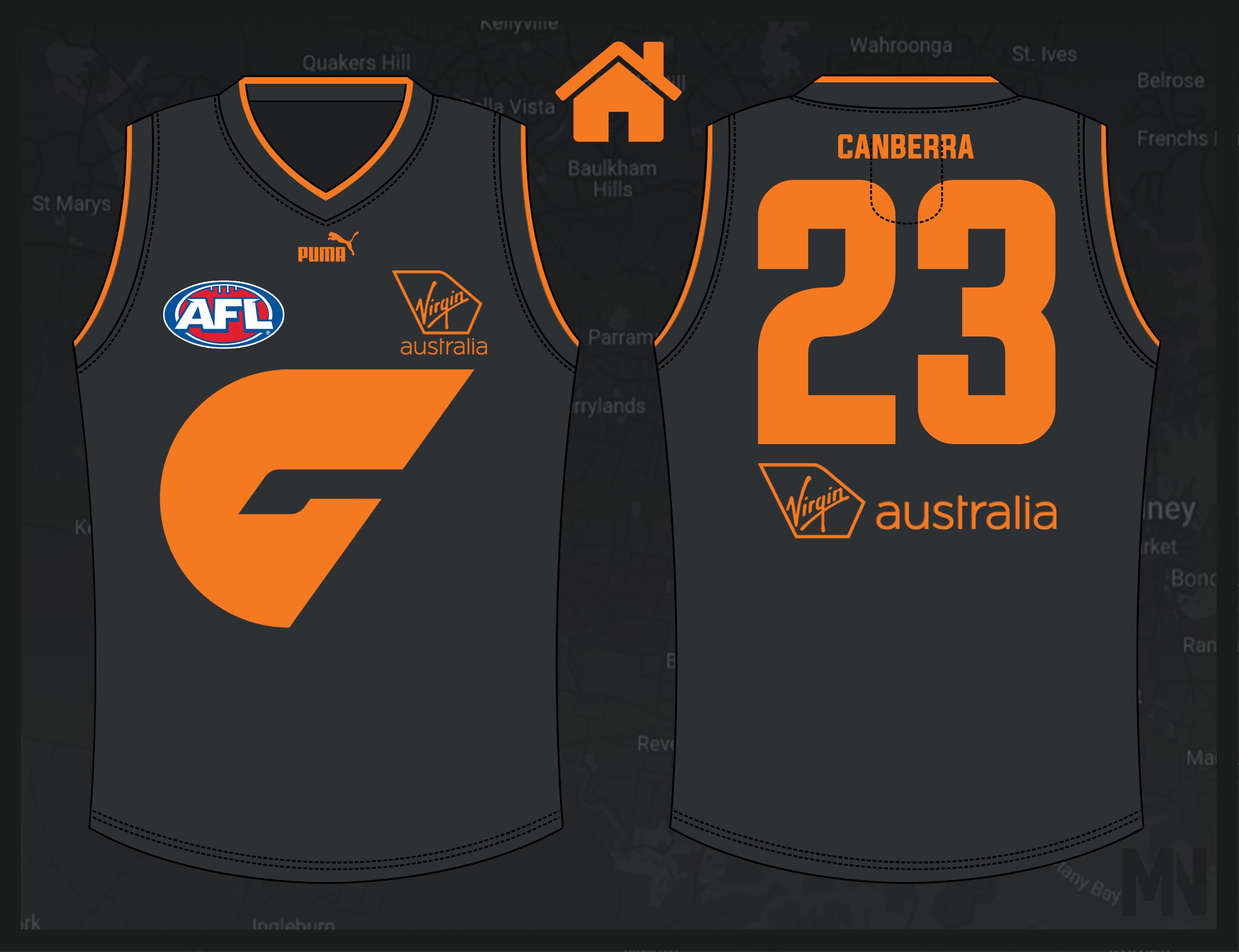
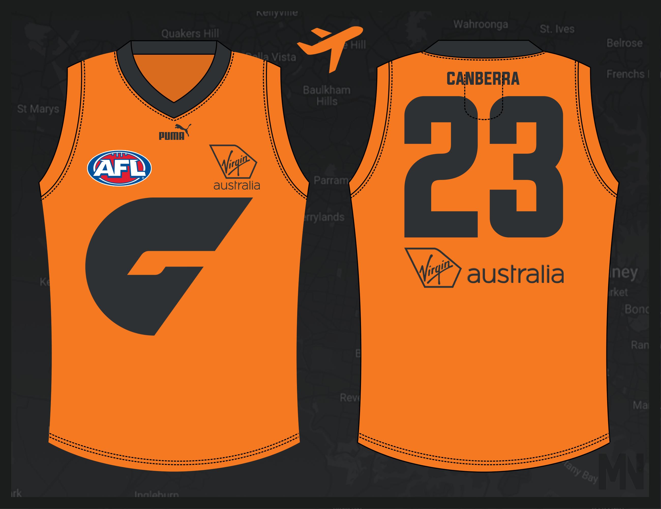
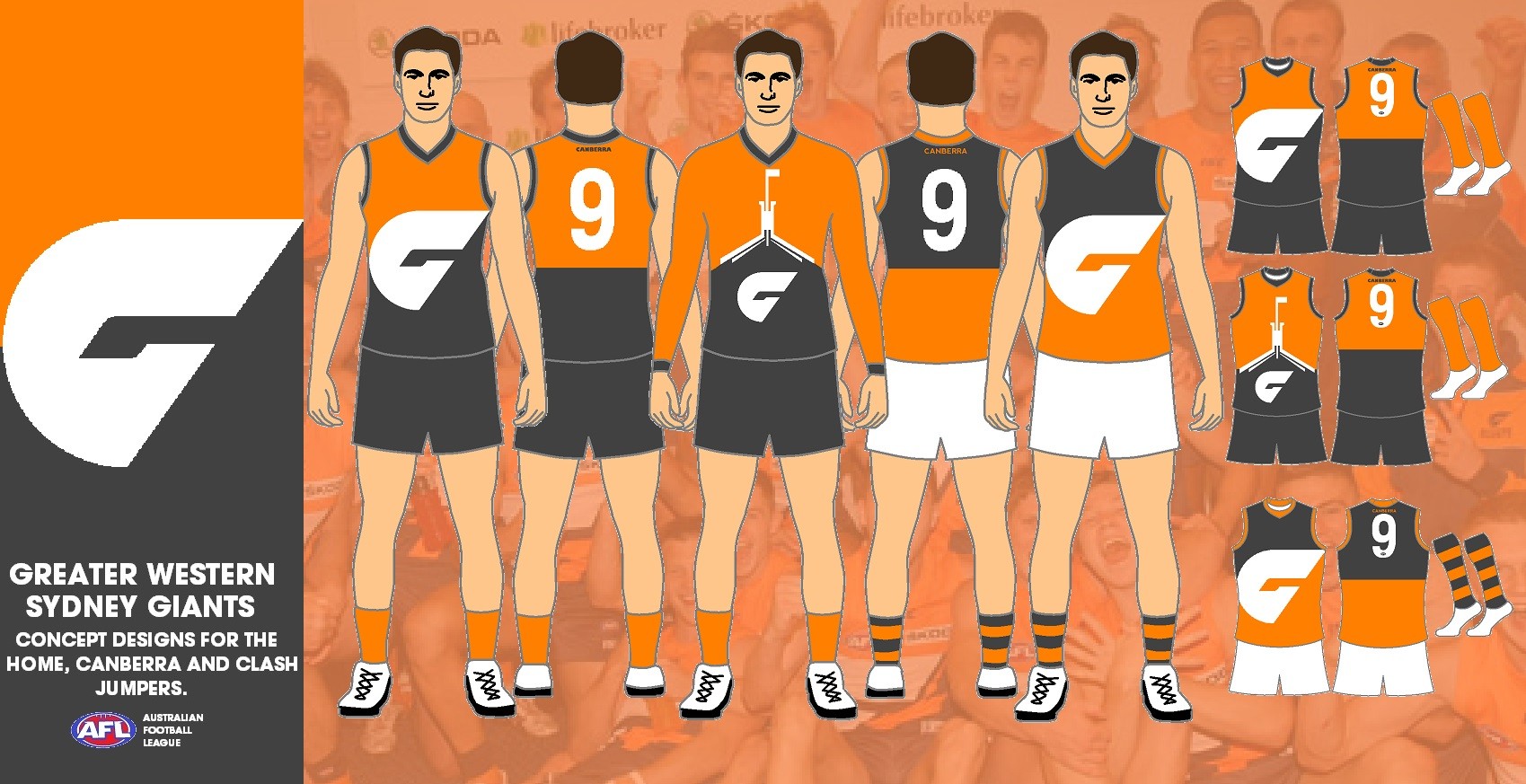
Given recent chatter over the state of the GWS kit, I thought it'd be fitting to centralise discussion here.

Keeping with the same vein as the Gold Coast thread, feel free post your designs and thoughts on the GWS jumper and identity as a whole.
 
If GWS are going to go down the path of a more simplified jumper like the one we saw them wear last night, then features such as cuff trims will go a long way in adding a bit more flavour. As you can see below just a minor change like that can make a world of difference. As for the clash, an all orange jumper is the obvious move. To make it feel less like it's just a logo slapped onto a jumper, a charcoal collar and perhaps cuffs can balance it out.

8Y9MZ1N.jpg
CHXF8ax.jpg
 
I actually like the home kit they use, with the off centre G. I don't mind the idea of a derby kit and the orange clash kit (which they probably will only wear in the vfl this season); just needs use the G to their advantage, like the ones done by magpienato
 

Log in to remove this ad.

PQpRXmE.jpg


Use the KISS method, Keep It Simply Stupid. Have the jumper used by the club for most of their games but simplify it a bit. An orange jumper cut by the Giant G with a charhol lower, below the cut. The Back will be half orange and half charhol. For the clash jumper it would simply be the opposite, a charhol jumper cut by the Giant G with a orange lower. The Canberra jumper would be Parliament House of the front, with the same as the home back. Making changes is the problem, solve it by keeping the same jumper.
 
Garry Lyon and Tim Watson threw the Giants jumper huge praise this morning on SEN. Watson believed the jumper they wore against the Swans should have some white in it, just a little bit.
I put this in the jumper ideas thread a while back, it would still be neat (even if the edit is a bit dirty)

1618789047378.png
 
Greater-Western-Sydney.png
I'm still a big fan of the offset G, a more modern take on the traditional yoke than what they have moved to this year. Modified set to what I came up with for them a few years back, this time with a charcoal derby guernsey if they want to go down that road.
 
View attachment 1107101
I'm still a big fan of the offset G, a more modern take on the traditional yoke than what they have moved to this year. Modified set to what I came up with for them a few years back, this time with a charcoal derby guernsey if they want to go down that road.
Aaaaaa i loved this design (and really the whole portfolio)

(where was it again I'm trying to find it)
 

(Log in to remove this ad.)

Aaaaaa i loved this design (and really the whole portfolio)

(where was it again I'm trying to find it)
It was at the end of one of the jumper ideas for ____ threads, 2018 or 2019 I reckon.
 
View attachment 1107101
I'm still a big fan of the offset G, a more modern take on the traditional yoke than what they have moved to this year. Modified set to what I came up with for them a few years back, this time with a charcoal derby guernsey if they want to go down that road.
Curve the right side of the yoke to match the left and continue the G onto the side/back and that would be the ideal jumper set. It’s a perfect balance of modern and traditional whilst being unique in the AFL.
 
View attachment 1107101
I'm still a big fan of the offset G, a more modern take on the traditional yoke than what they have moved to this year. Modified set to what I came up with for them a few years back, this time with a charcoal derby guernsey if they want to go down that road.

Big fan of the two-tone derby jumper. Keeps the yoke design while maintaining the solid colour look.
 
Big fan of the two-tone derby jumper. Keeps the yoke design while maintaining the solid colour look.
Cheers, I based it off their coaches' polo which uses a similar scheme (albeit with black rather than dark grey which doesn't really go with the cooler charcoal).
 

Remove this Banner Ad

Back
Top