cannavo
LFG #16
Ladies and Gentlemen........
For too long, we have witnessed the horrors football jumpers can produce
This stops now!

Each week a jumper that has been seen as bad, horrible, shocking or the general consensus isn't fond of
will get a makeover while keeping its certain themes.
Next under the knife is

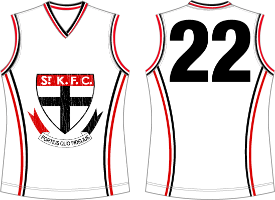
St Kilda 2008 Clash Jumper
(a.k.a The cracking logo)
Main Theme: White Base with Red and Black
Secondary: Use of the club logo
For too long, we have witnessed the horrors football jumpers can produce
This stops now!

Each week a jumper that has been seen as bad, horrible, shocking or the general consensus isn't fond of
will get a makeover while keeping its certain themes.
Next under the knife is

St Kilda 2008 Clash Jumper
(a.k.a The cracking logo)
Main Theme: White Base with Red and Black
Secondary: Use of the club logo
RULES
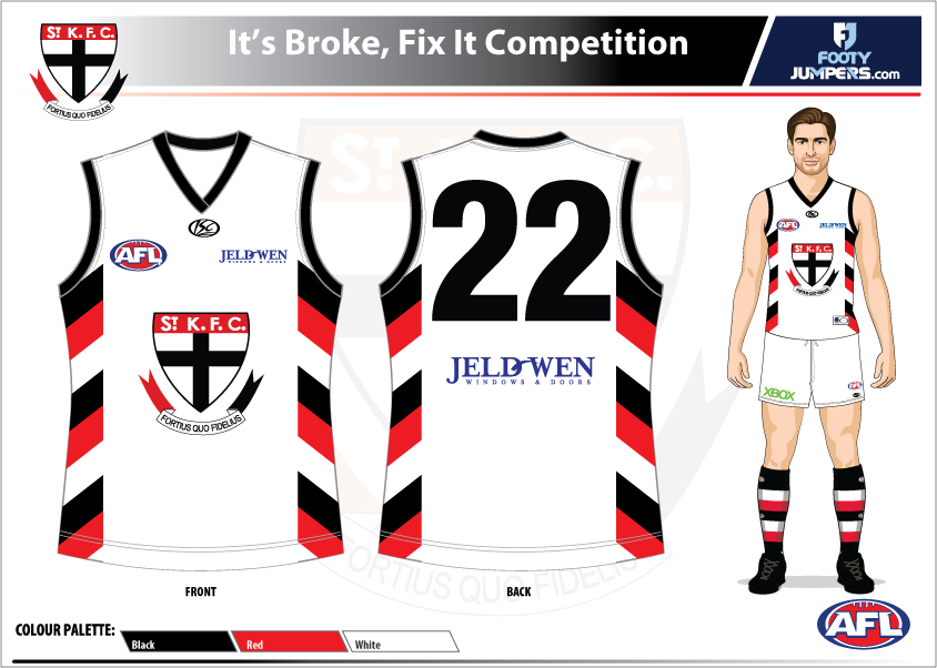
- Entries must include 1 jumper front and back (Shorts and Socks optional)
- You must keep at least 1 theme coming from the jumper
- eg. Hawthorns diamond jumper must include diamonds
- St Kildas yellow jumper must promote Pura light milk by keeping a yellow base etc.
- You cannot copy any past designs from the club
- Taking elements are allowed
- Maximum 2 Entries
- Any other questions, please ask.
NOTE: The quote "It's broke, Fix it" can mean "What's your take on this?"
List of jumpers with links
Links updated!
Past Results
- Week 1 - Hawthorn Diamond
- Week 2 - St Kilda Pura Light Start Yellow Away
- Week 3 - Carlton M&M
- Week 4 - Western Bulldogs Ballarat
- Week 5 - West Coast OCHRE
- Week 6 - Fremantle Tripanel
- Week 7 - Port Adelaide Gradients + Lightning
- Week 8 - Brisbane Piss Stain
- Week 9 - Collingwood Barcode
- Week 10 - Hawthorn Kokoda
- Week 11 - Richmond Silver Top Taxi
- Week 12 - Melbourne Pink Lady
- Week 13 - Hawthorn T-shirt
- Week 14 - Western Bulldogs Origin
- Week 15 - Hawthorn "Modern" Clash
- Week 16 - Adelaide Toothpaste
- Week 17 - St Kilda 2008 Clash In Progress
Jumpers to be done
- Adelaide Hawk
- Brisbane Funnel
- Brisbane Lionside
- Essendons Shade Of Grey
- Geelong Tramp Stamp
- Geelong Gradient Hoops
- Gold Coast Wave
- Hawthorn Flying Hawk Clash
- Melbourne 2015 Clash
- North Melbourne Logo With Wavy Lines + (Inverse for show)
- Port Adelaide Gradient Stripes
- Richmond Logo with wavy lines
- West Coast 2010 Protruding Head Clash
Last edited:


