Navigation
Install the app
How to install the app on iOS
Follow along with the video below to see how to install our site as a web app on your home screen.
Note: This feature may not be available in some browsers.
More options

You are using an out of date browser. It may not display this or other websites correctly.
You should upgrade or use an alternative browser.
You should upgrade or use an alternative browser.
Opinion International Geopolitics
- Thread starter Holden Hillbilly
- Start date
- Tagged users None
- Nov 6, 2014
- 60,831
- 74,788
- AFL Club
- Port Adelaide
FMD Oliver Stone?? Good try Mickey and no surprise that you posted it. You have shown before your pro Putin stance and weakness for his propaganda as happens with many MAGA.
Last edited:
Just another "embarrassed" vatnik trying to justify genocide.FMD Oliver Stone?? Good try Mickey and no surprise that you posted it. You have shown before your pro Putin stance and weakness for his propaganda as happens with many MAGA.
- Jul 26, 2020
- 11,460
- 31,857
- AFL Club
- Port Adelaide
Oliver Stone is bad now? When did that happen?
bomberclifford
Importer/Exporter
Oliver Stone is bad now? When did that happen?
He probably liked the wrong person's tweet.
Last edited:
He did a series of interviews with Putin a few years back. Probably the closest any westerner has got to Putin. I think they were on SBS a few years ago. I remember watching bits and pieces of them.
 www.theguardian.com
..........The last time the Guardian US profiled Stone, he had just completed a strangely sympathetic 4 hour-long documentary about Vladimir Putin (at the time he said “the Russian people have never been better off”). Have his feelings about the Russian leader changed in the especially troubling years since? “I think Russia is doing a great job with nuclear energy,” he says after a moment’s thought. “China is also a leader in that field, although I never was able to penetrate into China, which was a shame for the movie I wish we had. But Putin is a great leader for his country and the people love him.” And that is as far as he is willing to go. He’s gone far enough already......
I mean it is the Guardian, so bias drips from every word, but this would probably explain the cucktoid outrage.
Oliver Stone: ‘Putin is a great leader for his country’
The firebrand director talks about his new documentary on nuclear power, his distaste for Joe Biden and his continued support of the Russian president
..........The last time the Guardian US profiled Stone, he had just completed a strangely sympathetic 4 hour-long documentary about Vladimir Putin (at the time he said “the Russian people have never been better off”). Have his feelings about the Russian leader changed in the especially troubling years since? “I think Russia is doing a great job with nuclear energy,” he says after a moment’s thought. “China is also a leader in that field, although I never was able to penetrate into China, which was a shame for the movie I wish we had. But Putin is a great leader for his country and the people love him.” And that is as far as he is willing to go. He’s gone far enough already......
I mean it is the Guardian, so bias drips from every word, but this would probably explain the cucktoid outrage.
- Nov 6, 2014
- 60,831
- 74,788
- AFL Club
- Port Adelaide
Insane
- Nov 6, 2014
- 60,831
- 74,788
- AFL Club
- Port Adelaide
Haha oops that was a bad slip up wasn’t itOliver Stone is bad now? When did that happen?

- Jul 26, 2020
- 11,460
- 31,857
- AFL Club
- Port Adelaide
Haha oops that was a bad slip up wasn’t it
No?
Portology
Premium Platinum
An entire course in… so many things…in one little series of tweets.
On iPhone using recycled electrons, via BigFooty.com mobile app
On iPhone using recycled electrons, via BigFooty.com mobile app
- May 20, 2019
- 11,555
- 32,669
- AFL Club
- Port Adelaide
- Other Teams
- PAFC Maggies SANFL, ASU Sun Devils
An entire course in… so many things…in one little series of tweets.
On iPhone using recycled electrons, via BigFooty.com mobile app
Excellent thread.
Sadly most of the people who should read and understand what it says about misrepresentation of data won't be bothered reading beyond the first tweet.
And that E.Musk in a single line response to the original misrepresentation of data demonstrates he is incapable of critical analysis of 'odd' data tells its own story.
As you say - a lesson in many parts.
- Mar 1, 2014
- 13,942
- 17,609
- AFL Club
- Port Adelaide
- Other Teams
- Cronulla Sutherland Sharks
The question has probably been posed before but, what sort of country has a legal system in which someone can be found guilty of a sexual offence in a civil court and not face criminal charges? Trump is found guilty in a jury trial but not guilty enough to charge. Trump will settle out of court and the plaintiff will take the money and then Trump will go on and gladly accept the Republican nomination. In the US if you are rich enough you can get away with anything.

 www.abc.net.au
'Today the world finally knows the truth': E Jean Carroll sexually abused by Donald Trump, civil jury finds
Donald Trump is found liable for sexual abuse, but not rape, in a civil trial brought by writer E Jean Carroll, who accused the former US president of raping her in the mid-1990s.
www.abc.net.au
Mikey13G
Club Legend
Excellent thread.
Sadly most of the people who should read and understand what it says about misrepresentation of data won't be bothered reading beyond the first tweet.
And that E.Musk in a single line response to the original misrepresentation of data demonstrates he is incapable of critical analysis of 'odd' data tells its own story.
As you say - a lesson in many parts.
In summary the graph is entirely accurate but the author doesn't like the data!
Schulzenfest
TheBrownDog
Pretty much all of the legal systems.The question has probably been posed before but, what sort of country has a legal system in which someone can be found guilty of a sexual offence in a civil court and not face criminal charges?
- Nov 6, 2014
- 60,831
- 74,788
- AFL Club
- Port Adelaide
Chortle
Mikey13G
Club Legend
An entire course in… so many things…in one little series of tweets.
On iPhone using recycled electrons, via BigFooty.com mobile app
It's a graph on interracial violence and it shows that blacks commit violence against other races at a disproportionately high rate. The fact that intra-racial violence is much higher is irrelevant. He's a data scientist that is ignoring the data and focusing on 'underlying causes'.
The point of the graph Musk retweeted is to point out that the interracial crime the media shoves down our throats is the least likely to occur.
Last edited:
It's a graph on interracial violence and it shows that blacks commit violence against other races at a disproportionately high rate. The fact that intra-racial violence is much higher is irrelevant. He's a data scientist that is ignoring the data and focusing on 'underlying causes'.
The point of the graph Musk retweeted is to point out that the interracial crime the media shoves down our throats is the least likely to occur.
The point is musk is a giant piece of s**t troll who spends his time trying to stir up RWNJs like yourself on twitter.
Which is pretty much the entire way the media works and has for ages.It's a graph on interracial violence and it shows that blacks commit violence against other races at a disproportionately high rate. The fact that intra-racial violence is much higher is irrelevant. He's a data scientist that is ignoring the data and focusing on 'underlying causes'.
The point of the graph Musk retweeted is to point out that the interracial crime the media shoves down our throats is the least likely to occur.
They don't report news and then that news creates a narrative. They create a narrative and then handpick the stories that will fit that narrative. It applies to pretty much every push they've had since news media began.
TRUMP-SANTOS 2024
- May 20, 2019
- 11,555
- 32,669
- AFL Club
- Port Adelaide
- Other Teams
- PAFC Maggies SANFL, ASU Sun Devils
If you bothered to read the full discussion and made even a small attempt to understand it you will see that the author, a qualified data scientist, has zero problems with the data. Their issue is how the data has been manipulated in a graphic form to produce an inaccurate impression - an impression and conclusion in relation to the incidence of black on white crime that, surprise surprise, you have repeated.In summary the graph is entirely accurate but the author doesn't like the data!
Here is the original data on which that graph was based:
\
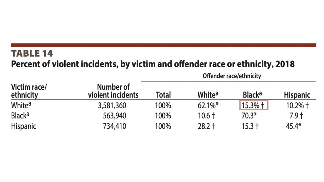
As the data scientist highlighted, it communicates clearly the fact that the rates at which white victims experience violent crime involving black offenders is very similar to the overall percentage of black people in the US population (14.6%). Which is NOT the perception immediately gleaned from the (carefully constructed to suit a particular narrative) bar chart.
There are other misconceptions that the data scientist highlights in his series of tweets that are worth reading to get a full picture of how graphic presentations can lead to false conclusions and, worse, used for disingenuous or nefarious reasons by media outlets and actors to promote a particular narrative.
But, as I said in my previous comment, the people who really need to go back and read the full series of tweets to understand the incorrect messaging being presented or at least inferred from that colourful bar chart don't have the capacity or desire to do so.
Mikey13G
Club Legend
If you bothered to read the full discussion and made even a small attempt to understand it you will see that the author, a qualified data scientist, has zero problems with the data. Their issue is how the data has been manipulated in a graphic form to produce an inaccurate impression - an impression and conclusion in relation to the incidence of black on white crime that, surprise surprise, you have repeated.
Here is the original data on which that graph was based:
\

As the data scientist highlighted, it communicates clearly the fact that the rates at which white victims experience violent crime involving black offenders is very similar to the overall percentage of black people in the US population (14.6%). Which is NOT the perception immediately gleaned from the (carefully constructed to suit a particular narrative) bar chart.
There are other misconceptions that the data scientist highlights in his series of tweets that are worth reading to get a full picture of how graphic presentations can lead to false conclusions and, worse, used for disingenuous or nefarious reasons by media outlets and actors to promote a particular narrative.
But, as I said in my previous comment, the people who really need to go back and read the full series of tweets to understand the incorrect messaging being presented or at least inferred from that colourful bar chart don't have the capacity or desire to do so.
- Nov 6, 2014
- 60,831
- 74,788
- AFL Club
- Port Adelaide
Oh Mikey, you didnt read…. or understand…. the whole thing at all, did you.It's a graph on interracial violence and it shows that blacks commit violence against other races at a disproportionately high rate. The fact that intra-racial violence is much higher is irrelevant. He's a data scientist that is ignoring the data and focusing on 'underlying causes'.
The point of the graph Musk retweeted is to point out that the interracial crime the media shoves down our throats is the least likely to occur.
Mikey13G
Club Legend
The original graph was comparing interracial violence and white on white is not interracial violence. You and Festerz are unbelievably dense and or disingenuous.Oh Mikey, you didnt read…. or understand…. the whole thing at all, did you.
Last edited:
Oh Mikey, you didnt read…. or understand…. the whole thing at all, did you.
He understands, he just hates blacks.
