

Malibu#27
Premium Platinum

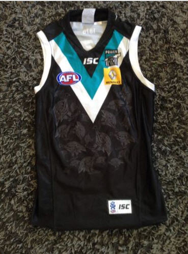
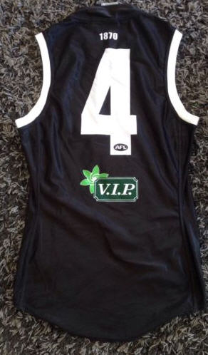
From an ISC error. Looks good, needs the collar to be white though. Add in a number panel, get rid of the emus, and you've got yourself a proper away* kit.
*Not clash. Away.
I absolutely hate that Guernsey.
I reckon we currently have a brilliant pair of guernseys. Why change something that is already pretty damn good. Look forward - not back (we have the prison bars for that ... The best nod to the prison bars is the prison bars ... Keep it special).

