Gratees
Club Legend
- Jul 15, 2019
- 1,944
- 4,015
- AFL Club
- Richmond
I agree, I actually kinda think its overratedeveryone keeps saying bring in the Grey, IT WON'T HAPPEN, IT'S NOT A GOOD HOME JUMPER. IT'S A GOOD CLASH THO
Follow along with the video below to see how to install our site as a web app on your home screen.
Note: This feature may not be available in some browsers.
I agree, I actually kinda think its overratedeveryone keeps saying bring in the Grey, IT WON'T HAPPEN, IT'S NOT A GOOD HOME JUMPER. IT'S A GOOD CLASH THO
This could probably just be moved to the Jumper Ideas thread but seeming it's slightly on topic.
View attachment 1220380 View attachment 1220379
Yea your right on that, they just changed the G to the middle. But I hope they will adapt on that with a full white and guernsey, orange cuffs and numbers, and a orange G.The indiginous kit is the only kit with white but that was designed last year? I think 2020
THAT THIRD IS FIRE
Kind of like the WSW?I love the throwback red collar on the Bulldogs strip.
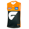
Considering people seem to love the Never Surrender as the Giants home jersey despite the lack of orange, could a classic old school orange collar spice it up a bit? But like... An ACTUAL collar. (Or not an actual one, either/or).
The Adelaide mid-00's red clash has always been associated with floggings
Is wear they did also change the vividness of the orange as well i think. Footyjumpers doesn't reflect it, but merch does a bit (although this could be just the photos):Yea your right on that, they just changed the G to the middle. But I hope they will adapt on that with a full white and guernsey, orange cuffs and numbers, and a orange G.


It's just the photo, I've got a 2020 jersey and it's a light orange like the 2021 home merch pictureIs wear they did also change the vividness of the orange as well i think. Footyjumpers doesn't reflect it, but merch does a bit (although this could be just the photos):
eg.
View attachment 1222366View attachment 1222367
I tried to find in-game shots from 2019 and this year, but they're not 100% conclusive as i couldn't find exact same lighting conditions etc
2021 vs 2019
View attachment 1222381 View attachment 1222383
That'll be more the brand/materials/lighting again, rather than a different shade. Blacks and grays are notoriously annoying to get consistent.Also the charcoal on the old jumper seemed a weird lighter nearly blueish grey unlike the charcoal like the Never Surrender jumper
I don't mind the centered G as well if it was slightly larger and more prominent. The only reason I like having the G to the side is because it creates a sort of yoke design, which I'm always a sucker for.I like this idea. I'm a big fan of the idea of just doing away with white as a feature of their jumpers. it's not necessary, it's not like Carlton who need a second colour for their monogram and numbers, GWS have two unique colours that contrast well.
But I also like the centred G, so could go either way
It looks more like a 'German Grey' on TV than the charcoal seen on the GWS store. This would be an issue with the material and lighting.Also the charcoal on the old jumper seemed a weird lighter nearly blueish grey unlike the charcoal like the Never Surrender jumper
yea it isn't a true charcoal. Also the side design is nice but the weird side panels make me cryIt looks more like a 'German Grey' on TV than the charcoal seen on the GWS store. This would be an issue with the material and lighting.
Always thought that if the Saints won the '97 flag, they'd still be wearing the Crusader.

Just an idea I had for a black-based Crusader. Probably more suitable as a home kit.This 100%.
It also didn't help that the jumper cuts themselves around the time were quite boxy and made it look pretty clunky pretty quickly (this is from 1999).
View attachment 1222999
I think if the recent 2017-19 clash was filled out with the full design it would look very bold (the proportions for the Riewoldt 300th one-off in 2016 were botched a little by ISC).
As well as being an excellent jumper, the candy stripe design of 2004-06 remains such a favourite for the additional reason that the 2004 and (eventually) the 2005 seasons were so enjoyable.

I agree not enough orange on itI like the 'never surrender' jumper (I did not know it was called that) a lot, but feel like it needs a bit more orange.
I think some thin orange stripes down the sides and orange cuffs/collar would look good.
Thicker outline on the G maybe?I agree not enough orange on it
Interesting that the Giants are wearing the never surrender guernsey against the cats
