Workshop Jumper Ideas for 2017

Remove this Banner Ad

Status
Not open for further replies.
Like this? Unfortunately I couldn't find all the sponsor vectors.

vyYwacD.png


Bit better.
Massive improvement on the tri-panels.

A few things to improve:

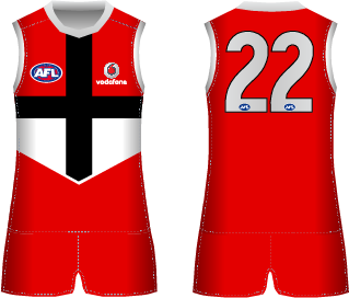
Black shorts.
Black back of guernsey.
White box for Bill Express logo.
Old X-Box logo on the shorts.
Use Mero's template.

One final comment.
Look forward to more of your work.
 
Moving away from the Gold Coast discussion, I've been pretty keen on this idea for a while as our away jumper (particular after Cody_ 's jumper lost out in the clash jumper competition).

Our brown inverse is good, but with the club seemingly keen on promoting the HFC monogram, 2017 would be a great chance to bring back our inaugural jumper in the VFL/AFL.

1.png 2.png

The first is essentially what we wore in heritage round 2003/4 (both times with white shorts), plus I chucked in a version with the V on the back like the original 1925 jumper which I reckon would be a pretty distinctive look in the league
 

Log in to remove this ad.

I think any monogram that comes out now should also be ultra unique. Being in a circle, the actual initials themselves could be anything. The words just complicate it on the jumper, so I'd keep the wordmark to other merchandise. If you remove the circle though you end up losing the structure and rigidity (which you need). I just think the current look would end up being blurry from even a mid-shot (ie the ones you get of packs).
Could you simply remove the yellow outer-part of the circle (with the wording) but leave the red center circle?
 
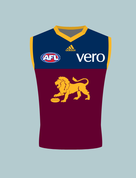
I'm giving my new template a test drive with some 2017 ideas.

First up is Brisbane's home. BLK's washed out colours has me wanting to go to the other side of the spectrum, and bring back Fitzroy's old navy and deeper maroon.

ET8xA4u.png


PS ignore the Adidas logo, it's going to be on all of my designs regardless.
 
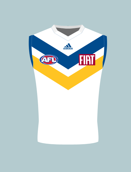
And now for something completely different. A little while ago I went on a rant about how s**t Gold Coast's branding is, and how they need a reset. Well, here goes.

Gold Coast Suns home jumper, mk ii

h7xJiMh.png
 
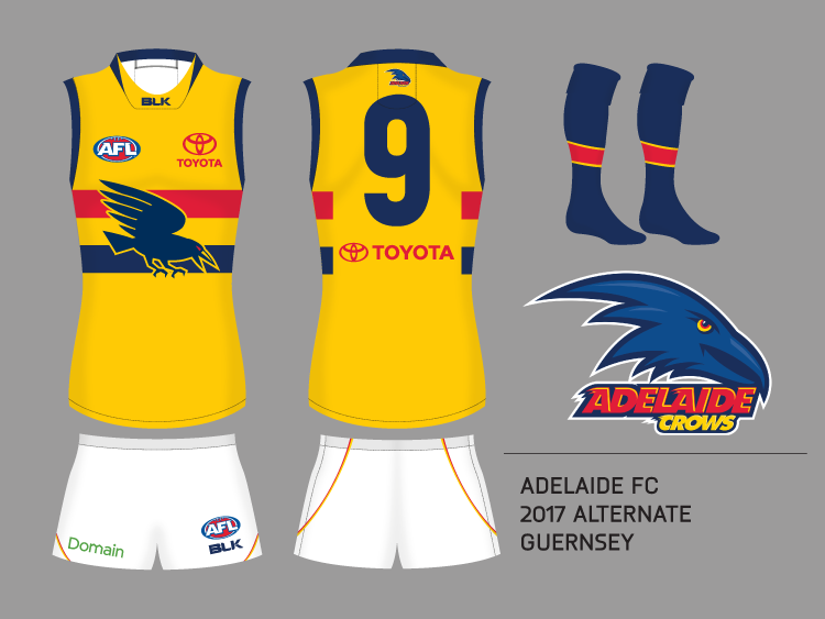
About as realistic as Freo bringing back the anchor but I would love to see the classic crow make a comeback on the yellow kit. I am not a big fan of the yellow hoop in-between the red and navy and think that this fills the space nicely. Also had a go at the new BLK collar on my shaded template, rather than making it unshaded and having to go back and do it later.
WwC6Q4U.png
 

(Log in to remove this ad.)

About as realistic as Freo bringing back the anchor but I would love to see the classic crow make a comeback on the yellow kit. I am not a big fan of the yellow hoop in-between the red and navy and think that this fills the space nicely. Also had a go at the new BLK collar on my shaded template, rather than making it unshaded and having to go back and do it later.
WwC6Q4U.png
This. Looks less 'piss stained Bulldogs' and more Adelaide.
 
We wouldn't be playing Sydney in it.
That much is obvious.
IMO it would just be a quantum leap in the wrong direction to tamper with an existing strip of ours and turn into something that in the end looks exceedingly similar to another team's existing home strip.

Red shorts have never been part of St Kilda's strips, why start now?
 
Last edited:
And now for something completely different. A little while ago I went on a rant about how s**t Gold Coast's branding is, and how they need a reset. Well, here goes.

Gold Coast Suns home jumper, mk ii

h7xJiMh.png

I reckon thats a great North Melbourne-Southport merger "Gold Coast Kangaroos" concept.

About as realistic as Freo bringing back the anchor but I would love to see the classic crow make a comeback on the yellow kit. I am not a big fan of the yellow hoop in-between the red and navy and think that this fills the space nicely. Also had a go at the new BLK collar on my shaded template, rather than making it unshaded and having to go back and do it later.
WwC6Q4U.png

My personal preference is to keep any logos off the front of our jumpers, but its interesting how putting the logo there actually highlights the yellow hoop in the middle more - as in, it makes it look more like an actual hoop. The crow seems to tie the three hoops together as a single design element on top of a gold jumper, unlike the current design which can sometimes just look like a single red and navy hoop on a gold background, meaning the gold hoop disappears. Works well.
 
Status
Not open for further replies.

Remove this Banner Ad

Back
Top