- Jun 18, 2016
- 51,629
- 98,969
- AFL Club
- West Coast
- Other Teams
- Perth Scorchers
Yellow jumper with red shorts would work and keeps to the lifesaver theme.View attachment 288201
Yeah it really doesn't work very well.
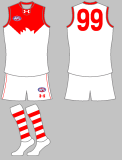
Here the inverse:
View attachment 288267
Just as horrid as I thought looks like a rejected outfit for Ronald McDonald