lmach
Naitanui2Yeo
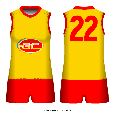
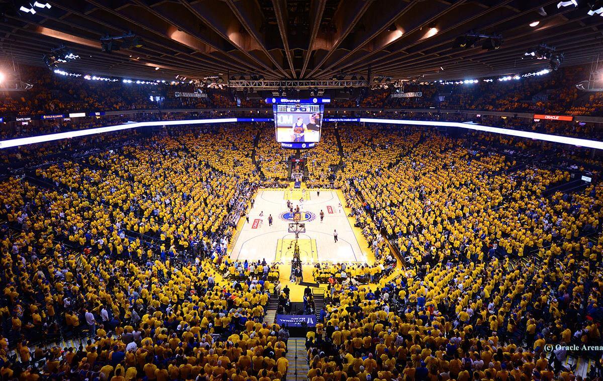
What about a predominately gold home kit for the Suns (gold jumper, blue/red shorts and socks)? I like what Dylan8 suggested - a gold and blue clash kit similar to Arsenal - but a gold home kit would be fairly unique to the league as they would be only second to Hawthorn. It would have to be two-colour though, no gold/blue/red rubbish. Imagine a stadium full of gold if they start getting decent crowds.

I know gold and blue might look like West Coast in the yellow peril, but I wouldn't mind. Plenty of teams have the same or similar colours. A gold home jumper would also mean the opposition can wear their home kit in most cases, plus Gold Coast would barely ever clash with another team when playing away.
I know gold and blue might look like West Coast in the yellow peril, but I wouldn't mind. Plenty of teams have the same or similar colours. A gold home jumper would also mean the opposition can wear their home kit in most cases, plus Gold Coast would barely ever clash with another team when playing away.
Last edited: