- Moderator
- #1,601
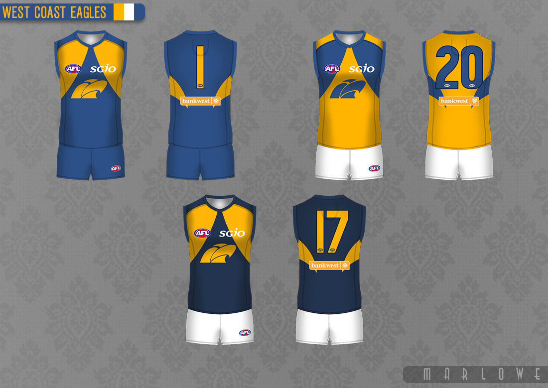
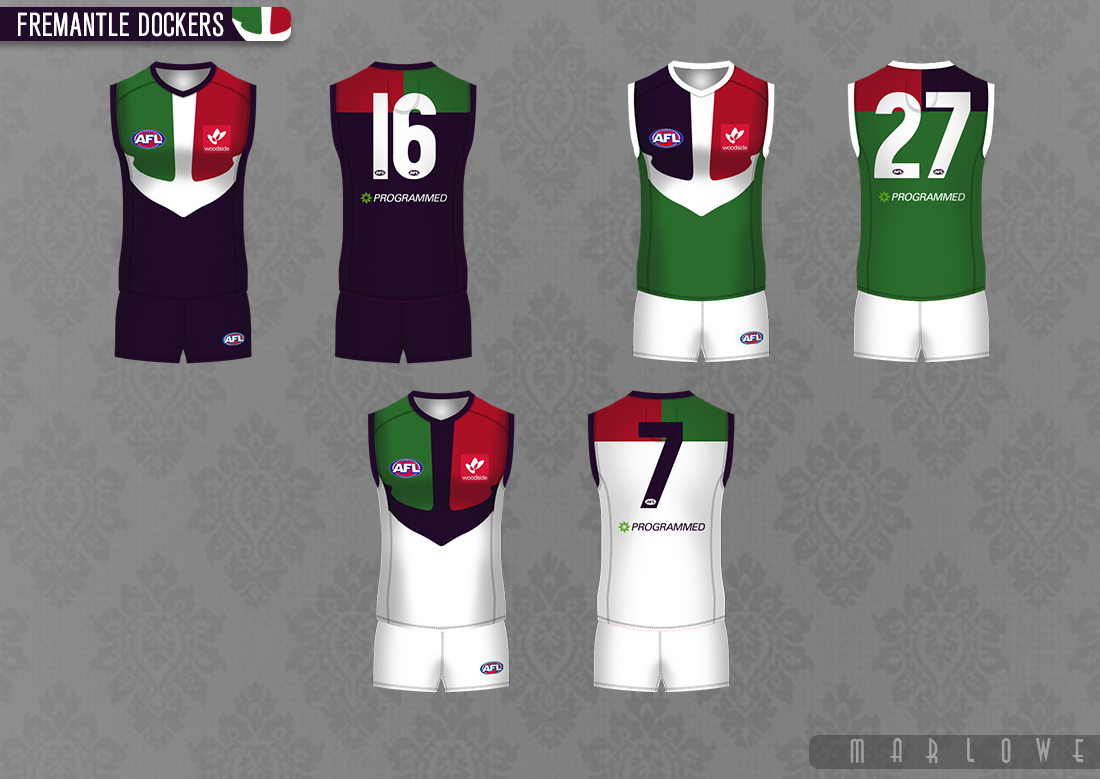
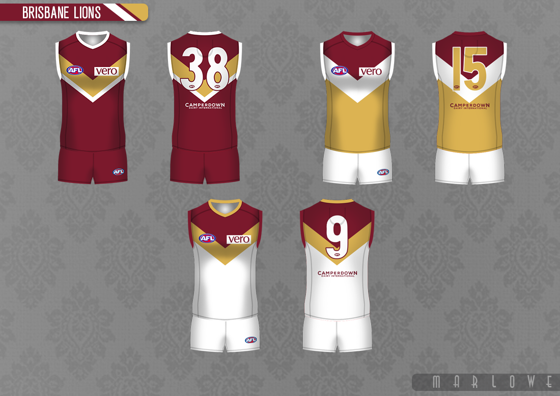
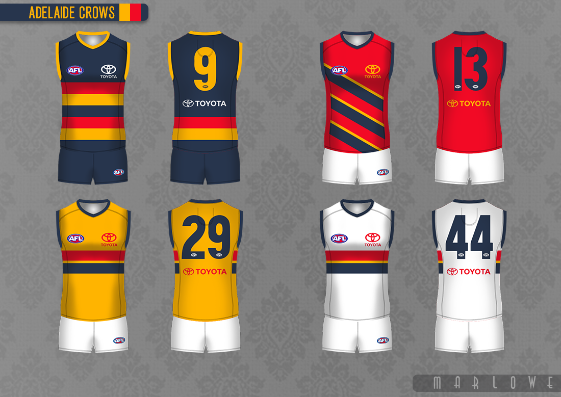
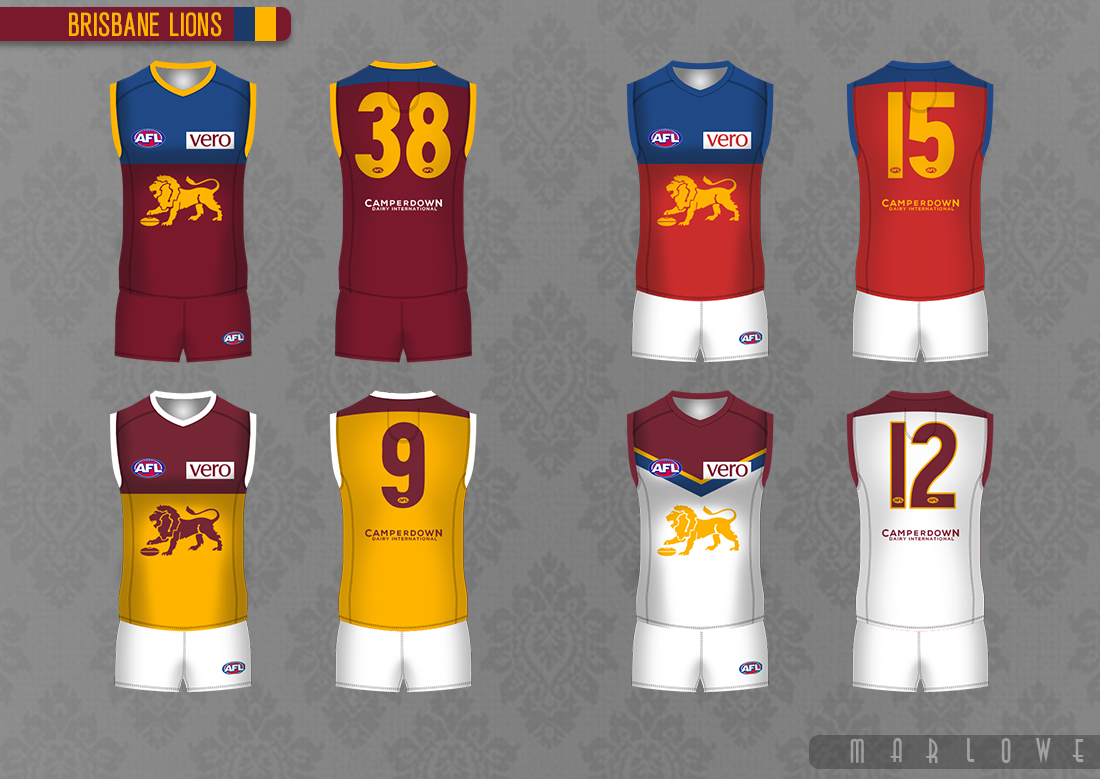
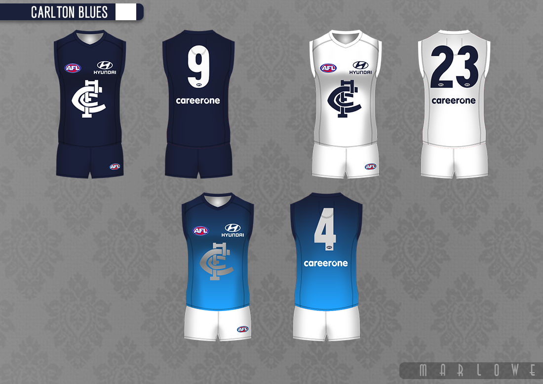
Program is paint.
Tutorial for making jerseys in paint: https://www.bigfooty.com/forum/threads/the-microsoft-paint-word-tutorial.660776/
This tutorial and its elements are over seven years old; I would politely suggest there are better options available now.

")