Navigation
Install the app
How to install the app on iOS
Follow along with the video below to see how to install our site as a web app on your home screen.
Note: This feature may not be available in some browsers.
More options


You are using an out of date browser. It may not display this or other websites correctly.
You should upgrade or use an alternative browser.
You should upgrade or use an alternative browser.
Workshop Jumper Ideas for 2019
- Thread starter Silent Alarm
- Start date
- Tagged users None
- Status
- Not open for further replies.
thanks mate! would hope the club to eventually move away from the logo on the front, so maybe something like this instead?Be the perfect home kit. Looks bloody good exile.
either way, looks a bit more unique compared to what we've got currently.

Zoops
Club Legend
- Apr 20, 2017
- 1,406
- 5,414
- AFL Club
- Melbourne
- Other Teams
- Vancouver Canucks, Southampton FC
Ever since Melbourne introduced the new logo in 2016 I have not grown to like it. It puts us out to be the club of Melbourne instead of the Demons. I want to see the old logo re-introduced.
Melbourne
Home: Worn Home vs Everyone.
Away: Worn Away vs Collingwood, Geelong, Gold Coast, GWS, Hawthorn, North Melbourne, Richmond, Sydney, Western Bulldogs.
Clash: Worn Away vs Worn Away vs Adelaide, Brisbane, Carlton, Essendon, Fremantle, Port Adelaide, St. Kilda, West Coast.
Preseason: Worn During Preseason. Could Also Be A Training Jumper.
Fizzler
BBTB
- Dec 26, 2013
- 12,770
- 16,360
- AFL Club
- Port Adelaide
- Other Teams
- OKC, Coburg, Werribee, Storm, QPR
I'd love to see that demon incorporated onto the current shield. Would look awesome I reckon.Ever since Melbourne introduced the new logo in 2016 I have not grown to like it. It puts us out to be the club of Melbourne instead of the Demons. I want to see the old logo re-introduced.
Melbourne
Home: Worn Home vs Everyone.
Away: Worn Away vs Collingwood, Geelong, Gold Coast, GWS, Hawthorn, North Melbourne, Richmond, Sydney, Western Bulldogs.
Clash: Worn Away vs Worn Away vs Adelaide, Brisbane, Carlton, Essendon, Fremantle, Port Adelaide, St. Kilda, West Coast.
Preseason: Worn During Preseason. Could Also Be A Training Jumper.
View attachment 542882
- May 25, 2009
- 4,014
- 2,765
- AFL Club
- Port Adelaide
I'd love to see that demon incorporated onto the current shield. Would look awesome I reckon.


The demon is just a quick trace job but you get the idea
lol god noView attachment 542932 View attachment 542933
The demon is just a quick trace job but you get the idea
Melbourne's move away from Demons to FC is great and the logo is one of the strongest in the league.
- Jul 13, 2017
- 4,773
- 8,743
- AFL Club
- West Coast
- Other Teams
- West Coast Wonders, West Perth
Gotta agree with that. It's much cleaner now than it ever has been.lol god no
Melbourne's move away from Demons to FC is great and the logo is one of the strongest in the league.
- May 25, 2009
- 4,014
- 2,765
- AFL Club
- Port Adelaide
Demons is alright and the logo would be top 3 but I couldnt/cant sleep so I figured I may as well see what it looks like and there we go.lol god no
Melbourne's move away from Demons to FC is great and the logo is one of the strongest in the league.
- Jul 9, 2010
- 24,163
- 26,536
- AFL Club
- Fremantle
- Thread starter
- #659
This is a decent example of a solid secondary logo that can be used for I guess more kid's merchandise, that sort of thing.
The Melbourne logo isn't bad, pretty simple, but it's been ripped off by Casey and Glenelg so it's gotten that sort of template look to it now.
I like the idea of them focusing on being 'Melbourne' though. Red socks, simple jumper, wearing that classic jumper as much as possible. It's a *in great set of colours and an awesome strip and even now they aren't trading off the fact they're the oldest professional sports club in the world...
jmac91
Perth Bandits Head Coach
Casey is Melbournes Reserve TeamThis is a decent example of a solid secondary logo that can be used for I guess more kid's merchandise, that sort of thing.
The Melbourne logo isn't bad, pretty simple, but it's been ripped off by Casey and Glenelg so it's gotten that sort of template look to it now.
I like the idea of them focusing on being 'Melbourne' though. Red socks, simple jumper, wearing that classic jumper as much as possible. It's a ****in great set of colours and an awesome strip and even now they aren't trading off the fact they're the oldest professional sports club in the world...
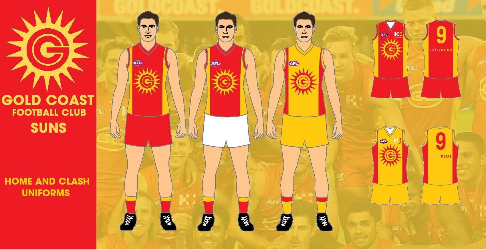
Here is my idea for the Gold Coast jumper and logo. The colours are Gold and Red. The logo is a traditional sun shape with GC in the middle. The gold sides on the jumper are expanded to come onto the shoulders of the jumper. The clash jumper is the reverse of the home jumper with gold shorts.
Zoops
Club Legend
- Apr 20, 2017
- 1,406
- 5,414
- AFL Club
- Melbourne
- Other Teams
- Vancouver Canucks, Southampton FC
I love the wide side panels, reminds me a bit of East Fremantle.
Here is my idea for the Gold Coast jumper and logo. The colours are Gold and Red. The logo is a traditional sun shape with GC in the middle. The gold sides on the jumper are expanded to come onto the shoulders of the jumper. The clash jumper is the reverse of the home jumper with gold shorts.
- Sep 8, 2011
- 11,013
- 11,015
- AFL Club
- West Coast
I'd even say go wider and make it more one thick panel in the middle.
- Sep 8, 2011
- 11,013
- 11,015
- AFL Club
- West Coast
bit more like that rank campaigner mob called North Beach in the WA ammos
Spanna_
The secret ingredient is crime
Up the mighty beach mate.bit more like that rank campaigner mob called North Beach in the WA ammos
- Aug 25, 2014
- 7,718
- 11,772
- AFL Club
- Richmond


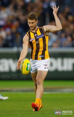
Update to Hawthorn home jumper based on my favourite Hawks kit:
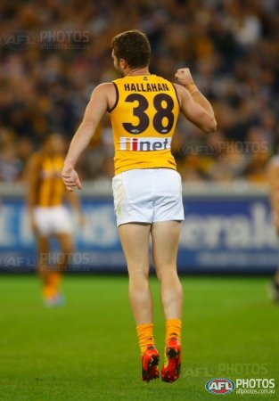
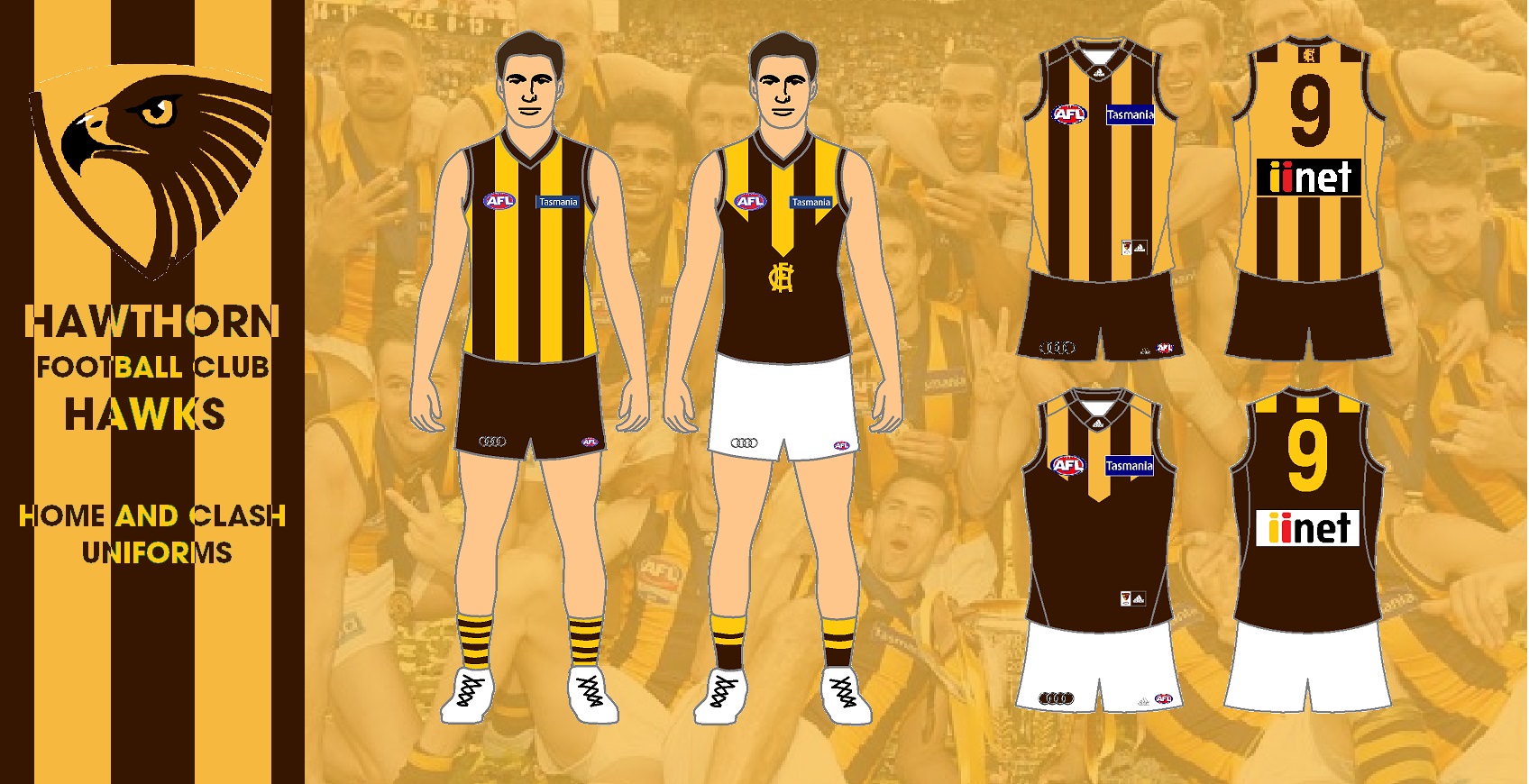
Don't know why people want the all gold socks back. They were said to be changed because they made the players look like they had chicken legs. The hooped socks are more traditional for Hawthorn, wearing them from 1950 to 1988 and from 1997 onwards. The all gold back use to be something I wanted back, but now I like the stripes on the back like we had them in 2013 and 2014. The jumpers looked more Hawthorn that way and could not be mistaken for a Sandingham jumper as seen from the back.
I love the wide side panels, reminds me a bit of East Fremantle.
View attachment 543569
I'd even say go wider and make it more one thick panel in the middle.
The red still has to carry a Suns logo and has to be that large.
Zoops
Club Legend
- Apr 20, 2017
- 1,406
- 5,414
- AFL Club
- Melbourne
- Other Teams
- Vancouver Canucks, Southampton FC
I still prefer the stripes going all the way on the back and the white number box.
Don't know why people want the all gold socks back. They were said to be changed because they made the players look like they had chicken legs. The hooped socks are more traditional for Hawthorn, wearing them from 1950 to 1988 and from 1997 onwards. The all gold back use to be something I wanted back, but now I like the stripes on the back like we had them in 2013 and 2014. The jumpers looked more Hawthorn that way and could not be mistaken for a Sandingham jumper as seen from the back.
- Aug 25, 2014
- 7,718
- 11,772
- AFL Club
- Richmond
Suns home idea:


Zoops
Club Legend
- Apr 20, 2017
- 1,406
- 5,414
- AFL Club
- Melbourne
- Other Teams
- Vancouver Canucks, Southampton FC
That would look great against Carlton and Fremantle.Suns home idea:
View attachment 543716
On [device_name] using BigFooty.com mobile app
The more I look at that, the worse it gets. The current setup with a yellow space for brown numbers looks so clean, you could never get that with the number panel. Adding two more unnecessary colours to the guernsey.I still prefer the stripes going all the way on the back and the white number box.
Zoops
Club Legend
- Apr 20, 2017
- 1,406
- 5,414
- AFL Club
- Melbourne
- Other Teams
- Vancouver Canucks, Southampton FC
I see your point I just think the number box differentiates Hawthorn's stripes from Collingwood and Norf.The more I look at that, the worse it gets. The current setup with a yellow space for brown numbers looks so clean, you could never get that with the number panel. Adding two more unnecessary colours to the guernsey.
The colours alone do that. There's no blue, there's no black. It's not a Richmond and Essendon sash thing. It's uniquely Hawthorn, despite two other teams having stripes. And now that they are the only team with a light base out of the striped teams, it makes it even more unique.I see your point I just think the number box differentiates Hawthorn's stripes from Collingwood and Norf.
Freight Train
Once hit the sign at the Mercantile Mutual Cup
- Moderator
- #675
View attachment 543656
View attachment 543653
Update to Hawthorn home jumper based on my favourite Hawks kit:
I usually do not like Hawthorn’s get-up, but holy * what an aesthetic this is. Plain gold back, white shorts, plain gold socks. Possibly the GOAT for the Hawks.
- Status
- Not open for further replies.
Similar threads
- Replies
- 726
- Views
- 78K
