Workshop Jumper Ideas For 2020

Remove this Banner Ad

Status
Not open for further replies.

Log in to remove this ad.

Got (heavily) inspired by fancyscum's series in the previous jumper ideas thread and did up my own jumper sets. Added in heritage kits as well. Will do the 1st half tonight & upload the 2nd half tomorrow sometime.

Adelaide: Really same old for the home (dumped the white stroke on the number), brought back the gold clash & did up a red version as the alternate/3rd. Heritage is a slightly fauxbacky version of the 96-98 preseason/08-09 clash (changed up the back to connect it better with the front).

Adelaide.png

Brisbane: Can't change perfection for the home + away, brought the bears jumper more towards the 87-91 home by dumping all the white, just like what almost every person here has done at some point. Heritage based off the last Fitzroy jumper with the really high-up yoke.

Brisbane.png

Carlton: Status quo for the home + clash, with the (WARNING!) orange being brought in for the 3rd in a much better way (unpopular but the orange could have been semi-decent if they had gone all out with it instead of the half-assed version nato & calo leaked). Heritage is the 1910-1926 monogram.

Carlton.png

Collingwood: Returned to the classic home, retained the current home as the clash, merged the braces & swooping magpie for the 3rd (also 2 of my favourite pies jumpers funnily enough). Heritage based off the 2017 one I guess?

Collingwood.png

Essendon: Home stays the same, clash bites the bullet and finally becomes a full-on inverse, 3rd is based off the old grey 'heritage' (I liked the grey one personally, the main problem was it was waaaaay too dark). Heritage a sort of mish-mash of the original thin sash from pre-1918 + red shorts from the '70s (did try red collar + cuffs but didn't really like the look of it).

Essendon.png

Footscray: Raised the hoops to starting just above the bottom of the cuffs (prefer that), changed the collar + cuff colours to balance the jumpers better & put the hoops on the sleeves for all the jumpers. 3rd obviously the return of the red kit (I love it, it has an undeserved rep personally) & heritage based off the 75-78 home.

Footscray.png

Freo: Home + clash status quo, 3rd/preseason the return of the classic anchor (with sleeves + cuffs matching the red & green panels!), heritage based off the '95-'97 away.

Fremantle.png

Geelong: Home stays the same, clash to what it should be (well, what it actually is, but in this scenario it would actually be worn in a match), 3rd/preseason a real throwback to the red jumpers of the 1860's & 1870's with the two-tone hoops design (inspired by some old designs I've seen around here), heritage based on the first ever hooped design ever worn from 1876-1883 (with a light grey outline around the number + sponsor to represent sewn-on panels).

Geelong.png

Gold Coast: Easily the most radical redesign of them all (I've posted the same design around here as well a few times). Blue dropped altogther, red darkened, jumper a half-half design with a retouched logo (representing the sun rising over the GC beaches), clash a white hooped design (could say it represents the red & yellow flags if you're a marketing whiz), 3rd/preseason sort of based off the '98 Carlton preseason and/or if they made the sidepanels on the current home really thick.

Gold Coast.png
 
Last edited:
Part 2 of my jumper designs.

GWS: Home now mostly charcol + no. panel on the back for better balance, clash is one that has been done a gazillion times (yet still looks pretty good), 3rd/preseason a sort of 'colour rush' version of the home.

Greater Western Sydney.png

Hawthorn: Home is the status quo, clash the one from 2013-onwards (seriously, why did it get dropped?), 3rd based off the mustard pots/this years 'legends' jumper but with the monogram put inside the vee (a la Cody's clash comp design). Heritage obviously the brown vee.

Hawthorn.png

Melbourne: Home & clash remain the same, 3rd brings back the red based jumper + monogram, heritage based off the 1919-1924 home.

Melbourne.png

North Melbourne: Home returned to what it should be (also oddly I feel like the black numbers actually look better than blue ones), current home stays as the clash, bounding roo retained (but with a mostly white back), heritage based off the 1st VFL home jumper.

North Melbourne.png

Port Adelaide: #bringbackthebars. Current preseason returns as clash, teal preseason back as the 3rd/preseason (tried the BiB but didn't really 'feel' it as a preseason jumper) & the classic power away returns as the heritage. Also put a black & white version of the power logo on the home.

Port Adelaide.png

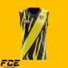
Richmond: Cut the sash off on the back to create a number panel + a point of difference with Essendon, clash also has all black collar + cuffs, 3rd/preseason a 'white tiger' concept + cut-off sash, heritage based off the 1st VFL home.

Richmond.png

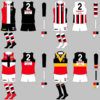
St Kilda: Home stays the same, clash returns the 15/16 version (with stripes on the sleeves!), 3rd the return of the crusader, matching socks to the primary colour of the jersey, heritage based off the 1919-1922 home, what not to like?!

St Kilda.png

Sydney: Current clash becomes the home (with yoke overlapping on the back), current home becomes the clash, 3rd obviously a Victorian jumper based off the classic South Melbourne home, heritage based on the original home with grey outlines on sponsors + no. panel to create the sewn-on illusion (like with Geelong).

Sydney.png

West Coast: Shallower wings a la the ones on the early printed jumpers, lmach's logo replacing the current one on the home + clash, the GOAT (with a navy back!) as the 3rd/preseason, heritage based on the 1987 home.

West Coast.png
 
Last edited:

(Log in to remove this ad.)

Adelaide Crows Home #1 with blue cuffs, thicker hoops which return to more of the original Guernsey from the 1990s and no white outline on the numbers.

Adelaide Crows 2020 Home1.png

Adelaide Crows Home #1 With gold cuffs

Adelaide Crows 2020 Home2.png

Adelaide Crows Away with the return of the 1996 preseason/2008-2009 Crow design, two different versions with variations on the back:

Adelaide Crows 2020 Alternative.png
Adelaide Crows 2020 Alternative15.png

Adelaide Crows Clash version with the thicker hoops and one with navy blue shoulders and one without:
Adelaide Crows 2020 Away1.png
Adelaide Crows 2020 Away2.png

Thanks to MagpieNatos for this great template which was used.

 
Old design , i'd still love too see the Saints bring back the candy stripes.
View attachment 705388
Had a thought the other day; Saints could go with a Black cuff, black back style for their home and then for every away game they wear a white cuffed jumper with a white back. I'll probably mock it up soon but I think it would look cool. I would love a return to candy stripe, very nostalgic.
 
Had a thought the other day; Saints could go with a Black cuff, black back style for their home and then for every away game they wear a white cuffed jumper with a white back. I'll probably mock it up soon but I think it would look cool. I would love a return to candy stripe, very nostalgic.
#bringitback
705741
 
Had a thought the other day; Saints could go with a Black cuff, black back style for their home and then for every away game they wear a white cuffed jumper with a white back. I'll probably mock it up soon but I think it would look cool. I would love a return to candy stripe, very nostalgic.

It works well for South Sydney changing the side panels and shorts from black to white for home and away.

Candy stripe will only work as an away, if the AFL still don't approve it as a clash
 
Status
Not open for further replies.

Remove this Banner Ad

Back
Top