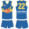
Workshop Jumper Ideas For 2020

Remove this Banner Ad

Status
Not open for further replies.
Without getting rid of the current hoops home jumper, I'd love for a version of the Bulldogs jumper worn yesterday to be introduced permanently alongside of it and the white clash. Maybe as the away (non-clash) or Ballarat jumper, with slightly thicker white hoops to better represent the style worn in the 1980s:

709434
 
few ideas for gold coast jerseys
 

Attachments

  • Screen Shot 2018-08-25 at 2.54.36 pm.png
    Screen Shot 2018-08-25 at 2.54.36 pm.png
    285.4 KB · Views: 250
  • Screen Shot 2018-05-18 at 9.11.51 pm.png
    Screen Shot 2018-05-18 at 9.11.51 pm.png
    420.6 KB · Views: 296
  • Screen Shot 2018-05-18 at 9.40.51 pm.png
    Screen Shot 2018-05-18 at 9.40.51 pm.png
    409.7 KB · Views: 329
few ideas for gold coast jerseys
Should be predominantly a colour no one else is and is instantly recognisable, and without gimmicky siloutes or graphics or cartoons. Just an bold traditional pattern in their own unique colours.
At the moment the are the exact opposite, no bold pattern, stupid graphics and common colours. Create an identity Gold Coast.
 

Log in to remove this ad.

I like it but I think the away jumper is a bit too close to the Adelaide Crows away guernsey :/
And Essendon's home guernsey is close to Richmond's and Collingwood's is close to North's and Hawthorn's.

The lucky thing is it'll never get worn at the same match as the Crows' one.
 

(Log in to remove this ad.)

And Essendon's home guernsey is close to Richmond's and Collingwood's is close to North's and Hawthorn's.

The lucky thing is it'll never get worn at the same match as the Crows' one.

I know it wouldn't actually clash, it's just that it doesn't look very distinct at all. It's literally the same, but a bit lower and one stripe removed.
With Rich/Ess, there's only two colours and it's a very distinct change.
 
I know it wouldn't actually clash, it's just that it doesn't look very distinct at all. It's literally the same, but a bit lower and one stripe removed.
With Rich/Ess, there's only two colours and it's a very distinct change.
Rich/Ess is literally the same, but with a different sash colour :p
Combined with red socks and red numbers on the back it'd be as distinct as most white-based clash jumpers are from each other.
 
Rich/Ess is literally the same, but with a different sash colour
Combined with red socks and red numbers on the back it'd be as distinct as most white-based clash jumpers are from each other.
Can't put red numbers on a black guernsey though. It's almost unreadable

On SM-G973F using BigFooty.com mobile app
 
Very good but gives off a bit of a Sydney vibe with yellow added.
And North gives off a bit of a Collingwood vibe but with royal stripes.

Honestly, it's a no-win. Go for something out there and "we want a traditional-looking footy jumper", go for something more traditional and it's too much like someone else's!
 
I reckon that is the best GC strip I have seen to date.

Maybe swap the white and yellow on the away to see if that appeases the people thinking it is "too similar". Personally I couldn't give a toss if a clubs away kit is similar to another clubs. It's not like two clubs are going to have such similar kits that there is no combination of jumpers that will make the supporters unable to distinguish between the two.
 
Completely random idea for a one off for Brisbane switching the numbers and the Lion (in place of the Fitzroy club emblem) from Gold to White inspired by Fitzroy's 1956 to 1973 guernsey (which is what the Brisbane home guernsey is already sort of based off)
717720
 
Status
Not open for further replies.

Remove this Banner Ad

Back
Top