Workshop Jumper Ideas For 2020

Remove this Banner Ad

Status
Not open for further replies.
I'm as sick as anyone of seeing the Suns run around in some very underwhelming jumpers, so I thought I'd have a go at putting together something a bit better than what they currently have. Darkened the colours to try and tone down the maccas vibe.
View attachment 725313
Their colours are so damn jarring and limited currently, a real challenge to keep them true to the life saving flags but create a decent kit. I wish they’d just abandon that idea. Like these, looking good!
 

Log in to remove this ad.

That Gold Coast logo is immense, did you make that? Absolutely brilliant monogram.

Thanks! I made it from a font, it was actually the letter 'G' but I altered/added/subtracted areas to create that. I thought about adding the 'S' or some sort of footy/goal post shape but it would have ruined the simplicity of it. Currently racking my brains for a 'Gold Coast' word mark that can sit with it.
 
Love some of these suns designs but I just don’t get why they need blue. It’s effectively the same colours as Brisbane.

I think red yellow and white works well Or red yellow and black.

Otherwise I’d full rebrand and go navy and powder blue or navy and pink.


Sent from my iPhone using BigFooty.com
Blue is in our song so it wont go anywhere. But it is close to lions no doubt.

Full rebrand. Gold coast pirates. New song. New jumper. New colours.

But that won’t happen...
 
Blue is in our song so it wont go anywhere.
Port have silver in their song but it features nowhere on their home jumper. No reason GC can't do the same and just use it for away/clash jumpers
 

(Log in to remove this ad.)

Blue is in our song so it wont go anywhere. But it is close to lions no doubt.

Full rebrand. Gold coast pirates. New song. New jumper. New colours.

But that won’t happen...
songs can be slightly altered, just like jumpers.

If they did a full rebrand and got the fans involved this time as opposed to a focus group in Melbourne there'd be good buy in from the fans.
 
songs can be slightly altered, just like jumpers.

If they did a full rebrand and got the fans involved this time as opposed to a focus group in Melbourne there'd be good buy in from the fans.
Is this how they came to the current 'brand?'

There's a lot of information out there on the Freo decisions, some contradict one another or clearly come from 'nah mate, I did that!' but you can get a general idea of how the colours and jumpers came about. There's even a good library of original alternate names, logos, and jumpers as well as drafts of the new crest and strip.

But what about Gold Coast and GWS? Yeah we know they were throwing in Rays, Marlins, Guards and Wolves et al, but what else is there? Who was tasked with their identity? And who was in charge of reconsidering it?

I saw somewhere that a bright lime green was nearly going to be it for GWS. As in, pretty close to the deadline.

I rate the GWS Giants look. It's not the strongest name and has no ties to a region rich with them, but the bright orange works well and along with the big simple G, everyone in Sydney will know what it means. Sky blue, white, and grey probably would've been good too – especially if they went under Western Sydney Wolves or something. Wouldn't have even minded something a bit wanky like Wolves of the West.

Gold Coast was completely ******* butchered. Marlins is kinda goofy but it suits em. Why they'd go Suns over Rays is just beyond me. The colours are a ******* joke and that's exemplified by the fact that in ten years, with dozens of talented designers, not one person on here has made a genuinely really good Suns strip.

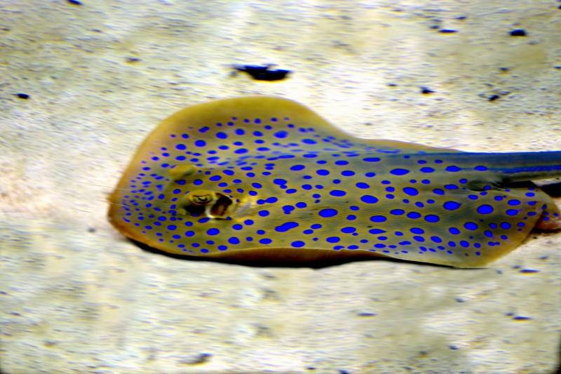
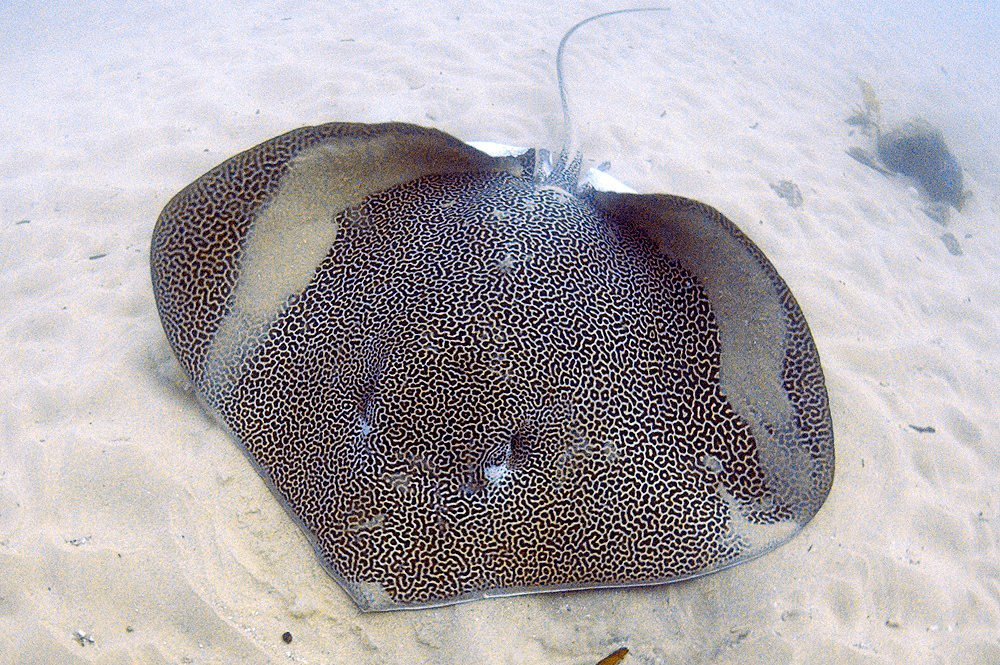
I personally would've gone more for a stingray, scuba-diving kinda vibe.

I immediately sort of think of the dark charcoal neoprene colour, as well as spots and splashes and zips of bright and seafoam blue. Like a lot of... stingrays have!

maskray_updated.jpg

blue-spotted-stingray-img_7621-2.jpg

HimanturaAustralIanBanks.jpg


Making a Dees-style yoke in the shape of the stingrays front would be recognisable, smart, and timeless. You could integrate the eyes too so it's more clearly a stingray and to give it some character.
 
IIRC - Gold Coast originally planned to not have a moniker - to let it develop organically while existing as Gold Coast Football Club, but then a year later they decided they were the suns, and organic growth did not occur in any regard.

They started their existence in the TAC Cup, then the VFL, the Giants followed a similar path except playing in the NEAFL instead of the VFL.

At the time, when they competed to ready their rookie squad for the AFL - as I’m sure all of us remember - they wore jumpers indicative of a blank canvas, as teams in the midst of formation - the difference here is that GWS actually built a brand from there, they ditched the home brand blue jumper/white V/footy logo for an actual identity that represents their stake of Sydney.

Gold Coast set a poor precedent in mostly all regards - they’ve basically never changed their look, other than that their jumper was gold in the TAC Cup then red in the VFL - they’ve held on to this identity-lacking design for a decade now while keeping the side panels they added in 2011, which was in-vogue at the time.

So for me, that’s the best explanation as to why GC17 look so s**t. They wear the strip of an expansion team exploratory committee that has yet to develop an identity, and have done for 10 years.

It’s like if an Olympic Bid was successful then never adapted an event logo - just sticking with what won them the bidding process.
 
Now that Port have confirmed the Prison Bars will be worn for the Showdowns next year, I'd like to see the Crows wear a replica of a SA State of Origin guernsey against them but not with the names on it like that failed attempt in 2014
727216

I would also like them to wheel out a version of the 1930 SA guernsey for maybe the away Showdown or go back to their 1991 guernsey
 
Now that Port have confirmed the Prison Bars will be worn for the Showdowns next year, I'd like to see the Crows wear a replica of a SA State of Origin guernsey against them but not with the names on it like that failed attempt in 2014
View attachment 727216

I would also like them to wheel out a version of the 1930 SA guernsey for maybe the away Showdown or go back to their 1991 guernsey
Beauty of a jumper.

Would love to see a red clash with the three stripes (basically their clash right now but in red). Would go a long way to honoring the SA jumper but without the controversy.
 
Now that Port have confirmed the Prison Bars will be worn for the Showdowns next year, I'd like to see the Crows wear a replica of a SA State of Origin guernsey against them but not with the names on it like that failed attempt in 2014
View attachment 727216

I would also like them to wheel out a version of the 1930 SA guernsey for maybe the away Showdown or go back to their 1991 guernsey
That's the state jumper: neither AFL team has a right to use it in my view. Imagine Carlton using the Big V. However I reckon Adelaide could get away with 2 horizontal hoops of the same width as the Vs (yellow & blue) as a nod to their SANFL roots. Going back to their 1991 guernsey is a good idea.
727441 727442

Would love to see these perhaps given a go as a nod to the state jumper, while also remaining neutral.
 
Status
Not open for further replies.

Remove this Banner Ad

Back
Top