Gratees
Club Legend
- Jul 15, 2019
- 1,944
- 4,015
- AFL Club
- Richmond
Like This?Change red to yellow.
Change yellow to blue
Change blue to red
?
Follow along with the video below to see how to install our site as a web app on your home screen.
Note: This feature may not be available in some browsers.
Like This?Change red to yellow.
Change yellow to blue
Change blue to red
?
What's wrong with a red jumper with a single gold V, with the inverse for away/clash? If they want to be clever they could create a decent logo/monogram and place that under the V as well. It might have shades of Hawthorn/Melbourne but those jumpers were worn so long ago it shouldn't matter.
Hmm. Maybe not.
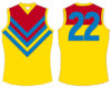
I would like a mostly gold jumper

...which hasn't been worn since the 90s, and when Brisbane rolls it out they won't be wearing it against Gold Coast. Make it yellow with a red V then, it doesn't really matter. There's a limit to the number of unique (traditional) designs you can make, so something is always going to look like something else. You can argue about changing colours, but let's be honest, how many teams have actually changed theirs? Fremantle comes to mind, but they didn't change colours, just dropped some. Just like every other team, Gold Coast is not going to change theirs.Because thats more or less the Brisbane Bears jumper.
...which hasn't been worn since the 90s, and when Brisbane rolls it out they won't be wearing it against Gold Coast. Make it yellow with a red V then, it doesn't really matter. There's a limit to the number of unique (traditional) designs you can make, so something is always going to look like something else. You can argue about changing colours, but let's be honest, how many teams have actually changed theirs? Fremantle comes to mind, but they didn't change colours, just dropped some. Just like every other team, Gold Coast is not going to change theirs.

Reckon they’ll go with a white box, black lettering and teal ‘roo’. Pretty much the same as the lendi logo on West Coast guernseys.What the Saints Deliveroo Jumper might look like:
View attachment 740206
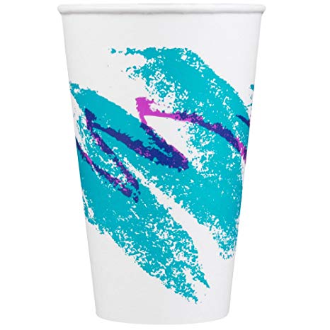
The teal bit on the Clash reminds me of this for some reason.


I like it. How about something like this?View attachment 748726
Quick 5 minute job of what I'd like to see Collingwood wear away to Geelong in the future. Could also use an inverse of this as a new clash strip.
Still black and white stripes, but would create a significantly greater contrast.

I dont mind that but in reality the current home and black shorts v geelong in white shorts is contrast enough as evidenced by last decade or so. Would this new collingwood one with white shorts provide enough contrast with geelong in blue shorts? Still reckon its two teams in dark and light v light and dark and messy.View attachment 748726
Quick 5 minute job of what I'd like to see Collingwood wear away to Geelong in the future. Could also use an inverse of this as a new clash strip.
Still black and white stripes, but would create a significantly greater contrast.
I like it. How about something like this?

I'd be putting Geelong in white shorts and Collingwood in black shorts regardless of who's home game it is. The 'away team wears white shorts' policy just creates unnecessary clashes.I dont mind that but in reality the current home and black shorts v geelong in white shorts is contrast enough as evidenced by last decade or so. Would this new collingwood one with white shorts provide enough contrast with geelong in blue shorts? Still reckon its two teams in dark and light v light and dark and messy.
But as a jumper like i say i like it
View attachment 748726
Quick 5 minute job of what I'd like to see Collingwood wear away to Geelong in the future. Could also use an inverse of this as a new clash strip.
Still black and white stripes, but would create a significantly greater contrast.


The Collingwood suspenders just doesn't look right to me. I think thinning or fading/darkening the stripes would work better.

Here's a thought, what if gold coast just switched their home and away jumpers? For example, the all white here would become their home and the red would be their away? Go full real Madrid with the home kit being white but keep a splash of colour on it?View attachment 718000View attachment 718002
Suns jumper keeping red and slight increase in blue but no logo in a traditional design.
Clash in white but could also switch to a blue clash to stick with club colours which doesn’t include white