GremioPower
Taking notes of policy re: bikini/lingerie images
- May 26, 2017
- 20,899
- 43,012
- AFL Club
- Port Adelaide
- Other Teams
- Grêmio, DC United, Pistons
Collingwood’s never looked so good…
Follow along with the video below to see how to install our site as a web app on your home screen.
Note: This feature may not be available in some browsers.
Collingwood’s never looked so good…

Brings back the BLK kit style
it's a shame but that's what O'Neills is going for this year so I made the template true to the supplierBrings back the BLK kit style

Yeah it's the same collar they use on their Super Rugby and NRL templates, I don't mind it tbhit's a shame but that's what O'Neills is going for this year so I made the template true to the supplier


Yeah they need to just do consistent piping, either right at the edge or a highlight stripe (like on the cuffs) for both cuffs and collar, not one and the otherPiping looks decent on the collar OR the cuffs. not so much both.
View attachment 1282683
View attachment 1282684

looks pretty clean! ps nice templateCurved Vee and red collar on the vic kit
View attachment 1283711
I've always loved the curved v or chevron or whatever you call it, hope they bring it back as their main kitCurved Vee and red collar on the vic kit
View attachment 1283711
Piping looks decent on the collar OR the cuffs. not so much both.
View attachment 1282683
View attachment 1282684
Would love the saints to bring back the piping from circa 2009 - was our best look I reckon
I really like the lack of blue on this guernsey, i reckon the better solution would be to make the lion maroon and then put the yellow somewhere else on the jumper. Here's what I came up with:Lions 2022 Kits, note the lack of monogram on these shots, although they were still present on last years kits despite not reflecting in photos (or just may only be on player issue).
Other changes;
- BBFFC moving to the hip
- Classic tag logo has moved up to below collar as well (gold on away and clash)
- Maroon on home and clash looks to be lighter than previous years (looks to be just the photos as the AFL logo colours are not consistent).
- Much larger and more intrusive tag, continues to below Lions back leg, previous years did not continue this far.
(example shot ** below).
View attachment 1285455
View attachment 1285456
View attachment 1285457
**
View attachment 1285459
Only glaring issue i have with them is the clash, maybe change all the gold to blue as the gold just shouldn't be sitting on white at all. Makes no sense readability-wise.
Quick dirty mockup
View attachment 1285832

Yeah that's nice and clean, maroon shorts would look pretty neat with it. The current one just feels like they were like "how many things can we add without putting in any thought".I really like the lack of blue on this guernsey, i reckon the better solution would be to make the lion maroon and then put the yellow somewhere else on the jumper. Here's what I came up with:


thanks for reminding me they didn't wear those god tier shortsI posted this on the Adelaide board too, but one thing that's annoyed me for ages about Crows guernseys is that we've added more hoops over time. It's gone from two sets of hoops leading into three in the 90's, to three leading into four. It makes it look a mess. I don't know when this started but I suspect it was when we were with Adidas in the middle 00's. So I mocked up some Ben Keayses showcasing what a two-hoop design would look like, with a bunch of collar/cuff combinations:
View attachment 1287171

It looks so much better with less yellow and more navy.I posted this on the Adelaide board too, but one thing that's annoyed me for ages about Crows guernseys is that we've added more hoops over time. It's gone from two sets of hoops leading into three in the 90's, to three leading into four. It makes it look a mess. I don't know when this started but I suspect it was when we were with Adidas in the middle 00's. So I mocked up some Ben Keayses showcasing what a two-hoop design would look like, with a bunch of collar/cuff combinations:
View attachment 1287171
This is so cool. Not even a Dees supporter and would probably buy one of these.
Really like this one too. Blue is cool, this is coolerObligatory Flag Flaming Demon Post!
View attachment 1246522
Ripper for a big freeze fundraiser! Seeing a the colours are mainly blue for the foundationThis is so cool. Not even a Dees supporter and would probably buy one of these.

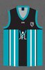
It looks good but i'm not sure why port are so adverse to using teal. It should be used more imo, this one actually looked decent and had some character.
View attachment 1272124
I’m big on this uniform combination. Teal with black shorts looks great.
Port should adopt this designI’m big on this uniform combination. Teal with black shorts looks great.