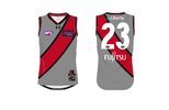
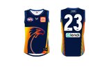
I’ll have to also say that the womens Cotton On jumpers look better than the mens. The collar on the womens m is great. Don’t really like the one on the mens thoughThe Cotton On shoulder seam cuts off several designs awkwardly. The colour swap on the shoulders for Adelaide and the Dogs diminishes the impact of the general design. GWS I hesitate to even call that a design, whatever it is.
But I do like that they do a bit more with the shorts. The AFL is a bit too bland in that regard.
Navigation
Install the app
How to install the app on iOS
Follow along with the video below to see how to install our site as a web app on your home screen.
Note: This feature may not be available in some browsers.
More options
-


LIVE: St Kilda v Western Bulldogs - 7:30PM Thu
Squiggle tips Saints at 51% chance -- What's your tip? -- Team line-ups »
You are using an out of date browser. It may not display this or other websites correctly.
You should upgrade or use an alternative browser.
You should upgrade or use an alternative browser.
Workshop Jumper Ideas for 2022
- Thread starter aCunningPlan
- Start date
- Tagged users None
Bjo187
Premiership Player
- Apr 30, 2020
- 3,156
- 4,157
- AFL Club
- Essendon
I’ll have to also say that the womens Cotton On jumpers look better than the mens. The collar on the womens m is great. Don’t really like the one on the mens though
Agree I also like how the accent line goes through to the back above the jumper numbers (example below).
The colours are better too, especially gold coast with the darker red, lions with all the colours and even Freo the purple is more vibrant.

that is the word- VIBRANT. The jumpers are very bold and vibrantAgree I also like how the accent line goes through to the back above the jumper numbers (example below).
The colours are better too, especially gold coast with the darker red, lions with all the colours and even Freo the purple is more vibrant.
View attachment 1319250
one thing I really don't like about the cotton on guernseys is the numbers. they're too low down the jumper and the font sucks. Looks especially bad for a club like North where there's no detail above the numbers, just a big white or blue void
I don't mind the font. I wouldn't mind that font transitioning to the men as well?one thing I really don't like about the cotton on guernseys is the numbers. they're too low down the jumper and the font sucks. Looks especially bad for a club like North where there's no detail above the numbers, just a big white or blue void
I also like how the above number sponsor works in the women's. In the men's it seems to be too cramped and congested. The women are more spaced out.
Keeping in mind, the numbers are lower for the girls that have long hair too?
the font they use in the men's is iconic and classic looking, the W one just reminds me of around the turn of the century when some clubs (like my own) tried using different ones and it was just ugly. that old number font is part of the look of footy to me, they're simplified and essentially the default version of each digit, which makes them fit better with a variety of different jumper designs.
Rubber Arm
AFL Sucks
Rubber Arm
AFL Sucks
RedmanWasHere
Rarely in kitchens at parties.
- Aug 23, 2010
- 26,809
- 29,426
- AFL Club
- Essendon
- Other Teams
- Exers, Gryffindor, Rich+Ess AFLW, Tassie
Why would you do that??????Training jumper or something.
View attachment 1322898
Rubber Arm
AFL Sucks
wdym lolWhy would you do that??????
So many design elements from awful past jumpers, all giving me flashbacks at the same timewdym lol
- May 3, 2004
- 643
- 1,210
- AFL Club
- Geelong
Most of my friends are 'Essedon' supporters, and they all unanimously hated this jumper, and never want to see it returnProbably alone here but I thought this was a strong design and I'd like to see it return with the new template.
They identify with red and black, as Geelong does blue and white, Richmond yellow and black, and Collingwood black and white
- Mar 30, 2014
- 2,599
- 4,256
- AFL Club
- Brisbane Lions
- Other Teams
- Dolphins, Seattle Kraken
The one i find funny is the Collingwood one. The only team that i can think of that has relatively recently used gold on their kit is Hawthorn. Considering it has been on the logo for a long while, and as we have seen on our designs, the Pies could make some epic blackout kits with gold trim even as one offsMost of my friends are 'Essedon' supporters, and they all unanimously hated this jumper, and never want to see it return
They identify with red and black, as Geelong does blue and white, Richmond yellow and black, and Collingwood black and white
Rubber Arm
AFL Sucks
yeah that's the point. It slapsSo many design elements from awful past jumpers, all giving me flashbacks at the same time

- May 3, 2004
- 643
- 1,210
- AFL Club
- Geelong
The one i find funny is the Collingwood one. The only team that i can think of that has relatively recently used gold on their kit is Hawthorn. Considering it has been on the logo for a long while, and as we have seen on our designs, the Pies could make some epic blackout kits with gold trim even as one offs
They could, but according to His Excellency Prince Sir Eddie McGuire MD PhD OAM, Collingwood legally owns black and white stripes globally, with nobody else allowed to consider laying claim to Collingwood's invention...
If they move an inch from it, they may give Port ammunition to return to their traditional jumper
I think Black with some gold would look okay, but I think Collingwood have a really good jumper as it is, and there's also the factor of politics at play
Bjo187
Premiership Player
- Apr 30, 2020
- 3,156
- 4,157
- AFL Club
- Essendon
They could, but according to His Excellency Prince Sir Eddie McGuire MD PhD OAM, Collingwood legally owns black and white stripes globally, with nobody else allowed to consider laying claim to Collingwood's invention...
If they move an inch from it, they may give Port ammunition to return to their traditional jumper
I think Black with some gold would look okay, but I think Collingwood have a really good jumper as it is, and there's also the factor of politics at play
Really? What about Newcastle in the epl.
- May 3, 2004
- 643
- 1,210
- AFL Club
- Geelong
Really? What about Newcastle in the epl.
I was really only joking...
- Mar 30, 2014
- 2,599
- 4,256
- AFL Club
- Brisbane Lions
- Other Teams
- Dolphins, Seattle Kraken
Hi Only Joking, I'm DadI was really only joking...
- May 3, 2004
- 643
- 1,210
- AFL Club
- Geelong
Get back to the home, Dad 
- Mar 30, 2014
- 2,599
- 4,256
- AFL Club
- Brisbane Lions
- Other Teams
- Dolphins, Seattle Kraken
Get back to the home, Dad

buckleyist1958
Debutant
- Nov 20, 2021
- 55
- 100
- AFL Club
- Collingwood

Yes. Problem?They could, but according to His Excellency Prince Sir Eddie McGuire MD PhD OAM, Collingwood legally owns black and white stripes globally, with nobody else allowed to consider laying claim to Collingwood's invention...
If they move an inch from it, they may give Port ammunition to return to their traditional jumper
I think Black with some gold would look okay, but I think Collingwood have a really good jumper as it is, and there's also the factor of politics at play
- Oct 27, 2016
- 5,938
- 10,623
- AFL Club
- Collingwood

- Other Teams
- Packers, Raptors, Renegades
Gold just isn't one of our club colours. The wreaths on our emblem are gold because it evokes heraldry (and also it would just look odd if it were white or black). A good example I can think of is with the Boston Celtics logo where you have Lucky the Leprechaun with his light complexion, not because it's necessarily a colour they use on kits but because it just makes sense within the context of the logo.The one i find funny is the Collingwood one. The only team that i can think of that has relatively recently used gold on their kit is Hawthorn. Considering it has been on the logo for a long while, and as we have seen on our designs, the Pies could make some epic blackout kits with gold trim even as one offs
That's not to say it wouldn't be nice to see a splash of gold here and there in the future, but I just could never see it becoming more than a gold-coloured training jumper for the reasons above.
fancyscum
Radical Crommunist
Not to mention that large amounts of “gold” (it really looks more like djion mustard when they can’t use a shiny material) on a jumper looks terrible. It either needs the right finish to it (like hawthorns power ranger jumper) or it’s not worth doing at all.Gold just isn't one of our club colours. The wreaths on our emblem are gold because it evokes heraldry (and also it would just look odd if it were white or black). A good example I can think of is with the Boston Celtics logo where you have Lucky the Leprechaun with his light complexion, not because it's necessarily a colour they use on kits but because it just makes sense within the context of the logo.
That's not to say it wouldn't be nice to see a splash of gold here and there in the future, but I just could never see it becoming more than a gold-coloured training jumper for the reasons above.
- Mar 30, 2014
- 2,599
- 4,256
- AFL Club
- Brisbane Lions
- Other Teams
- Dolphins, Seattle Kraken
Yeah but i'm not even saying large amounts of gold. Have a look at some of the designs people have done on here with blackouts and slight gold trim, they look epicNot to mention that large amounts of “gold” (it really looks more like djion mustard when they can’t use a shiny material) on a jumper looks terrible. It either needs the right finish to it (like hawthorns power ranger jumper) or it’s not worth doing at all.
Similar threads
- Replies
- 726
- Views
- 78K


