Rubber Arm
AFL Sucks
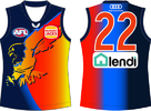
Although I think there's already enough V-shaped deigns in the league, if they were going to do a Southport style jumper, this could work.
View attachment 1401492
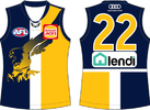
Away and clash guernseys are also less jarring if you use darker colours