Swooping_Magpie
it's swooping season
- May 16, 2021
- 463
- 748
- AFL Club
- Collingwood

- Other Teams
- liverpool cheifs victory gators celtics
- Thread starter
- #101
how would these look with a white G?GWS Home variations
View attachment 1406810
Follow along with the video below to see how to install our site as a web app on your home screen.
Note: This feature may not be available in some browsers.
how would these look with a white G?GWS Home variations
View attachment 1406810
Both are fantastic and would look great with charcoal shorts.GWS Home variations
View attachment 1406810
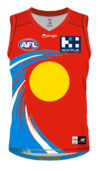
See i love the azure and feel like they should lean into azure and gold for a surf and sand motife, but i get what you mean about gradients.I think the jumper would look mean if the 'piss' gradient was swapped for a gold wave with white streaks to balance it out. Blue just needs to be dropped all together I think it just takes the focus away from an otherwise really strong colour scheme of red, gold and white.
View attachment 1407180

S
See i love the azure and feel like they should lean into azure and gold for a surf and sand motife, but i get what you mean about gradients.
If they actually turned their logo into some form of surfer or a surfboard that was "interacting" with that wave, it would be neat (considering the logo is mean to be a surfboard).
Here is a super quick colour replacement to reintroduce the azure in place of yellow, doesn't look bad. Added a circle in the middle to represent the sun
View attachment 1407203
I think the jumper would look mean if the 'piss' gradient was swapped for a gold wave with white streaks to balance it out. Blue just needs to be dropped all together I think it just takes the focus away from an otherwise really strong colour scheme of red, gold and white.
View attachment 1407180
Show itttttttt
GWS Home variations
View attachment 1406810
the one on the left inverted? pls show.
Could you do the left one but with red instead? Will look much better than my cheap mockup haha
could do the yellow one with a blue wave, would probably work too. For the record the yellow one doesn't look bad
I do love a white yokeThey look great, my favourites are probably top right and the middle, as I like a different colour going from the bottom of the jumper to the shorts. That being said the bottom left looks better than the current home too.
Honestly the yellow and blue ones look pretty sweet. I'd say the yellow one would benefit from the same red logo as the red design.
The only rough part of the yellow guernsey is the logo but with the red logo I reckon that’d look pretty good, might be worth trying a white one (like they originally had as well) but maybe switch out the blue to keep the red/yellow/white theme consistent
Great looking jumpers. But I think for now to get the branding much more simple. Just red and gold, no blue. A gold based jumper and a red based, you don’t even need one to be home or away, just best for match up. Brisbane has too similar colours and is confusing. SLSC’s flags and branding is just red and gold, and most of our iconic clubs only have, and need, two colours to show their clubs identity.Away and clash guernseys are also less jarring if you use darker colours
View attachment 1401496
View attachment 1401497
That is s**t hotI think the jumper would look mean if the 'piss' gradient was swapped for a gold wave with white streaks to balance it out. Blue just needs to be dropped all together I think it just takes the focus away from an otherwise really strong colour scheme of red, gold and white.
View attachment 1407180
