Mero
Norm Smith Medallist
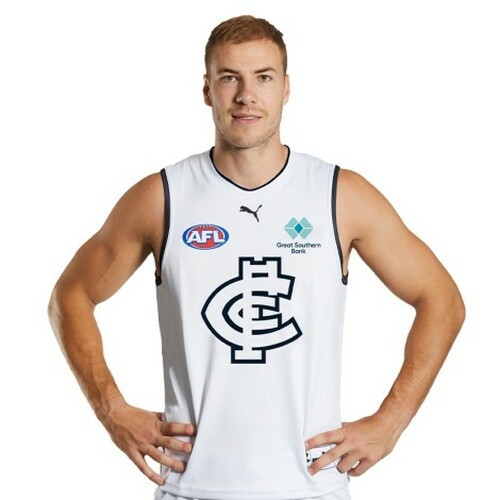
Why do we insist on jumpers that don't really fix the Clash?
(Rhetorical question, the answer is because the club wants to sell them and jumpers in non-club colours don't sell.)
If they were actually serious they'd use a non-club colour
Like Lime Green


(Rhetorical question, the answer is because the club wants to sell them and jumpers in non-club colours don't sell.)
If they were actually serious they'd use a non-club colour
Like Lime Green