Workshop Jumper Ideas For 2023

Remove this Banner Ad

Status
Not open for further replies.
Why wouldn’t Port wear black with grey/silver prison bars and grey silver with black prison bars as the clash? I know it’s not the original, but it’s the colours you now use and would look great and would be instantly recognisable as Port Adelaide. It would still be maybe the best jumper in the league? Is Kochie and others leading Port too bloody minded and because of this, are playing in a inferior guernsey now than what they could be?
As I understand it Collingwood had an issue with us using grey/silver + white as well. Would have been the sensible option at the time (1995-6), and I wouldn't be surprised if they'd still be opposed to it for some nonsensical reason now.
This was cartoonist Broelman's guess at our initial jumper & identity in 1994, and at the time I really thought we'd be doing something like it:
1660167984407.png
 
As I understand it Collingwood had an issue with us using grey/silver + white as well. Would have been the sensible option at the time (1995-6), and I wouldn't be surprised if they'd still be opposed to it for some nonsensical reason now.
This was cartoonist Broelman's guess at our initial jumper & identity in 1994, and at the time I really thought we'd be doing something like it:
View attachment 1472627
Yarr the Port Adelaide Pirrrrrrrrrrrates.
Hell could have even gone Buccaneers, Privateers, Scoundrels, Marauders, Corsairs, Raiders, Sea Wolves, or my favourite ... Water Thieves
 

Log in to remove this ad.

I guess in principle though what's much different between having silver bars and teal bars? Has silver been used by Port in their SANFL past?

On a separate note instead of the direct approach of 'Bringing back the Bars', I think it should shift to bringing back a Heritage/Retro Round and cite McGuire's original agreement to allow Port to wear the PBs in a heritage context.

And just on that if Heritage Round were to come back, I think it would be interesting to see teams wear their Heritage jumpers across different rounds.
For example: Collingwood and Carlton happen to be playing on a Saturday arvo in Round 4 so both clubs agree to wear their Heritage kits. And similarly Port and Adelaide have the Showdown Round 12, both clubs agree to wear their Heritage kits.
 
For example: Collingwood and Carlton happen to be playing on a Saturday arvo in Round 4 so both clubs agree to wear their Heritage kits. And similarly Port and Adelaide have the Showdown Round 12, both clubs agree to wear their Heritage kits.
Make it a Port home showdown, with them in the prison bars, Crows in this 🤤
Adelaide-PS1.gif
 
Looks amazing
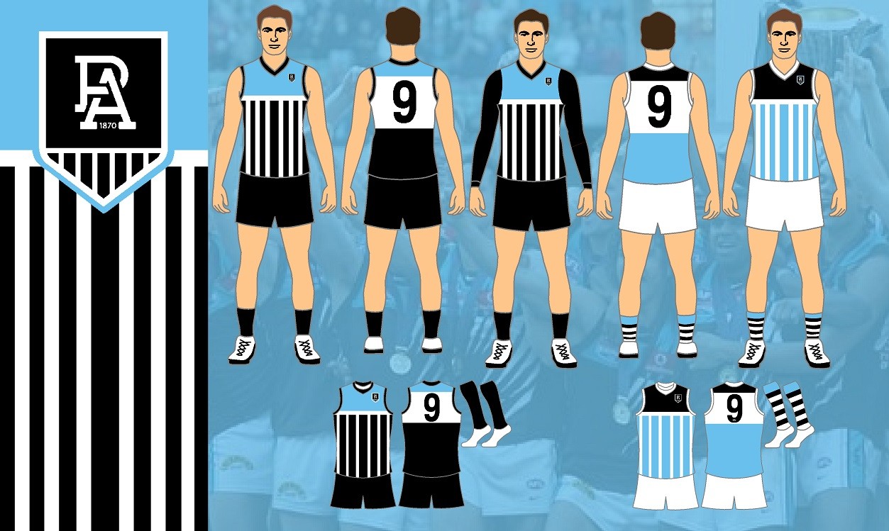
. Do you like them Rubber? Would you prefer this set to your current set?
Port is my second team because my family goes for them and my dad used to play for them in the SANFL. I live in Geelong and support Geelong so I don't know why I put Port as my favourite team lol. That being said, I don't follow Port as much as I used to but if I did, I wouldn't mind seeing these guernseys. It's not white but it's closer to white than teal and that's all that matters to me

On SM-G991B using BigFooty.com mobile app
👍🏼I too live in Gtown.
 
I am genuinely confused at the niche tastes on this board at times. Do people seriously like the big mascot head jerseys, and the hideous 90s retro away designs like we saw Freo wear recently are any good?

Is it a case of "they're so bad they're good", or is there a movement to trot them out as a curiosity or nostalgia? Or am I in the minority here?

In my personal opinion, the 90s Crow jersey, the anchor, the massive Hawk head jersey, the Richmond pre-season, the lightning bolt, etc, are all on par with the infamous Hawthorn jester outfit or the Paddle Pop Lion.

It's a nostalgia / ironically ugly thing I think.

The Freo jumper they trotted out is an all-time abomination... I think they know that. In any case, seemed a popular move among their fans.
 
It's a nostalgia / ironically ugly thing I think.

The Freo jumper they trotted out is an all-time abomination... I think they know that. In any case, seemed a popular move among their fans.
If the Lions ever wear our piss yellow gradient white jerseys, our Disneyland yellow ones from the early 2000s, or the paddle pop ever again, I'll boycott the sparkling new Gabba olympic stadium development.
 
I am genuinely confused at the niche tastes on this board at times. Do people seriously like the big mascot head jerseys, and the hideous 90s retro away designs like we saw Freo wear recently are any good?

Is it a case of "they're so bad they're good", or is there a movement to trot them out as a curiosity or nostalgia? Or am I in the minority here?

In my personal opinion, the 90s Crow jersey, the anchor, the massive Hawk head jersey, the Richmond pre-season, the lightning bolt, etc, are all on par with the infamous Hawthorn jester outfit or the Paddle Pop Lion.
I think some of these are good and others are just ugly, the 90’s crow jumper looked great when they redesigned it in the late 2000s and I’ve always liked the 3D anchor for some reason

The problem I have with modern guernsey designs is that everything is becoming quite bland and boring, every team has some slight variation on a basic design (there’s three teams that wear basic vertical stripes)

Freo and Port are the most recent example of this, they could have modern and sleek jumpers with the anchor or lightning on them (the old purple haze jumper for example or Ports first away jumper) but instead, they’ve both just got basic V designs that if you recoloured them, it could be anyone.
I think the move to the chevrons for Freo and the V for Port were the right decisions when they happened 10 years ago but I wouldn’t mind a return to some jumpers with a bit of unique identity about them
 
This is probably as good a thread to post this as any

Devon Smith retired, and on the video the Bombers have a jumper in the background.
I'd be willing to bet this is this is the 2023 Indigenous jumper.
One good thing, with the Home & Away rotation being fixed next year, Essendon will be wearing Black & Richmond Yellow jumpers.
1660326004268.png
 
This is probably as good a thread to post this as any

Devon Smith retired, and on the video the Bombers have a jumper in the background.
I'd be willing to bet this is this is the 2023 Indigenous jumper.
One good thing, with the Home & Away rotation being fixed next year, Essendon will be wearing Black & Richmond Yellow jumpers.
View attachment 1475086
sort of looks like a strand of dna
 

(Log in to remove this ad.)

This is probably as good a thread to post this as any

Devon Smith retired, and on the video the Bombers have a jumper in the background.
I'd be willing to bet this is this is the 2023 Indigenous jumper.
One good thing, with the Home & Away rotation being fixed next year, Essendon will be wearing Black & Richmond Yellow jumpers.
View attachment 1475086
Thanks for pointing that out but I agree with SM above. Also, why would they have the jumper all designed 9 months in advance?
 
Thanks for pointing that out but I agree with SM above. Also, why would they have the jumper all designed 9 months in advance?
All jumpers for next year are created this year.

1 The SDN jumpers for example, get painted by the artist this year,
2. They get approved by the AFL.
3. They get digitised so they can be printed onto the jumpers.
4. A sample gets made.
5. The full run of jumpers is made, in every number the club has. They have two of each for blood rule. They also have seconds level jumpers made as well (VFL, SANFL, WAFL)

That image, which could be DNA, I agree.
 
Last edited:
Instead of adding teal to the Port Adelaide colours, why not add the colour which was part of their first jumper, light blue. So a Port Adelaide prison bar jumper would look like this.

wHq7EUF.jpg
 
All jumpers for next year are created this year.

1 The SDN jumpers for example, get painted by the artist this year,
2. They get approved by the AFL.
3. They get digitised so they can be printed onto the jumpers.
4. A sample gets made.
5. The full run of jumpers is made, in in every number the club has. They have two of each for blood rule. They also have seconds level jumpers made as well (VFL, SANFL, WAFL)

That image, which could be DNA, I agree.

One thing I don’t understand is draftees and their sizes/numbers - would they not have to be printed after the draft?


Sent from my iPhone using BigFooty.com
 
One thing I don’t understand is draftees and their sizes/numbers - would they not have to be printed after the draft?


Sent from my iPhone using BigFooty.com
Once numbers are assigned they can do sizing, however that is step 5.
 
Status
Not open for further replies.

Remove this Banner Ad

Back
Top