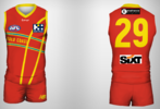
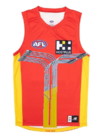
Thicker horizontal yellow curves
Navigation
Install the app
How to install the app on iOS
Follow along with the video below to see how to install our site as a web app on your home screen.
Note: This feature may not be available in some browsers.
More options
You are using an out of date browser. It may not display this or other websites correctly.
You should upgrade or use an alternative browser.
You should upgrade or use an alternative browser.
Workshop Jumper Ideas For 2023
- Thread starter Swooping_Magpie
- Start date
- Tagged users None
- Status
- Not open for further replies.
I don't think thicker lines will make it look any better, to be honest.
xSQUALLx
Draftee
- May 3, 2004
- 643
- 1,210
- AFL Club
- Geelong
- Mar 30, 2014
- 2,606
- 4,270
- AFL Club
- Brisbane Lions
- Other Teams
- Dolphins, Seattle Kraken
How do i pre-order?
Big yellow erection from top of shorts
Bjo187
Premiership Player
- Apr 30, 2020
- 3,186
- 4,197
- AFL Club
- Essendon
Better than their current jumper.
xSQUALLx
Draftee
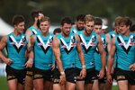
So I tried my hand at another "city edition" jumper, this time for Port Adelaide.
The hexagon is referencing the port adelaide light house. Didn't go all out of the prison bars, but added in a few as it is iconic to Port Adelaide.
Originally i did have the teal as a full yoke, but i brought it down to resemble more of the port river.
At the bottom on the front, you can see the Fos Williams Stand from Alberton Oval. The bottom of the back, I have a reference to the working class history of the port adelaide docks with the elder smith wool shop. Nike logo, because macron sucks.

Bjo187
Premiership Player
- Apr 30, 2020
- 3,186
- 4,197
- AFL Club
- Essendon
So I tried my hand at another "city edition" jumper, this time for Port Adelaide.
The hexagon is referencing the port adelaide light house. Didn't go all out of the prison bars, but added in a few as it is iconic to Port Adelaide.
Originally i did have the teal as a full yoke, but i brought it down to resemble more of the port river.
At the bottom on the front, you can see the Fos Williams Stand from Alberton Oval. The bottom of the back, I have a reference to the working class history of the port adelaide docks with the elder smith wool shop. Nike logo, because macron sucks.
View attachment 1593811
A very clever design, the only two things I would change:
- the box with the PA is a little big.
- I'd like to see teal at the top of the number plate at the back. The back of the jumper looked great back in the 04 flag year.
xSQUALLx
Draftee
unrelated, just realized your display photo is of Ueno Yodobashi camera lol i live near ueno actually, im in AsakusaA very clever design, the only two things I would change:
- the box with the PA is a little big.
- I'd like to see teal at the top of the number plate at the back. The back of the jumper looked great back in the 04 flag year.
royboy2
Average Old Bastard
- Dec 7, 2007
- 13,039
- 15,117
- AFL Club
- Brisbane Lions
- Other Teams
- Rabbitohs, Villa, McLaren F1, ENG
But the Constitution!!
nnuckzz
Draftee
- Feb 1, 2023
- 16
- 49
- AFL Club
- Western Bulldogs
- Other Teams
- Altona Magic, Sunderland & Melb City
Our two official jerseys this year are both terrible IMO, so i've created my own version. Ignore the 2024 bit. Changed some of the sponsors to better represent the Footscray area, wanted to get rid of Mission as well but it's iconic. Home is back to normal with a retro feel, Away also has a retro feel to it - basically an invert of our old 1975-96 jerseys. Special jersey will be our "Multicultural Round" jersey, paying tribute to the Vietnamese community of Footscray and the rest of the Western Suburbs.


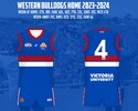
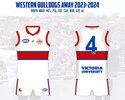
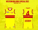
Would be cool if that game could be played at Whitten OvalOur two official jerseys this year are both terrible IMO, so i've created my own version. Ignore the 2024 bit. Changed some of the sponsors to better represent the Footscray area, wanted to get rid of Mission as well but it's iconic. Home is back to normal with a retro feel, Away also has a retro feel to it - basically an invert of our old 1975-96 jerseys. Special jersey will be our "Multicultural Round" jersey, paying tribute to the Vietnamese community of Footscray and the rest of the Western Suburbs.View attachment 1600530View attachment 1600531View attachment 1600532
Carn the Hawkers
Rookie
- Jul 26, 2022
- 28
- 38
- AFL Club
- Hawthorn
I’m looking to get into designing New Jerseys would someone be able to tell me where they get the templates from?
Zoops
Club Legend
- Apr 20, 2017
- 1,406
- 5,414
- AFL Club
- Melbourne
- Other Teams
- Vancouver Canucks, Southampton FC
magpienato just shared his easy-to-use his template and I'd also suggest you check out The Template and Resource Thread which features various templates.I’m looking to get into designing New Jerseys would someone be able to tell me where they get the templates from?
Finally got around to finishing this but I've made a new template for any new or intermediate designers out there who are looking for an easy-to-use template to perhaps make a portfolio off of or even just throw some of their ideas onto. Let me know if you have any issues with it but otherwise it's yours to do as you please
https://www.bigfooty.com/forum/thre...ads/the-template-and-resource-thread.1100538/
if someone could add this onto the templates thread would much appreciated Red Crow Gibbsy Freight Train
https://www.bigfooty.com/forum/thre...ads/the-template-and-resource-thread.1100538/
Carn the Hawkers
Rookie
- Jul 26, 2022
- 28
- 38
- AFL Club
- Hawthorn
magpienato just shared his easy-to-use his template and I'd also suggest you check out The Template and Resource Thread which features various templates.
Ok thankyou
Anyone able to make a mockup of a teal alternative to the Port clash jumper? I reckon the design is basically there but Port are just missing out on utilising such a unique colour.
Last edited:
Fizzler
BBTB
- Dec 26, 2013
- 12,765
- 16,359
- AFL Club
- Port Adelaide
- Other Teams
- OKC, Coburg, Werribee, Storm, QPR
Much like some of my other posts this isn't strictly a 2023 jumper idea but it does include a 2023 version of a North Fitzroy Kangaroos design, feel free to check out the whole post and give it a like/comment/follow me on IG if you feel so inclined!
- May 3, 2004
- 643
- 1,210
- AFL Club
- Geelong
Much like some of my other posts this isn't strictly a 2023 jumper idea but it does include a 2023 version of a North Fitzroy Kangaroos design, feel free to check out the whole post and give it a like/comment/follow me on IG if you feel so inclined!
"North Melbourne Lions" would have worked
North got greedy
The jumper idea works
Rubber Arm
AFL Sucks
- Oct 10, 2018
- 1,641
- 3,572
- AFL Club
- North Melbourne
- Other Teams
- ^ I don't actually go for North.
Looks decent with black shorts, insipid with white shorts.
- Mar 30, 2014
- 2,606
- 4,270
- AFL Club
- Brisbane Lions
- Other Teams
- Dolphins, Seattle Kraken
It's a common thing, ex-Fitzroy Lions fans complaining about the fall of their club and gutting of the branding, but forgetting pretty plainly that the actual Lion would be lost to history if the North deal had actually gone through (barring of course tiny snippets on jumpers or whatever), much like the Bear itself."North Melbourne Lions" would have worked
North got greedy
The jumper idea works
i dunno if it's greedy man."North Melbourne Lions" would have worked
North got greedy
The jumper idea works
respectfully to the old Roy Boys, we had the upper hand. Our club wasn't going to fall off the face of the Earth if a merge didn't go through. if we wanted to keep the kangaroo, we were gonna keep the kangaroo.
- Moderator
- #700
i dunno if it's greedy man.
respectfully to the old Roy Boys, we had the upper hand. Our club wasn't going to fall off the face of the Earth if a merge didn't go through. if we wanted to keep the kangaroo, we were gonna keep the kangaroo.
The arrangement was clear. The second name in the combined club name gets the mascot.
- Status
- Not open for further replies.
Similar threads
- Replies
- 726
- Views
- 78K
- Replies
- 175
- Views
- 14K


