- Apr 9, 2015
- 1,192
- 3,395
- AFL Club
- Carlton
- Other Teams
- Melbourne City FC, Southampton FC
Yuck that’s horrible
Follow along with the video below to see how to install our site as a web app on your home screen.
Note: This feature may not be available in some browsers.
Yuck that’s horrible
never understood the thought process behind watermarks. it's just so... i don't know??
When they're super subtle and done for a purpose - Puma using them to denote a PI for instance - then I don't have an issue with them. However when clubs chop and change manufacturers and the watermarks come across as a design element then I agree, it isn't a good look at all.never understood the thought process behind watermarks. it's just so... i don't know??
the thin collar looks weird, but the majestic logo underneath paired with it kinda looks like its a good fit. shape is pretty unique, if the collar was the same thickness as the cuffs but maintained the same shape it could be interesting
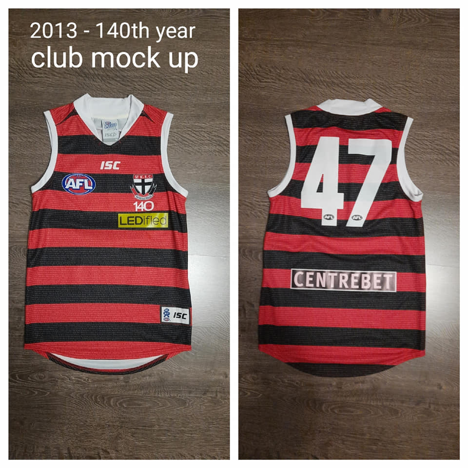
![May be an image of basketball jersey and text that says '2011-club mock up [PLAYERCARD]Sam Fisher[/PLAYERCARD] ISC AFL S CENTREBET 25 LINENHOUSE CENTRE ISC' May be an image of basketball jersey and text that says '2011-club mock up [PLAYERCARD]Sam Fisher[/PLAYERCARD] ISC AFL S CENTREBET 25 LINENHOUSE CENTRE ISC'](/forum/proxy.php?image=https%3A%2F%2Fscontent.fadl4-1.fna.fbcdn.net%2Fv%2Ft1.6435-9%2F244116699_1017770059046182_2571808361547320438_n.jpg%3F_nc_cat%3D102%26ccb%3D1-5%26_nc_sid%3Db9115d%26_nc_ohc%3Dd4XjkZNBXqEAX_Yl397%26_nc_ht%3Dscontent.fadl4-1.fna%26oh%3D869e728e41e44b3cf8a79a36997fd577%26oe%3D61883695&hash=3946d2150e1bb7679760d84046b997f5)
![May be an image of basketball jersey and text that says '2007 prototype [PLAYERCARD]Leigh Fisher[/PLAYERCARD] Bill 6 vodafone' May be an image of basketball jersey and text that says '2007 prototype [PLAYERCARD]Leigh Fisher[/PLAYERCARD] Bill 6 vodafone'](/forum/proxy.php?image=https%3A%2F%2Fscontent.fadl4-1.fna.fbcdn.net%2Fv%2Ft1.6435-9%2F243920071_1017770039046184_4741280361688787434_n.jpg%3F_nc_cat%3D102%26ccb%3D1-5%26_nc_sid%3Db9115d%26_nc_ohc%3DljxS-5wj85UAX_cEmfX%26_nc_ht%3Dscontent.fadl4-1.fna%26oh%3Dcc535aa807fc9dbf9db92d8b594a17a6%26oe%3D6186F220&hash=35e7b6d0aa8bf8ce94f5760465fe3181)
thought i'd chuck the prototype 2021 Melbourne premiers jumper in here
View attachment 1246201
View attachment 1246202
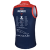
I was actually a fan of Majestic, but yeah can't get behind the watermark at all. I'm pretty sure they introduced it in 2017 when they took the contract, along with a shocking collar which they improved the next year.View attachment 1256774
Honestly still looks better than their very sloppy Classic guernseys.
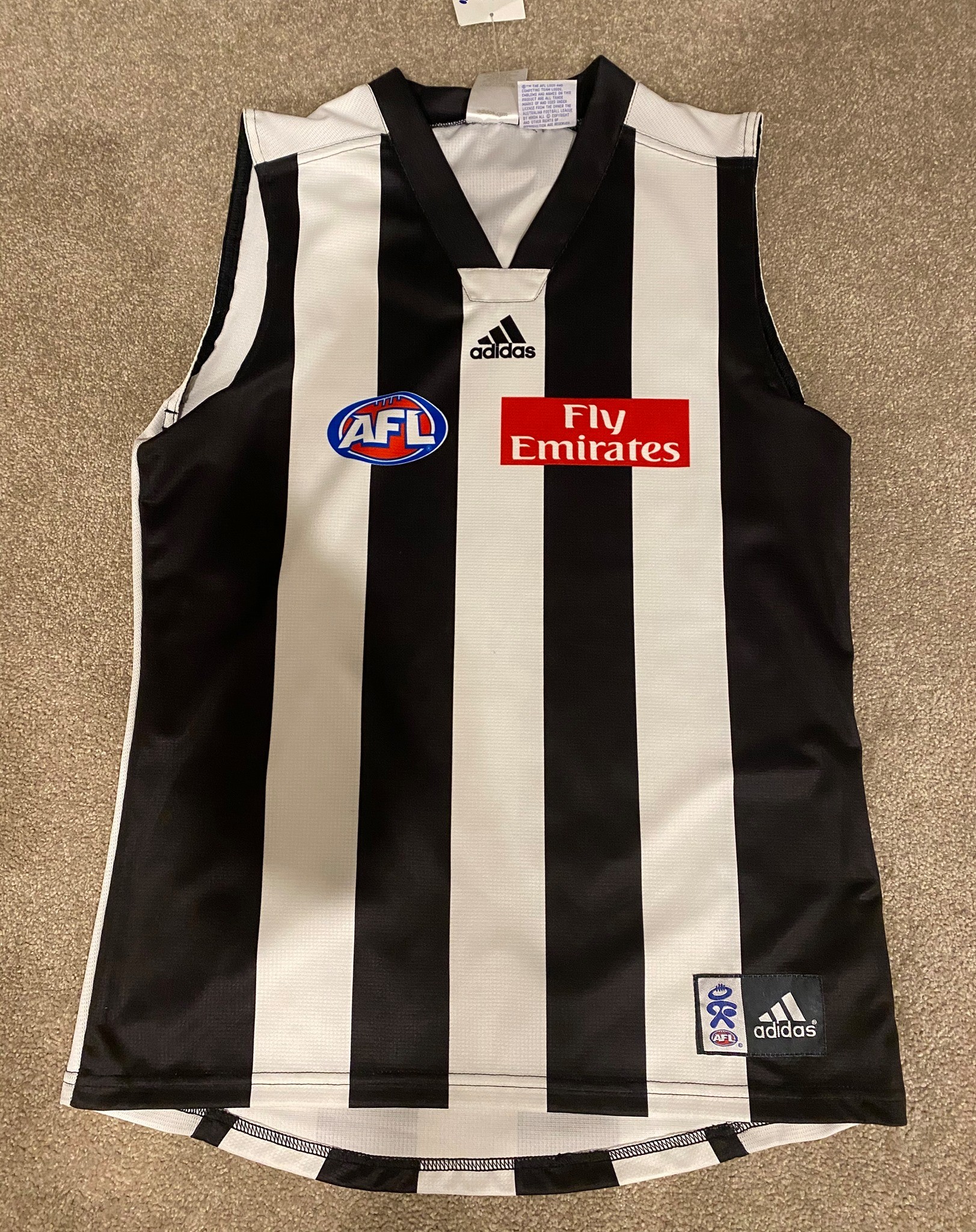
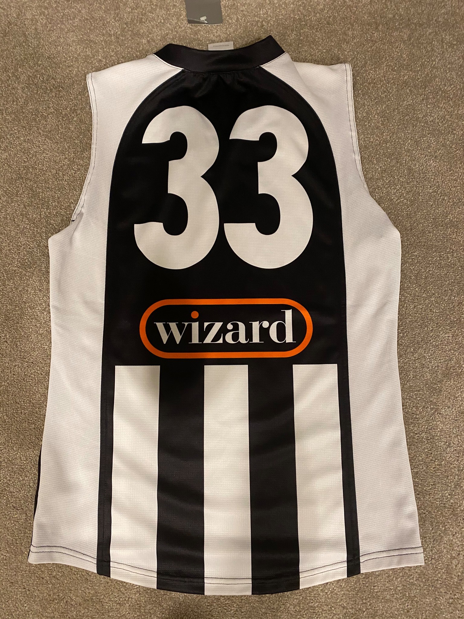
noPies 2006 sample jumper.


That arch shape on the back of the Collingwood one might be suited to a Saints jumper perhapsPies 2006 sample jumper.


Some Saints too


Pies 2006 sample jumper.


Yeah the watermark is just not needed. If it was something like the old Fitzroy monogram and the old Bears logo intermittently on the kit, sure i guess, but the Lion on the Lion? why?Yeah look there's all sorts of things wrong with that Brisbane prototype collar. Majestic collars looked all sorts of strange generally.
Still can't quite get my head around Brisbane running with the watermark.
That arch shape on the back of the Collingwood one might be suited to a Saints jumper perhaps
Brownie points for looking a bit more unique then brisbanes yoke, but yeah its ugly.GWS photo day 2018, yoke got raised to usual position in time for the season
View attachment 1243544
Optus Stadium doesn't have light towers..... Surely they could have had something to reflect Optus on itView attachment 1256780
View attachment 1256782
2021 Premiers got added inside the collar on the final thing.
Just had to re-post this... sheeesssh
The fact we didn't get that jumper 2nd from the left with the three adidas stripes going onto the long sleeves is a tragedy.
The fact we didn't get that jumper 2nd from the left with the three adidas stripes going onto the long sleeves is a tragedy.
Geelong had to drop this jumper;The league probably wouldn't have allowed it, genuinely. The Cats' 1998 adidas away strip featured the three stripes pretty prominently and was gone after a year (albeit because they switched to FILA), and Hawthorn's three stripes on the back of their brown away jumper in 2013 were removed before the start of the season


