alexfenton
Debutant
- Joined
- Jul 22, 2022
- Posts
- 66
- Reaction score
- 74
- AFL Club
- Sydney
I'm actually impressed they were able to make a Giant work
Kind of giving GWS Trolls vibes lol but yeah I love all of these they’re impressive
Follow along with the video below to see how to install our site as a web app on your home screen.
Note: This feature may not be available in some browsers.

 BigFooty Tipping Notice Img
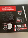
Weekly Prize - Join Any Time - Tip Round 13
The Golden Ticket - Corporate tickets, functions, Open Air Boxes at the Adelaide Oval, ENGIE, Gabba, MCG, Marvel, Optus & People First Stadiums. Corporate Suites at the Gabba, MCG and Marvel.
I'm actually impressed they were able to make a Giant work
Kind of giving GWS Trolls vibes lol but yeah I love all of these they’re impressive
Log in to remove this Banner Ad
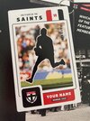
Essendon the only one without a footy.
might be something in that
If you are thinking Giants you would be mistaken.If you look closely there's actually two of them.
If you are thinking Giants you would be mistaken.
But i could be blind
If you are thinking Giants you would be mistaken.
But i could be blind
If you look closely there's actually two of them.
Contrast. You can see where all their guernseys begin and stop - not the Crows mascot if it didn't have cuffs.This is getting to me, why does the Crows mascot thing have yellow collar and cuffs, whilst Brisbane, St. Kilda, Hawthorn and West Coast should also show distinguishable colour differences in the mascot
It’s a different shade of navy from jumper to crow. Whereas the cats baby is one in the sameContrast. You can see where all their guernseys begin and stop - not the Crows mascot if it didn't have cuffs.
My point is you can still see where the guernsey finishes up on the Geelong mascot...It’s a different shade of navy from jumper to crow. Whereas the cats baby is one in the same
Slapped together in 5mins.
I think the updating of the linework actually makes it a "smoother" logo, and they also really don't need the motto on the shieldSlapped together in 5mins.

I think the updating of the linework actually makes it a "smoother" logo, and they also really don't need the motto on the shield
Also a cleaner font choice
View attachment 1513311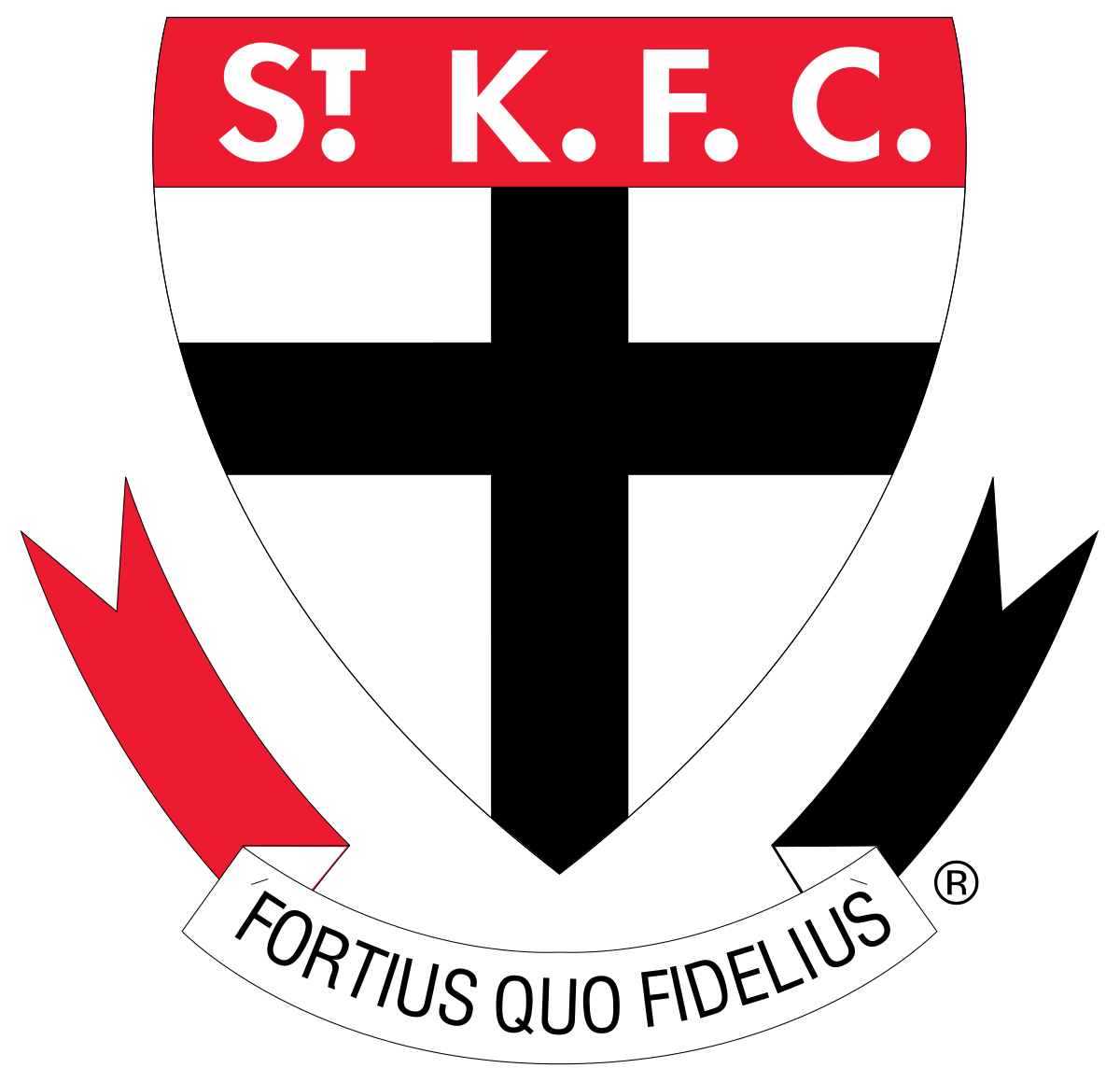
Agreed.Slapped together in 5mins.
I think the updating of the linework actually makes it a "smoother" logo, and they also really don't need the motto on the shield
Also a cleaner font choice
View attachment 1513311