Discussion Logo Discussion Thread

Remove this Banner Ad

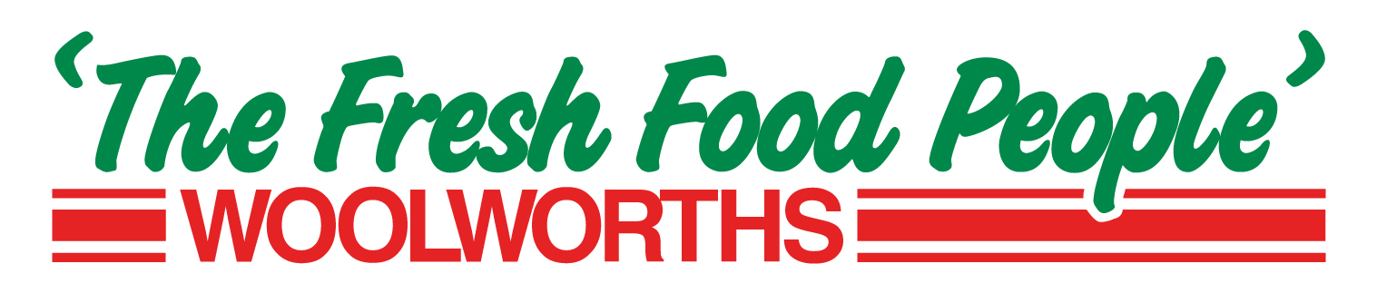
I love Woolworths logo change from a few years ago, it's brilliant.

Old:
woolworths-logo.jpeg

New:
18juneWWlogovertical%5B1%5D.jpg

I work at Woolworths. When we first changed to that logo all of us disliked it and made fun of it. Now it's actually grown on me.
 

Log in to remove this ad.

Amart All Sports are now known as Amart Sports.


Before:

Amart%20large.gif


After:
AMART%20LOGO.gif


I like what they've done with the M and the O to create a medal. The old Impact like font was getting pretty outdated. The new one is much sharper.
 
3 prominent logo pairings have done the rounds on the net these past couple of days.

Let's start with the Flickr alternative.

The wordmark.

Before.

s441Instragram+logo.png
.

After.

Instragram+logo+2013.png
.

The camera logo's not gone anywhere.

Procter and Gamble.

Procter+&+Gamble+logo+2003.png
.

Procter+&+Gamble+logo+2013.png
.

Those 2 came courtesy of The Branding Source, an Australian website on Blogger.

These come straight from Under Consideration's Brand New section.

shazam_logo.png
.

facebook_logo.gif
.

This one's at least 3 months old.

startrack_logo.gif
.
 

(Log in to remove this ad.)

That is awful. What's the branding purpose in that? It's just two L's, which aren't aesthetically pleasing in any sense. The old logo was instantly recognisable, the new one is just dull and has no movement. It's also inexpressive of what the brand stands for, at least the old one actually featured two bottles and had anything to do with what they're actually marketing.
 
Here's the thread dedicated to the logo at Southland you were talking about.

http://www.australianinfront.com.au/forum/thread/liquorland-rebrand.

liquorland.jpg
.

Wizard Waffle, the logo looks pretty shocking.

Candidate for worst logo of 2013.

I am only reporting the change in the logo, I am not saying I like it or not. Was down at Southland the other day and saw the new style Liquorland store. People were talking about the Liquorland logo here so I mentioned that it could be replaced soon.
 
I am only reporting the change in the logo, I am not saying I like it or not. Was down at Southland the other day and saw the new style Liquorland store. People were talking about the Liquorland logo here so I mentioned that it could be replaced soon.


Hopefully it's only a teaser and not the full reveal.
 

Remove this Banner Ad

Back
Top