Navigation
Install the app
How to install the app on iOS
Follow along with the video below to see how to install our site as a web app on your home screen.
Note: This feature may not be available in some browsers.
More options
Style variation

-

Rd 12 Reviews + Club Forums »
StK v HAW · CAR v GEE · SYD v RIC · BL v FRE · WB v COL · MEL v GWS · WCE v ESS ·
Weekend Wrap and "Liked, Learned, Hated" right here -- How did tipping go?

You are using an out of date browser. It may not display this or other websites correctly.
You should upgrade or use an alternative browser.
You should upgrade or use an alternative browser.
Discussion Logo Discussion Thread
- Thread starter akkaps
- Start date
- Tagged users None
🥰 Love BigFooty? Join now for free.
Klim
Brownlow Medallist
- Joined
- Sep 17, 2013
- Posts
- 12,532
- Reaction score
- 10,365
- AFL Club
- Sydney
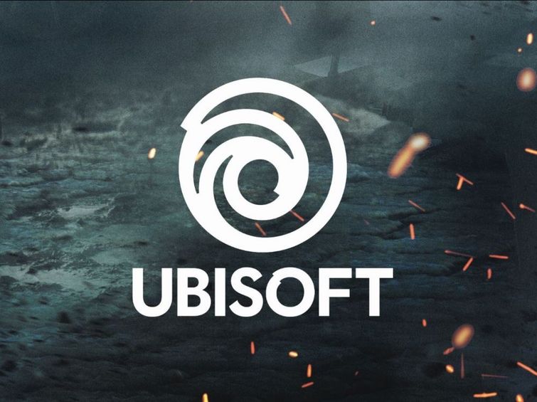
Ubisoft have updated their logo.
OLD

NEW
OLD
NEW
Log in to remove this Banner Ad
RedmanWasHere
Rarely in kitchens at parties.
- Joined
- Aug 23, 2010
- Posts
- 31,103
- Reaction score
- 38,508
- Location
- Information Superhighway
- AFL Club
- Essendon
- Other Teams
- Exers, Gryffindor, Rich+Ess AFLW, Tassie
Another part of my youth is gone.

Just looks ugly AF.
The mouth is too much like Rolling Stones.
Just looks ugly AF.
The mouth is too much like Rolling Stones.
- Joined
- May 27, 2014
- Posts
- 6,742
- Reaction score
- 11,017
- Location
- Port Adelaide
- AFL Club
- Port Adelaide
- Other Teams
- Port Adelaide Magpies

HAHAHAHHAcraegus I'll plop this one here.
Salisbury Hwy, Mawson Lakes SA. On some truck probably some trucking company.View attachment 378251
Why are you always such a dick?HAHAHAHHA
Bacon Warrior
D10
- Joined
- Jul 19, 2012
- Posts
- 6,434
- Reaction score
- 8,464
- Location
- Wanneroo
- AFL Club
- West Coast
- Other Teams
- Swan Districts, Phoenix Coyotes
hasn't started puberty yet and is fed up of waiting.Why are you always such a dick?
am i???Why are you always such a dick?
Craegus
One and Only
- Joined
- Aug 8, 2008
- Posts
- 7,996
- Reaction score
- 8,724
- Location
- Campbelltown
- AFL Club
- Sydney
- Other Teams
- Macarthur FC
craegus I'll plop this one here.
Salisbury Hwy, Mawson Lakes SA. On some truck probably some trucking company.View attachment 378251
Hmmm, have never seen it before, might be a SA based company. Anyone have any more info on this?
Might have to speak with my logos designer about this....
do you make the designs?Hmmm, have never seen it before, might be a SA based company. Anyone have any more info on this?
Might have to speak with my logos designer about this....
Craegus
One and Only
- Joined
- Aug 8, 2008
- Posts
- 7,996
- Reaction score
- 8,724
- Location
- Campbelltown
- AFL Club
- Sydney
- Other Teams
- Macarthur FC
do you make the designs?
Read my post on the last page about my logos history for your answer (in regards to my logo only, the one on the truck I have no idea about).
Andonis1997
Sporting masochist
- Joined
- Jun 24, 2011
- Posts
- 26,687
- Reaction score
- 17,364
- Location
- Adelaide
- AFL Club
- Carlton
- Other Teams
- ΠΓΣΣ LFC Sturt Steelers Nix
I've seen the Symon(d)s Clark trucks around as well, but never got a chance to post it up. Every time I've thought of craeguscraegus I'll plop this one here.
Salisbury Hwy, Mawson Lakes SA. On some truck probably some trucking company.View attachment 378251

Craegus
One and Only
- Joined
- Aug 8, 2008
- Posts
- 7,996
- Reaction score
- 8,724
- Location
- Campbelltown
- AFL Club
- Sydney
- Other Teams
- Macarthur FC
I've seen the Symon(d)s Clark trucks around as well, but never got a chance to post it up. Every time I've thought of craegus
Hmm, that is not good. Now I have to ask myself if I need to change my logo again to make it unique as it now isn't.
Andonis1997
Sporting masochist
- Joined
- Jun 24, 2011
- Posts
- 26,687
- Reaction score
- 17,364
- Location
- Adelaide
- AFL Club
- Carlton
- Other Teams
- ΠΓΣΣ LFC Sturt Steelers Nix
It's all good. How were you (or Freight Train) to know? I say keep itHmm, that is not good. Now I have to ask myself if I need to change my logo again to make it unique as it now isn't.
")
Hmm, that is not good. Now I have to ask myself if I need to change my logo again to make it unique as it now isn't.
You need to have a watch of Derren Brown's 'Advertising Agency Task' episode. Should explain maybe where you go the idea from.
TheLoungeLizard
The world's most handsome man
- Joined
- Oct 21, 2010
- Posts
- 13,599
- Reaction score
- 19,076
- Location
- England
- AFL Club
- Richmond
- Other Teams
- Newcastle United, New York Yankees
Did you ever copyright it?
Freight Train
Maccas footy aficionado
- Joined
- Sep 12, 2015
- Posts
- 7,374
- Reaction score
- 17,007
- Location
- ADL via PER
- AFL Club
- West Coast
- Other Teams
- Perth Glory
With all due respect, given this was my design, this logo was never ripped from anybody. It was a unique design and was an offshoot of the original design which Craegus felt looked too much like a battery (the C and the D were joined to make a full loop).
They're two different logos but if you want to change it Craegus, by all means go ahead.
They're two different logos but if you want to change it Craegus, by all means go ahead.
🥰 Love BigFooty? Join now for free.
- Joined
- Mar 20, 2012
- Posts
- 48,187
- Reaction score
- 33,537
- AFL Club
- Carlton
- Thread starter
- #1,571
I think the term you are looking for is "lawyered"*lawslap*
Copyright is automatic. Trademarks can be registered but do not have to be.
- Joined
- Mar 20, 2012
- Posts
- 48,187
- Reaction score
- 33,537
- AFL Club
- Carlton
- Thread starter
- #1,573
That phrase was never used though.This is the more violent equivalent.
Craegus
One and Only
- Joined
- Aug 8, 2008
- Posts
- 7,996
- Reaction score
- 8,724
- Location
- Campbelltown
- AFL Club
- Sydney
- Other Teams
- Macarthur FC
With all due respect, given this was my design, this logo was never ripped from anybody. It was a unique design and was an offshoot of the original design which Craegus felt looked too much like a battery (the C and the D were joined to make a full loop).
They're two different logos but if you want to change it Craegus, by all means go ahead.
Yeah it is just a complete coincidence, I guess the combination of letters does lead to the possibility of there being other designs looking similar.
They are, and there is actually quite a difference with looking properly, I am unlikely to change the design as I still love the logo.
